


Picking Interior colors that flow throughout
dgarstang
6 years ago
Featured Answer
Sort by:Oldest
Comments (8)

sas95
6 years agoRelated Discussions
How to create flow with this color?
Comments (14)Abi1, we have a somewhat similar situation here. It's not exactly the same, but ... we just painted a short hallway a rich purple. No pictures, but try to picture all this.... The hall connects a mudroom/laundry room (gray stone floor and a kind of beige/mushroom-y color) on one end to a family room on the left side of the other end and the kitchen on the right side of the other end. The floor in the hall and kitchen are a rich, darkish color with orange undertones, as are the stained doors at the ends of hall to the mudroom and, at the other end, between FR and kitchen leading to the pantry. The FR had already been painted in a warm color with - yes - kind of orange undertones. I don't know the color, wheat, maybe (?) It actually goes very well with an oriental carpet in tones of pale sage green and pale rose. Perhaps the FR color has pink undertones. The color is not nearly as intense as the purple, but it's in no way a pale or pastel either. To my eyes, the purple hall and orange-y colors of floors, door, and FR walls coordinate very well together. The stain on floor and doors is of an intensity strong enough to work with the purple. But what also ties the purple to FR & kitchen are "pops" of color. In a window in the FR that can be seen from hall and kitchen is a piece of Shona sculpture in a rich purple stone. On the other side of the doorway from hall to kitchen are niches, three on each side of the opening, that hold pieces of glass. We painted the niches in the same purple as the hall, and, from the kitchen, you can see the niches (of course), part of the hall, and the piece of sculpture. To continue with "pops" of color and to balance the purple niches on one side of the kitchen, I hope to find things like towels, potholders, and small rugs with purple in them, maybe also some window treatments; these would go on the other side of the kitchen. If successful, they will lead the eye from that side of the kitchen to the niches to the hall to the FR with its stone sculpture. Or so I hope. ;) Also, there are two framed prints in the mudroom of purple grapes. I hope to find a rug for the room that has purple in it. If I find one, I could use it in both mudroom and kitchen, and, ideally, find a coordinating runner for the purple hall. Another thing: hanging on one wall of the hall is an antique crazy quilt. It takes up most of that wall, so the purple acts like a border, rather than as a large block of color. The quilt is bound in a maroon velvet and consists of pieces of silk and velvet. On the other wall of the hall are three framed Chinese figures, in silk, backed by now-faded maroon, and framed in black. So the purple hall, while dramatic, is almost only a backdrop for various pieces of art that work together. Or so I hope, once again. ;) One more color theme: the kitchen trim is a soft green that has gray in it I think. (The kitchen walls are an off-white of sorts.) The oriental carpet in the FR also has soft sage-y/gray green. The grape prints in the mudroom have inner mats that are marbleized, with one of the colors a green. And there are green grape leaves, too. Finally, a large oriental carpet in the kitchen has gray-green in it, and the tablecloth has another soft green in it.... purples and greens. It'd be nice if towels, potholders, and rugs could have purples and greens in them, too. Sorry for the very lengthy description! But one more thing: two of the objects in the kitchen's six purple niches are glass birds. On the far end of the kitchen, where I hope to place purple or purple and green rugs, towels, etc., is a large framed print of a bird. The purple Shona sculpture is an abstract bird and, in the window on either side of it, we've hung two stained glass windows with peacocks as the central motif. Finally, we have three paintings, all by the same artist, two in the FR and one in the kitchen, each of which has a different bird in it. So...purple hall works with its floor and door color, with the kitchen floor color, and with the FR color. The kitchen's niches and the FR's bird are purple. The purple also works with green, and there are greens in all the rooms connecting to the hall. Purple hall's drama is muted by large pieces on it, so it's not too overwhelming. The purple is more of a border than large eye-killing blocks of color. Finally, there's a theme (birds) than connects kitchen through to the FR. I should mention that that theme was entirely accidental. I guess I like things with birds in them! I hope this lengthy description gives you a few ideas....See MoreQuestion, how to make the paint colors flow thru house
Comments (14)To mry193--YW, mry. Go ahead, take the plunge! Easy for me to commit you to all this agony, eh? :-) It is hard,sometimes, but it's fun, too, and so gratifying when you get something right. But that's the thing, as in cooking or buying a blouse we think is going to be absolutely perfect with "those" slacks...no matter how much practice we have, we all make mistakes now and then. We get "it" home and it doesn't look right, even if we have years of practice and have successfully executed color schemes before. So I say, don't be intimidated, jump in and when you mess things up, you can do what I still have to do often enough (even after thirty years, two apartments, one rental, five owned homes and probably, counting renos, a couple dozen color schemes): repaint or change the shower curtain. :-D What are you picturing in your mind's eye? What kind of colors do you see in your dream scheme? To hoosiergirl: Ditto your agent; you built a beautiful home, and I love the way you put everything together. [For skeet, if you see this and look at hoosier's pics, the very first photo I saw had a good example of the visual linking. Look at the way the finish on the door on the left side relates well to the floor color on the right, even though the wall colors are different and there's a different (carpet? rug?) color between the door and the other room's floor. So, even though the two areas are different, they're tied together with the same undertones and similar finishes.] To hoosier, again--That's a lovely kitchen, and you seem to have done a much better job than I have in using what look to be almost the exact same colors/tones (as nearly as I can tell from pics) in our kitchens. Aghhhh! Help me, hoosier! LOL I agree with you. We built this house not quite four years ago. The hardest part was picking the paint. I'm happy with a lot of the house, but so far I've repainted the kitchen twice, and as I noted above, I'm having to do it again. I hope I get it "right" this time! I was happy to see your cabinet color used with black appliances. That's what I have, except for the cooktop and fan (SS). I am struggling to get some cheer/energy in this room. The main difference is that I have the wooden cabinets on the perimeter of the room and the (soft) white cabinetry on the island. Do you have decent natural light in that kitchen? Mine's okay until about 2 p.m., then it gets dreary. There's a LOT of wood in here, with the cabs, the plank floors (a little darker than your tile, but the same reddish undertone), and a farmhouse table. There's a lot of warm painted furniture (chairs, pie keep, a linen chest), but it's still a heavy room. The walls were originally some kind of off-white (maybe...BM Ballet?). I thought it would be nice, because of all the (Early American) colors in the furniture, but, no. I think the white had too grey a base. Then I hand-mixed a soft green that looks close to the same hue as yours, except a bit lighter. I thought I liked it, but it became draggy as the weather got greyer. I also used matte, and maybe that was a problem. So...now I'm going to try a warm white (something like BM Navajo or Calming Cream) in *eggshell* on the walls) and a lighter, warm gold (like Marblehead Gold or Dorset Gold) on all the doors and trim. Like your house, there's a lot of trim/millwork. The palette on this floor mostly comes off of BM Philadelphia Cream/Guilford Green/Palladian Blue/Goldfinch. That's a beautiful fan hood, btw. Maybe warmer metal finishes would help around my kitchen. Anyway, nicely done!...See MoreNeed advice on how to pick paint colors throughout home!
Comments (5)Our Benjamin Moore paint store has a woman who will come to your house and help pick wall colors and help with the flow from one room to another, as long as you purchase the paint from them. You really need someone to be there in person to see how the house flows and especially how the light varies from room to room. Trim/door/window paint color kept the same also helps the flow and even “white” trim can be tricky depending on the mix of cool vs. warm tones - especially with neutrals and you mentioned gray.. The two Benj. Moore trim paints recommended to me were Simply White or Chantilly Lace which work with warm or cool neutral tones....See MoreNeed help picking the color of interior shutters. White or black?
Comments (4)I would eliminate black for the sole reason that you do not have enough (or in some elevations any) black trim on the exterior for it to tie into....See More
Rina
6 years ago PRO
PROUser
6 years agodgarstang
6 years agolast modified: 6 years ago
Denita
6 years agolast modified: 6 years ago
Annie Deighnaugh
6 years agoLaura Alexoff
6 years ago
Related Stories
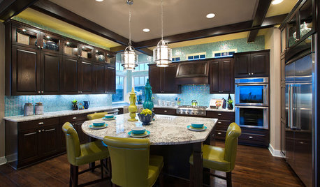
DECORATING GUIDESStrategies to Create Color Flow Throughout a Home — a Case Study
Unite your indoor and outdoor rooms with a consistent color palette, for cohesion and a polished look
Full Story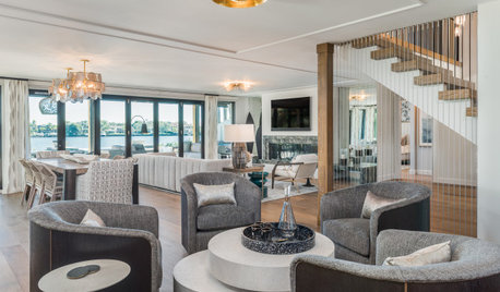
DECORATING GUIDESHow to Create a Cohesive Color Flow Throughout Your Home
Designers share eight techniques for avoiding a choppy feeling in your spaces
Full Story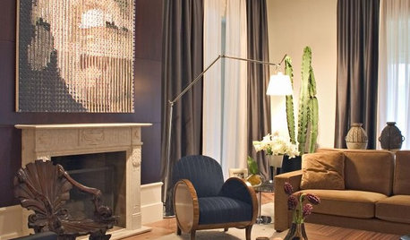
COLORPick the Right Color Palette to Showcase Your Art
Set your artwork off to its best advantage with the ideal background colors throughout your home
Full Story
COLORDesigner Picks: 12 Soothing Light Blue Paint Colors
These sky-blue paint colors evoke a sense of calm and cheerfulness. Designers tell us why they love them
Full Story
COLORPick-a-Paint Help: How to Quit Procrastinating on Color Choice
If you're up to your ears in paint chips but no further to pinning down a hue, our new 3-part series is for you
Full Story
COLORPick-a-Paint Help: How to Create a Whole-House Color Palette
Don't be daunted. With these strategies, building a cohesive palette for your entire home is less difficult than it seems
Full Story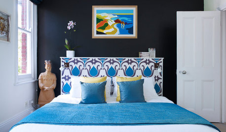
COLOR7 Tips for Picking Colors With Staying Power
Worried that your paint choices will be out of style before the walls dry? Follow these steps for a trend-proof palette
Full Story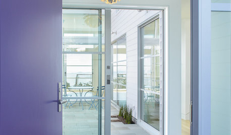
COLORS OF THE YEARPantone Picks a Purple for Its 2018 Color of the Year
Move over, Millennial Pink. Pantone’s color experts think Ultra Violet is ready to influence design choices next year
Full Story
COLORPaint-Picking Help and Secrets From a Color Expert
Advice for wall and trim colors, what to always do before committing and the one paint feature you should completely ignore
Full Story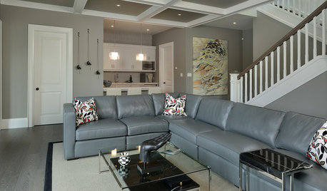
COLORWant Gorgeous Interior Colors? Look to the Light
See how to manipulate natural and artificial light — and learn about those baffling new bulbs — to get the exact room colors you want
Full Story


Sabrina Alfin Interiors