


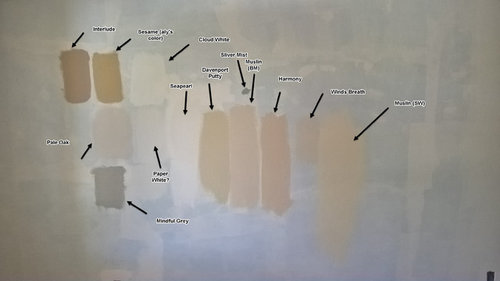
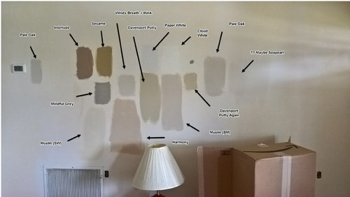
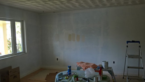
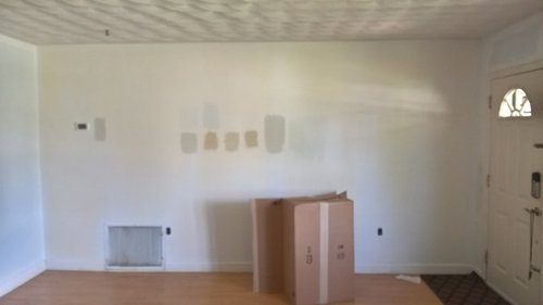
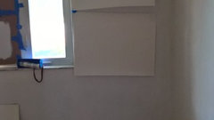
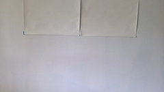
Need help - North Facing Room conundrum - opinions on my colors (pics)
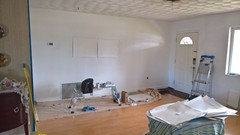
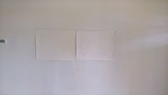
mysteryegg
6 years ago
last modified: 6 years ago
Featured Answer
Sort by:Oldest
Comments (39)
Related Discussions
Need help picking out a color for North facing room please!
Comments (15)50-ish, if you find one at 45 or so that you like don't discount it just because of the LRV number. Unless there are standards/color specs involved, LRV is more like a loosey-goosey guideline, not a formula or prescription to follow. And, yes, colors with a higher LRV number have better odds of delivering the light and airy atmosphere you're after vs. darker colors. A dramatically shifting paint color has more to do with its own metameric tendencies vs. the quality of light. A rule of thumb is if your color stays consistent in appearance when viewed in fluorescent and incandescent lighting, it will *probably* be consistent in any light source. More about north light: North exposure is not direct rays of sunlight. Very different from south light beaming into your kitchen almost all day long, or the morning sun bursting through your east facing bedroom windows at the break of day. North light isn’t necessarily reflecting or bouncing off of something else to get inside the space, it’s just that when your windows face north you don’t have actual, direct beams of light entering fenestration. North light is the most balanced from a spectral distribution perspective, it has a nice, even collection of all the wavelengths though it tends to be heavier in the blue range. Because it’s a balanced bundle of wavelengths and also because it is not a direct beaming, or spot-light effect of natural light, north facing rooms are ideal for any kind of artistic work environment. The pronounced blue of north light is a factoid that's been blown way out of proportion. Blogosphere has taken that one single aspect of north light and made a huge deal out of it - I guess because it makes a good 'sound bite' or something. I dunno. But it's kind of a dumb thing to hyper-focus on. Heavy in blue doesn't mean it's gray. Doesn't necessarily mean it's cool either. North light is simply indirect light that's balanced over the visible spectrum as a whole but with a pronounced bump of blue....See MoreNorth Facing Great Room & Dining Room paint help
Comments (6)As others have pointed out a north-facing room will have no direct sunlight and little natural light 365 days a year. The good thing about north light, as any architect or artist will tell you, is that the lighting level and color will tend to be the same throughout much of the day, i.e., you will never have hot spots, glare and significantly different lighting levels throughout the day. If it was my house I'd find a cream, white or other light value color to enhance and amplify the overall light level level. Creams and whites come in a wide range of hue and temperature biases. I always recommend that consumers buy several of the small sample containers and do "brush ons" on several surfaces which are parallel and perpendicular to one another and to the windows, since colors always look different depending on where they are located. They also look different depending on whether the day is sunny or overcast. Good luck with your project!...See MoreNorth Facing Room - Paint Help
Comments (6)What are the colors you are trying on the wall? Your sofa/chairs have a white/creamy look, am I seeing that correctly? I put BM Edgecomb Gray in my north facing bedroom. Furniture color close to your floors, creamy white bedding, creamy taupe drapes. During the day the paint is brightening, at night with lights on it does take on a creamy/beige hint. And its gives warmth that you never get from cooler grays. Very nice greige. Sorry I cannot give you a SW color match for it. I do know the BM Edgecomb Gray is LRV 63. Light reflecting colors above 50 are better at reflecting natural light during the day or artificial lights at night. I hope that helps....See MoreHelp needed for north facing kitchen
Comments (7)Definitely warmer. I will definitely get a sample of Patience. I am not looking for warm like we had I just wanted it to look tan or a neutral beige but it went straight to light gray. I think it would be fine in my south facing front hall but it is shocking how gray it looks. Also the cabinets are casting more red than the brown they looked like with the old paint. I am not a newbie to painting this is our 7th house but I guess I never had such a north facing brightly lit room. Thank you everyone!...See More
mysteryegg
6 years ago PRO
PROAnglophilia
6 years agomysteryegg
6 years ago
havingfun
6 years agoeverdebz
6 years agolast modified: 6 years agoeverdebz
6 years agoeverdebz
6 years ago
januarisun
6 years ago
House Vixen
6 years ago PRO
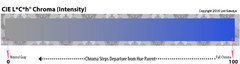
PROLori A. Sawaya
6 years ago
pamghatten
6 years agoeverdebz
6 years agolast modified: 6 years ago
aprilneverends
6 years agoHouse Vixen
6 years agolast modified: 6 years ago- PRO
Lori A. Sawaya
6 years agolast modified: 6 years ago House Vixen
6 years agolast modified: 6 years ago- PRO
Lori A. Sawaya
6 years ago havingfun
6 years ago- PRO
Lori A. Sawaya
6 years ago House Vixen
6 years agohavingfun
6 years agoaprilneverends
6 years agolast modified: 6 years agoaprilneverends
6 years agoaprilneverends
6 years ago
Olychick
6 years agohavingfun
6 years agoHouse Vixen
6 years agolast modified: 6 years agomysteryegg
6 years agoaprilneverends
6 years agohavingfun
6 years agomysteryegg
6 years ago
alex9179
6 years agomysteryegg
6 years agoalex9179
6 years ago
Related Stories

COLORPaint-Picking Help and Secrets From a Color Expert
Advice for wall and trim colors, what to always do before committing and the one paint feature you should completely ignore
Full Story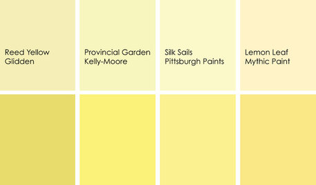
DECORATING GUIDESColor Feast: When to Use Yellow in the Dining Room
Make mealtimes a cheery affair with swaths of this sunshiny hue on your dining room walls, furniture or ceiling
Full Story
COLORPick-a-Paint Help: How to Quit Procrastinating on Color Choice
If you're up to your ears in paint chips but no further to pinning down a hue, our new 3-part series is for you
Full Story
DECORATING GUIDESNo Neutral Ground? Why the Color Camps Are So Opinionated
Can't we all just get along when it comes to color versus neutrals?
Full Story
COLORPick-a-Paint Help: How to Create a Whole-House Color Palette
Don't be daunted. With these strategies, building a cohesive palette for your entire home is less difficult than it seems
Full Story
DINING ROOMSColor Feast: When to Use Gray in the Dining Room
The right shade of gray pairs nicely with whites and woods to serve up elegance and sophistication
Full Story
HOUZZ TOURSMy Houzz: Saturated Colors Help a 1920s Fixer-Upper Flourish
Bright paint and cheerful patterns give this Spanish-style Los Angeles home a thriving new personality
Full Story
COLORFUL HOMESThe Best of My Houzz: 10 Living Rooms With Wall Colors to Love
Jet black, Meyer lemon yellow, mossy green — these spaces make a statement with bold color
Full Story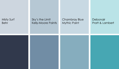
DECORATING GUIDESColor Feast: Yes, You Can Use Blue in the Dining Room
The sky's the limit for beautiful blues in your home's dining spaces; here's how to make it work
Full Story
EXTERIOR COLORChoosing Color: 1 Home Has Fun With 5 Different Color Schemes
See a home’s potential for transformation with several new hues. Do you have a favorite?
Full Story


alex9179