


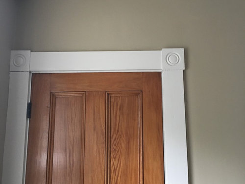
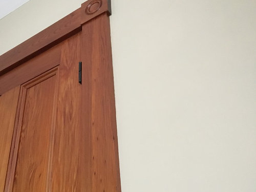
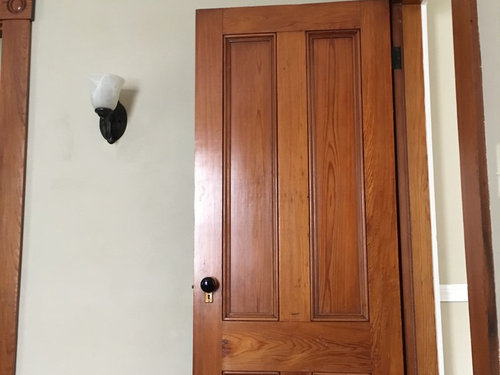
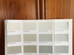
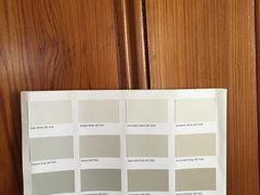
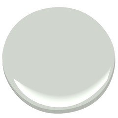
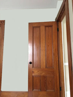
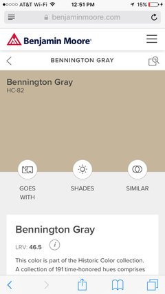
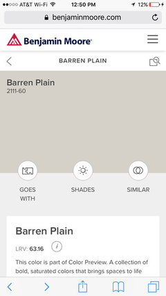
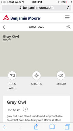
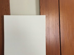
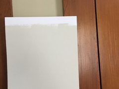
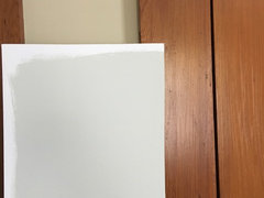
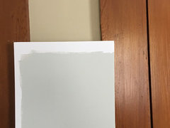
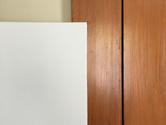
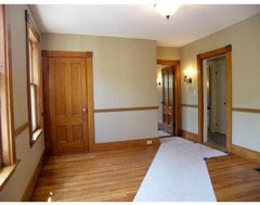
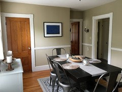
Help brightening walls with orange antique trim (undertones question)
User
6 years ago
Featured Answer
Sort by:Oldest
Comments (27)

User
6 years ago PRO
PROJudyG Designs
6 years agolast modified: 6 years agoRelated Discussions
Antique White Trim for Historic House
Comments (9)Check out Duron's Colors of Historic Charleston and Carolina Low Country Collection. Duron is owned by Sherwin Williams, so all the colors are available even though they don't carry the color cards in house. SW will match BM colors too. BM has some historic color collections. Buyaurapaint.com has a comprehensive listing of their colors. If you click on the color it will show you the LRV Light Reflective Value rating and sometimes tell you whether the color has a warm or a cool undertone. I have found this immensely helpful. Lastly, check out Lowes if you have one in your area. Their Valspar line has National Trust Historic Paint color palettes. I'll post the link below. If you find something you like, you can get SW to match it for you. A tip about Sherwin Williams. Go when it's not busy, typically a weekday after 10 am. The pros are all in there first thing in the morning. It might not be the right time to get someone to work on matching a sample. I've gone in in the mid morning or early afternoon and find that I have the sales person's undivided attention and get the match I'm looking for. BTW, two SW off whites I like are Westhighland White SW7566 (lighter) and Restful White 7563. Dover White 6385 is also pretty, but a bit yellow-er. Other sites: oldhousecolors.com http://www.oldhouseweb.com/suppliers/paints-and-sundries/historic-paint-colors/ Sorry to lob so much info your way. I hope it helps! Kathe Here is a link that might be useful: National Trust Historic Paint Colors...See MoreHow to Determine Undertones of Neutral Paint?
Comments (118)Oh that is such a good question, Jennifer! I love it that you are really thinking about this. The big difference as illustrated on the Sherwin Williams Poised Taupe graphic that you posed (and I made) is the illuminant. We have TWO illustrated - D65 and D50. An illuminant mimics a light source; D65 and D50 are two different colors of light - you can see what they look like on the diagram below. The light is boss. Change the light and you change how the color looks. I used two different illuminants on purpose to demonstrate how a Poised Taupe's hue family shifts based on the light source. So, easyRGB and the NIX are very close 4YR and 5YR - that's an expected and acceptable margin of error. Actually, it's an amazingly tiny margin of error considering we're talking about two different devices measuring two different color chips in two different environments. The Color Muse measurement for Poised Taupe's hue family is 1YR because I measured the color with a D50 illuminant - a different color of light. It SHOULD be different from notations calculated from measurements captured under a D65 illuminant. The point of the graphic I made, the bottom line is Poised Taupe belongs to the Yellow-Red hue family, D65/2° and D50/2°. If Poised Taupe shifts and looks purple-ish or reddish or whatever, then we know the quality of light is not balanced and from that point of knowing, we can develop an informed color strategy for the space. The fact that all three of these notations in this example are so close is a testament to the efficacy and usefulness of these inexpensive hand-held color measurement tools. Being able to toggle between illuminants, like D65 and D50, with these devices is super helpful because it enables the color pro to get two different perspectives on a color. Since every person sees color differently, it's helpful to take a look at color notations from two illuminant perspectives because it helps a color pro anticipate how a color could be perceived differently by different humans. When it comes to color data values, all the dots connect every single time. If there is a disconnect or inconsistency, there's a reasonable reason. Even if that reasonable reason is the human perception of color is a natural phenomenon and shift happens....See MoreKitchen Help! Not sure how to brighten it up?
Comments (92)Color. You need color. The paint samples are all nice but they won't do anything to cheer up/brighten up that kitchen. If you don't want color on the walls, then use your lightest Warm Neutral, brighten up the space with accessories and doodads in a bright cheerful color... and I myself would paint the dining set a matching bright cherry color. (Meant to say cheery, but Cherry sounds pretty good!)...See MoreCOOL WHITE WALLS WITH ANTIQUE WHITE CABINET
Comments (17)I just went through this same situation. I have off white glazed cabinets in my kitchen and I didn't want to change them so I chose the same color warm (SW antique white) paint I had on my trim in half formula and painted all the trim and walls the this same color. If you compare the paint to a true white it still looks very creamy but without any contrast (other than sheen) between the trim and walls it feels like a nice warm white space. Not too bright but not too creamy either. It also made the space feel much larger because there are no definitive stripes around the room! FYI - I am an interior designer and I looked at many, many options before going this direction and I am very happy with the outcome....See MoreUser
6 years agoUser
6 years agoUser
6 years agoUser
6 years agoUser
6 years agolast modified: 6 years agoUser
6 years agoDebbie Downer
6 years agoUser
6 years agoUser
6 years agoUser
6 years agolast modified: 6 years agoUser
6 years ago PRO
PROLori A. Sawaya
6 years agoUser
6 years ago- PRO
Lori A. Sawaya
6 years ago 
junco East Georgia zone 8a
6 years agoDebbie Downer
6 years agoUser
6 years agolast modified: 6 years agoUser
6 years agoUser
6 years agoUser
6 years agoUser
6 years agoUser
6 years agolast modified: 6 years ago


Related Stories
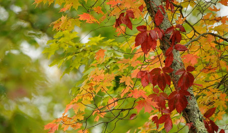
COLORFall on the Wall: Decorating With Rich Reds, Browns and Oranges
For your interiors, take a cue from nature’s colorful seasonal offerings
Full Story
TRIMTrim Color Tips: Get Your White Trim Right
Set off wood tones, highlight architectural features, go minimalist ... white trim is anything but standard when you know how to use it
Full Story
COLORPaint-Picking Help and Secrets From a Color Expert
Advice for wall and trim colors, what to always do before committing and the one paint feature you should completely ignore
Full StoryDECORATING GUIDESThe Case for the Anti-Accent Wall
Go ahead, paint everything the same color (even the trim)
Full Story
EXTERIORSCurb Appeal Feeling a Little Off? Some Questions to Consider
Color, scale, proportion, trim ... 14 things to think about if your exterior is bugging you
Full Story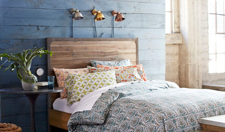
BEDROOMSHouzz Quiz: What Color Should You Paint Your Bedroom Walls?
Cool and soothing, or warm and spicy? Answer these questions and learn what hue is right for you
Full Story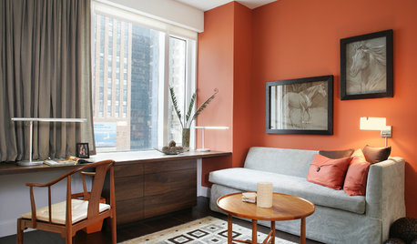
MOST POPULARFalling for Color: 9 Ways With Pumpkin Orange
From racing stripes to accent walls, see how to work this vibrant hue into your home
Full Story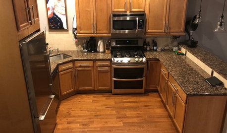
BEFORE AND AFTERSSee How Refaced Cabinets Brighten This Dated Kitchen
By updating the cabinets, countertop and backsplash, designers help a homeowner create a fresh, modern style on a budget
Full Story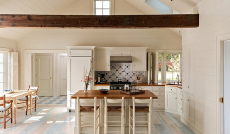
WHITE3 Easygoing Rooms With Creamy Off-White Walls
Look to this colorless color for warm, relaxed style with elegant undertones
Full Story
KITCHEN DESIGNWhy a Designer Kept Her Kitchen Walls
Closed kitchens help hide messes (and smells) and create a zone for ‘me time.’ Do you like your kitchen open or closed?
Full StorySponsored
Professional Remodelers in Franklin County Specializing Kitchen & Bath


Sara Sota