


How to Determine Undertones of Neutral Paint?
queenbe11
6 years ago
Featured Answer
Sort by:Oldest
Comments (118)
 PRO
PROLori A. Sawaya
6 years ago PRO
PROBeth H. :
6 years agolast modified: 6 years agoRelated Discussions
Warm/cool undertones - cabinet paint
Comments (5)Thanks linjbo. It's funny how individually we perceive color differently in our spaces. Breezygirl sees no yellow in her Simply White but does in Cloud White. I'm the total opposite. When it comes down to it, we have to trust our own eyes in our own spaces. It is what it is....See MoreLooking for a Warm Neutral Paint Color with touch of Yellow
Comments (18)Hi, I have painted by house with several BM colors. I actually have Monroe Bisque, Standish White, Pittsfield Buff, and Shelburne Buff. I have low ceilings, natural oak floors, with white trim. I have furniture of all colors. Of all the colors I used Shelburne buff seems to have the least amount of green. I personally think Pittsfield Buff has a lot of gold. The color that everyone loves believe or not is Monroe Bisque. I was not sold with any of these colors until I put them up as samples. One of the reason that these colors have some green is it tends to give these colors more versatility. For me I didnt want a creamy yellow, because I didnt want my rust colored furniture to look too red....See Moreundertones and combining neutrals in a white kitchen
Comments (16)Hi Waterdamage, There's a lot of angst about mixing whites and undertones of late. I'm a painter and I agree that large fields of very different whites (a pinkish white and a yellowish one, for example), may look like an unintended and unfortunate mismatch. I see a neighbour's 'neutral' house everyday (even moreso as the leaves come down) that has greenish off white window trim, a pinky beige board and batten clad addition, ivory stucco, and reddish asphalt shingles on a 70s interpretation of a Mansard style roof. The result looks haphazard and jarring. And yet, multiple whites can look wonderful together. Think of a field of cricketers in their ivories and whites, often punctuated somewhere with a crisp line of bold colour. What a gorgeous, multi-layered, luxurious look. Our own kitchen is white with some black. We have three white paint colours (not counting our off-black island), stained white wood trim, white marble on the island (calacatta carrara marble--with some caramelly veining, but very pure white body), two tiles--floor and backsplash--both off white, and a whitewashed brick wall. Sounds like cacophony, but looks wonderfully textured and nuanced. Next to the bold contrast of the black island and soapstone, all the whites blend into pale submission. We did take great care choosing our various whites. A sample board of all the elements in appropriate proportions can be a great help. Observe it in all lights. Light and colour have an intimate and changeable relationship. Trust your own eye (or post pictures). Be brave....See MoreTricorn black paint on island and brown undertone
Comments (8)I thought Tricorn black was a neutral black but it’s shows a lot of dark brown undertone. Tricorn Black belongs to the Purple-Blue hue family. Blue, Purple-Blue hue family is typical for colors that are usually perceived as "neutral" or "just black". So, you're right, Tricorn is usually perceived as "just black". There is nothing brown about it. The color notation is no where near brown and it doesn't look brown either. If it appears brown, something is really off. Either you have some dramatically influential light source. Or it's a bad color match/mix....See More- PRO
Lori A. Sawaya
6 years ago - PRO
Lori A. Sawaya
6 years ago - PRO
Lori A. Sawaya
6 years ago  PRO
PRODiana Bier Interiors, LLC
6 years ago- PRO
Lori A. Sawaya
6 years agolast modified: 6 years ago - PRO
Diana Bier Interiors, LLC
6 years ago  PRO
PROJAN MOYER
6 years agolast modified: 6 years ago- PRO
Lori A. Sawaya
6 years ago 
Jennifer Hogan
6 years ago- PRO
Lori A. Sawaya
6 years agolast modified: 6 years ago - PRO
JAN MOYER
6 years ago - PRO
Lori A. Sawaya
6 years ago Jennifer Hogan
6 years ago- PRO
Diana Bier Interiors, LLC
6 years ago Jennifer Hogan
6 years ago- PRO
Lori A. Sawaya
6 years agolast modified: 6 years ago - PRO
JAN MOYER
6 years agolast modified: 6 years ago - PRO
Lori A. Sawaya
6 years ago - PRO
Lori A. Sawaya
6 years agolast modified: 6 years ago - PRO
JAN MOYER
6 years agolast modified: 6 years ago Jennifer Hogan
6 years ago- PRO
Lori A. Sawaya
6 years agolast modified: 6 years ago - PRO
Lori A. Sawaya
6 years ago - PRO
Lori A. Sawaya
6 years ago - PRO
Lori A. Sawaya
6 years agolast modified: 6 years ago 
queenbe11
6 years agoJennifer Hogan
6 years agoqueenbe11
6 years ago- PRO
Lori A. Sawaya
6 years ago queenbe11
6 years agoqueenbe11
6 years agoJennifer Hogan
6 years ago- PRO
Lori A. Sawaya
6 years agolast modified: 6 years ago Jennifer Hogan
6 years ago- PRO
Lori A. Sawaya
6 years agolast modified: 6 years ago queenbe11
6 years ago- PRO
Lori A. Sawaya
6 years agolast modified: 6 years ago - PRO
Lori A. Sawaya
6 years agolast modified: 6 years ago 
User
6 years agolast modified: 6 years ago


Related Stories
COLORWhite vs. Cream: Which Neutral Paint Color Is Right for You?
Do bright white rooms give you the chills? Are off-whites too drab and boring? Let’s see which is a better fit for you
Full Story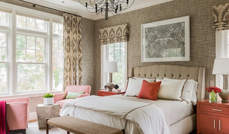
COLORHow to Give Neutral Paint Colors a Subtle Jolt
Don’t compete with your neutral hues — complement them!
Full Story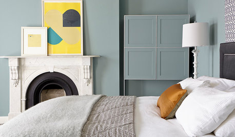
GRAY10 Off-Grays for When You Want a Richer Neutral Hue
Look to these undertones to give your space the subtle color you crave
Full Story
WHITEHow to Pick the Right White Paint
White is white, right? Not quite. See 8 white paint picks for 8 very different effects
Full Story
GRAYDesigners Share Their Favorite Light Gray Paints
These versatile neutrals can help create a range of moods in any room
Full Story
GRAYChoosing Paint: How To Pick the Right Gray
Which Version of Today's 'It' Neutral Is For You?
Full Story
COLOR PALETTESChoosing Color: See This Home Try On 5 Exterior Paint Palettes
Dark and dramatic, or soft and neutral. See how paint color alone can change the look of a home
Full Story
TRIMWhat Color Should You Paint Your Trim?
Learn the benefits of painting your trim white, black, neutral, a bold color and more
Full Story
COLORBeige Is Back: Designers Share 10 Beautiful Warm Paint Colors
Enthusiasm for cool grays has waned, and warm neutrals have returned. See which beige and greige tones designers prefer
Full Story
COLOR PALETTES8 Purple Paint Colors That Work Well in a Kitchen
See how this versatile hue plays with gray and other undertones to give a kitchen a stylish accent color
Full Story

Darzy