


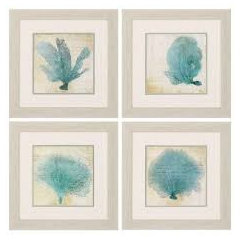
Beach house art advice.
Mel
6 years ago
Featured Answer
Sort by:Oldest
Comments (13)

User
6 years ago PRO
PRODeck The Halls
6 years agoRelated Discussions
Need art advice- Hollywood Regency meets Art Deco
Comments (8)Hi Blessedbe. I used to live in an incredible Streamlined Deco apartment building built in 1940, with terrazzo floors, glass block walls & steel casement windows with metal Venetian blinds 12 feet wide--the widest made--and although it's been 25 years since I lived there, I still love that sleek look. OK, so you don't mention whether your whole place is, like mine was, actually of the period, or if it's newer construction, and you also don't say whether you're going for an authentic period look--as though your bath might have been decorated during the era & somehow survived intact till now, or whether you're making a room that's about the era & the style. They're two totally different things. Either way, forget Maxfield Parrish & Alphonse Mucha. Both were wonderful artists, but they're both way earlier, and their lush colors & lavishly ornamental style have nothing to do with the slick, high-contrast style typical of late Art Deco that you're after. In fact, when Bette Davis' elegant movie characters were swooning about in sleek penthouses & nightclubs, both Mucha's & Parrish's artwork would have been considered hopelessly old-fashioned, and all that adding them into the mix would do is muddy the concept. Paris & San Francisco, on the other hand, were both sophisticated & up-to-date, with plenty of shops & theatres & apartments & hotels executed in just the glamourous style you're after. In fact, Paris' exhibition in 1937 & San Francsco's in 1939 represent the pinnacle of the style's development just before the dark days of WWII put a sudden end to the party. But watch out if you're thinking about using photos: there are a lot of classic photos of both cities that, like the Mucha & Parrish posters, would only confuse your decor. The Eiffel Tower is too old by half a century to say anything about the Art Deco era, and while the Golden Gate bridge is an icon of 1930s design, neither image would have been used to decorate a bathroom of the period. Nor would a picture of Bette Davis, talented though she was. No, those things--movie star portraits, photos of landmarks of the period, vintage magazine ads for, say, Evening in Paris perfume or Packard automobiles, covers from Fortune magazine or Vogue, colorful fruit crate labels, vintage travel posters featuring the Pan-American Clipper or the 2oth Century Limited--while perfect for a room that's ABOUT the period/style, are all wrong for a bathroom that's meant to look as though it's FROM the same period. OK, maybe a struggling actress or a shopgirl living on the cheap in an efficiency apartment might hang a picture of Bette Davis in her tiny bathroom, but only becasue she could tear it out of a magazine for free and hang it in a ten-cnt frame from Woolworth's. But a wall full of ads & commerical art wasn't likely to appeal to most people, even if they wanted to hang artwork in their baths, which generally, they didn't. For the upper classes--the target audience, after all, for the styles that we call (thanks to Kelly Werstler & Bevis Hiller) Hollywood Regency & Art Deco--the whole point of 1930s baths was Glamour Without Fussiness. That's why they went for rich or striking new materials on the walls--marble, Vitrolite, colored or engraved mirror--and often, strong color in the fixtures: by making beauty inherent in the materials themselves, they could eliminate superfluous ornamental touches. You wouldn't have found pretty crocheted doilies or dainty flower arrangements or frilly curtains in any high-style bathroom of the period. As Belle Watling said in 1939, "It wouldn't be fittin'." So, if you want a true period look but you still want a bit of decoration, you might try adding a stenciled (or taped) border (a zigzag, or a Greek key, or a very-authentic angel-fish-&-bubbles motif in black & one other color--there are lots of possibilities) just above the tiles or just below the ceiling. Stenciled & painted designs are an authentic look, because a border is actually part of the room rather than something in the room. And, on the other hand, if you're doing a room that's not intended in any way to be authentic but one that's, rahter, ABOUT the period, you have a lot more possiblities beyond the obvious cliches. If it's photos you want, look at the striking black-&-white images that Hedrich-Blesing took for the 1933 World's Fair here in Chicago. Their lustrous shot of the Chrysler building at night has gotta be the most drop-dead glamorous photo of the whole century. I think you can buy a reproduction from the Library of Congress. Or check out Ewdard Weston's work, if you don't know it. Once you've seen his voluptuous, suggestive photgraphs of produce, you'll never look at a green pepper the same way again. For Art Deco drawings, look up Hugh Ferris' work. His renderings of Hoover Dam are awesome. For posters, look at the work of A.M. Cassandre, or Joseph Binder, whose graphic work between the wars is some of the most powerful ever. And since this approach is not really authentic for the period, anyway, there's one more image that would fit in just fine with the style & also with the black-&-white scheme you've already got going on: Richard Estes' iconic painting "Drugs" from the Art Institute of Chicago. It's a 196Os piece, but the subject is a classsic late-1930s facade in curved black Vitrolite & bent glass, and I bet the AIC has it in reproduction. I hope this suggests the two different approaches you can take as you finish your room. Be sure to post some pics when you get your room the way you want. Regards, Magnaverde....See MoreNeed advice on Living Room decoration. Area Rug/Art work/ feature etc.
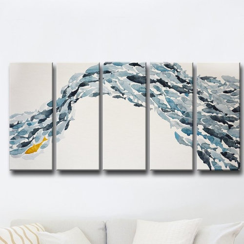
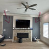
Comments (23)great advice upthread I'll try to be short, probably repeating several people: -get rid of the white console next to the fireplace/look for smth else instead if you need it there for function -think of other window treatments. curtains? woven blinds? roman shades? any of these will look better. move your sectional a bit from the wall, both to allow room for window treatments and because furniture generally needs at least couple inches to breathe..that wil also make room seem larger -you already purchased the ottoman in the same color and style of the sofa..off white, right? well something different would be better, but it's okay..buy a throw, fold it and put there to break your lines a bit. tray is great too-both for function and beauty. you'll appreciate it when watching this TV -I liked reading how your wife gets her art:) okay..so if there's no real room for other suggestions(I'm also prejudiced against mass produced canvas art..maybe she can be talked into a print instead?..)..put that art there first. Make sure it fits-seems huge?.. Say you go for that a very similar art, you have there-a bit of white, black, brown, indigo blue, fiery yellow white and brown you already have in your room (btw like your furniture) pull your other colors (in pillows and throws and accessories) from that art -deep sophisticated blues, golds. can be metallic accessories (like vases or flower pots?), can be softest fur pillows can be velvet, can be knitted throw. everythhing you buy-make sure it's a different texture..leather is sleek you've got enough of it. Speaking from experience-I also have my fair share of leather:) then look for a big ticket items like curtains and a rug. (or simultaneously..just keep your general scheme in mind). you can decide to make them fairly neutral. repeat the color of the furniture, just different material of course. or go for one vivid deep color but make it a shag rag for example. Don't try to match pattern to art..art has a mind of its own. Look at the room as a whole..what does it ask for? and know yourself of course..say I love many rugs but I don't like to clean them lol. You know whether it's high traffic area, what your habits are, and whether you'll be sad for 5 min if the rug will have spots and then get over it, or will be sad for 5 days. when you buy a side table try, again, to introduce another texture, just different material in this case. maybe wood. maybe ceramics(garden stool?some of these look really modern). every new material you bring creates dimension. Dimension is something you look for when creating spaces. Why? well that what we've used to. Ouside always has it. Even when it's a desert or an ocean. It has depth. we need to recreate it with all sort of ways and means that are availiable to us.. Good luck! will be a cool room edited because of thousand typos..))...See MoreHelp! Need advice on BOLD colors for a home art room
Comments (3)How about going a little crazy and painting one wall with a stylized mural or geometric design or some such thing. You don't have to be a realistic artist - just use big bold strokes and always remember you can paint over it. Don't let yourself get caught up in perfection in every stroke, just keep it loose. I'd make the other walls a coordinating neutral that will be a nice backdrop to hanging artwork on....See MoreNeed advice selecting exterior house colors for Arts&Crafts bungalow
Comments (11)Thank you Beverly for adjusting the photo- what a difference! I also really like the colors that you and houssaon have suggested. I'd like to stay with a color scheme that is Craftsman but that also brightens and lifts the house while showing off the Craftsman details. Right now it just appears as one darkish mass. Our weather tends toward, cloudy and grey more often than not, which doesn't help. I can see that colors in the greenish family work nicely and are Craftsman appropriate. Would colors that have a bluish grey tint also work? Thanks so much to both of you for your suggestions....See More
Mel
6 years agok9arlene
6 years agodeeinohio
6 years ago
lolauren
6 years ago
ravencajun Zone 8b TX
6 years agoMel
6 years ago PRO
PROJudyG Designs
6 years agolast modified: 6 years agoChristy Reves
6 years agoMel
6 years ago PRO
PRODesigner Drains
6 years ago

Related Stories
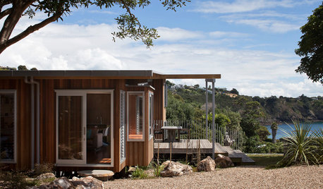
HOUZZ TOURSHouzz Tour: Three Pods Make a Beach House in New Zealand
See how separate living and utility zones boost the beach experience on Waiheke Island
Full Story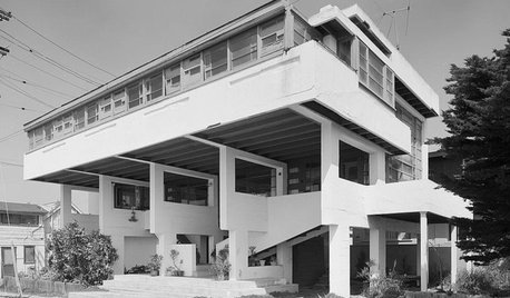
HISTORIC HOMESMust-Know Modern Homes: The Lovell Beach House
R.M. Schindler redefined architectural space through form. See how this striking California home influenced modern architecture to come
Full Story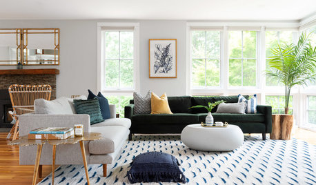
HOUZZ TOURSTour a Designer’s Modern Glam Beach House in Rhode Island
Desiree Burns pulls together a green sofa, navy blue accents, rattan chairs and brass to create coastal style that pops
Full Story
ROOTS OF STYLEArt Deco, Art Nouveau, Arts and Crafts: What’s the Difference?
If the zigzag and swirly designs of the past leave your head spinning, these descriptions will straighten you right out
Full Story
HOUZZ TOURSMy Houzz: A Summer Beach House Charms and Welcomes
An expansive, thoughtful renovation transforms a humble 1870s house on Cape Cod into an inviting place for living and entertaining
Full Story
HOUZZ TOURSMy Houzz: Hodgepodge Happiness in a Santa Cruz Beach House
Flea market finds picked for love, no matching required, fill a 1950s home in coastal California
Full Story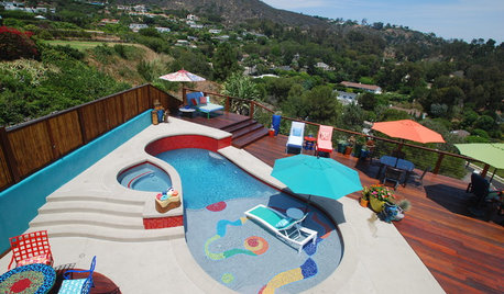
HOUZZ TOURSHouzz Tour: Color Explodes at a Surfer’s Malibu Beach House
Finding himself a bachelor after a divorce and retirement, this homeowner chose bright, bold colors to breathe new life into his home
Full Story
FEEL-GOOD HOMEHow to Create the Mood of a Laid-Back Beach House
Try these 10 ideas for making your home as relaxed as a vacation house
Full Story
VACATION HOMESHouzz Tour: Bright Beach House Goes for Fun Coastal Style
This Delaware home takes nautical detailing to the next level
Full Story
HOUZZ TOURSHouzz Tour: Modern Beach House With a Custom Twist
A family name inspires the interior of a colorful townhouse on Chesapeake Bay
Full Story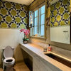


roarah