


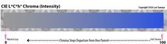
which has more pink? BM Harmony or BM Sea Urchin
WendyB 5A/MA
7 years ago
Featured Answer
Sort by:Oldest
Comments (10)

WendyB 5A/MA
7 years agoRelated Discussions
What's your favorite BM paint colors?
Comments (84)After living with the (boring) neutrals that were in the house when we moved here 15 years ago, we just finished painting all of our upstairs rooms and I love all the colors. Hard to pick a favorite, as each was chosen to go with the light and furnishings in that particular room. What I probably love most is the Atrium White trim and how it plays nicely with all of the somewhat intense colors we chose. All have LRVs around 30: Louisburg Green, Van Cortland Blue, Richmond Gold, Summerdale Gold are all lovely. In the bath, which gets lots of western light and has bright white fixtures and shower curtain, we went more intense with Philipsburg Blue. I couldn't be happier....See MorePittsburgh Paint? Olympia? BM?
Comments (6)I've had a Pittsburg dealer within a few blocks of me for years. He then switched from independent and became a PP franchise. (When he was independent he carried primarily Pburg, but also Cab Coat, Muralo, Olympia and others, but those were mostly specialty, like for concrete floors or exterior stains, etc.) Since going franchise, it's all strictly PP products across the board. I've used their paint on many occasions (Manor Hall, the top of the line I was told by owner) and no complaints. Actually, it's quite good, and I like it just as much as BM. Don't know where it stands from a 'technical' perspective, but as a consumer, it goes on well for me, retains color well for years, color does not wipe off when 'new' (BM eggshell did come off wall when wiped in first couple months). I painted a 70's dark stained oak vanity 12 years ago in a cream color PP had, it still looks good as new today. What the dealer/owner told me: the Pittsburg line you see at Menard's is a lower quality line. I think he said like a contractor grade? What prompted me to ask is there is a Menard's selling the Pburg paint only about 1 1/2 miles away, so that's unusually close proximity (at least in my parts) for two dealers of the same line. So I asked what was up, and that's when he told me it's the lower end of the Pburg line. I've been hooked on BM in recent couple years just from Home Dec feedback. But you know, I stopped in Pburg store recently, and they've updated their display (finally!) and have samples now. They've got some really nice colors in their line, and coordinate the sample pots with cards that show complimentary colors. Very handy! So I might give one of them a try for the bath I want to repaint. The only Olympia product I ever used was a solid white stain on my picket fence. It held up very well (no yellowing whatsoever). But I got that at the Pburg dealer back when he was independent, not Menards.)...See MoreBM color fan--warm neutral for LR, grayish-blue for DR? (LONG)
Comments (10)Thank you, voila, for coming out of lurkdom to help me! This HAS been painful in the sense that I really dislike being in limbo, uncertain, and indecisive, which has also been time-consuming since I have been looking at paint colors off and on for 2 or 3 years, and stewing around about them trying to figure this out. To clarify regarding the Carlisle Cream with the hint of pink: this is not the trim color. I will try to see if I can find the name somewhere in my files, but the color of the trim for all of the house and most of the ceilings has a yellowish cast. The Carlisle Cream is only on the ceiling in the DR & MBR (and the paint chosen for the DR will also be used in the MBR which faces NW), as well as the walls of the mudroom, laundry, powder room, and MBath. You are correct that it fights with yellow, because the tiles have hints of yellow tones, and it does not look good there. Except for the 2 ceilings, the Carlisle Cream will be changed to something that goes better with all of the tiles and countertops that probably need a color with some yellow, rather than pink, in it. When we painted our former N facing foyer with Pittsfield Buff, it really pulled together the colors of the 2 small rugs and tile, which are almost the same as what we have now. But that is a whole nuther story. Wythe & Palladian Blues are on my "possible" list, so I will give them further consideration. The HC 139-141 at first glance under kitchen lighting seemed minty, but the lighting in the LR is halogen, so they look different in there. I will need to see them on a sunny day. Another vote for HC 146, 147, and Gray Wisp is good! And I really like your suggestion of Quiet Moments. It is interesting that you say, "all greens seem to go together", which I had heard before. The reason I got a new LR rug was that my old one had multiple colors of green and greenish gold on a cream field, and to me it clashed with the fireplace in daylight. I moved it into the kitchen eating area that has the same slate tile on the other side of the 2-way FP where it only gets light from the NW which is not directly on it as it is in the LR, and it looks perfect in the different light! Also, if I turned the LR rug around, it would look much better upon entering the room, but to me the green from that direction looks awful with the FP green. I think it will be a lot easier to choose the DR paint than that for the LR. I will definitely pursue looking at grayed colors for both rooms, but I would still like to try maybe a rich tan that does not lean to red or yellow and see if that could work in the LR to pull out those colors in the rug, but maybe nothing will do this? I suppose that would only add to the blendy feeling that I am so good at achieving. I had originally imagined having a sort of rich, dark cream, but I guess that would mean yellow, so it is out. A correction regarding the "drapes." They are actually 4 drapery panels on each side of a 7 ft triple casement that help to set off the piano and a small chest near the creamy beige rug, and at each end of a 4 window bank (each 42" wide) next to the chest and behind the mauve wing-back near the FP. They are not directly next to the 9 x 12 "green" rug. The 2 rugs are separated by the sofa, so you do not see much of the Bokhara when entering the LR. I know that all the detail causes many people not to read this, but I welcome comments from anyone who has the patience to work through them to give me additional guidance. Anne...See MoreHow can I find out what color is complimentary to BM pale oak?
Comments (18)Sure. Very pretty. White Dove and Pale Oak are fine together. Low contrast. Barely enough difference in chroma to work together - but, again, it's fine. And I can see how the low contrast, continuity between the two would be appealing to a certain aesthetic. I personally like more contrast and a brighter, cleaner white on trim. Like OC-151 White or SW's Extra White. That's just my personal preference....See More PRO
PROLori A. Sawaya
7 years agolast modified: 7 years agoWendyB 5A/MA
6 years ago- PRO
Lori A. Sawaya
6 years ago - PRO
Lori A. Sawaya
6 years ago - PRO
Lori A. Sawaya
6 years ago WendyB 5A/MA
6 years ago- PRO
Lori A. Sawaya
6 years ago - PRO
Lori A. Sawaya
6 years agolast modified: 6 years ago


Related Stories
COLORHow to Layer Tones of Gray for Depth and Harmony
Use texture, pattern, contrast and more to create a subtle, sophisticated look with this popular color
Full Story
WORLD OF DESIGNEngland’s Most Famous Garden Designer Has These Tips for You
Lancelot 'Capability Brown' was born 300 years ago, but his ideas about naturalistic landscape design may be more relevant than ever
Full Story
COLORBedroom Color: The Secret to More Sex and More Sleep
Look to surprising revelations about bedroom wall colors to get more of what you want
Full Story
FEEL-GOOD HOMEThe Question That Can Make You Love Your Home More
Change your relationship with your house for the better by focusing on the answer to something designers often ask
Full Story
COLORGet a Soft Spot for Sea-Glass Green
Soften a room's look by washing its walls in this delightfully airy shade, no sand in your shoes required
Full Story
COLORColors of the Year: Look Back and Ahead for New Color Inspiration
See which color trends from 2014 are sticking, which ones struck out and which colors we’ll be watching for next year
Full Story
BATHROOM DESIGN20 Ways to Design an Asian-Style Bathroom
Want a bathroom that’s inviting and serene, with spa-like luxury? Be inspired by these Asian-style spaces, which offer all that and more
Full StoryDECORATING GUIDESSo Your Style Is: Transitional
This sophisticated look hits the sweet spot between traditional elegance and contemporary cool for harmony in your home
Full Story
COLORColor of the Week: Watery Blue Is Summer's Best Hue
See how to bring the soothing colors of the sea into your home
Full Story
COLOR PALETTESEaster Egg Inspiration: 9 Great Ways to Use Pastels
Mint green, light aqua, pale pink, blossom yellow and soft lavender can bring spring beauty into your home
Full Story

Lori A. Sawaya