


Natural Paper Shade on Ceiling Light - is it too yellow???
reddyinga
7 years ago

Featured Answer
Sort by:Oldest
Comments (7)

reddyinga
7 years agoRelated Discussions
Paint is too yellow, too pink, or too peach
Comments (21)For the people who understand hue, color, value, etc. What is in the green or blue that doesn't change colors? Do they have more cooler colors? There's nothing *in* the green and blue. Rather it's a matter of their being less toned. They likely have a very simple mix of colorants - just one or two - in the can. Which is why they look pastel. Which is also why they seem to not change much from the chip -- they are simple colors and it is easy to see what hue family they belong to, blue and green. Near neutral paint colors are colors that have been toned down so far they look "gray". These colors are not so simple. They are complex and it is not easy to see what hue family they come from. Every color comes from a hue family. And that is where the hue bias, like green, purple, and blue comes from. For example, the gray you think *turned purple* has always been purple you just didn't see it. Probably because you didn't know to look for the hue bias. It is also the hue family that gives direction as far as color temperature. Near neutral paint colors from the yellow-red hue family will be warmer than the paint colors from the blue hue family. Paint chips are arranged by hue family at every paint store. Paying attention to what hue family section of the display you are pulling chips can help; even with those super toned down colors that look gray. Sometimes the store will pull the near neutral colors out into a separate side display. Which makes it harder for people to identify hue bias and temperature in paint chips. This post was edited by funcolors on Mon, Feb 4, 13 at 18:24...See MoreBehr interior paint color Song of Summer - nice lite yellow
Comments (3)Will post some pictures when I can, can't find the cord to the camera at the moment - everything a mess from moving stuff to paint. This was a semi-gloss job, being in the kitchen I wanted a tough finish. Been about a week now I guess since the color has been on the walls and love it - as the light shifts it looks more golden buff, other times a creamy lemon. Read on the Internet that a STRONG yellow color, while warm and appealing, can also be intensely irritating to people (more people fight in yellow rooms and restaurants use bright yellow on the walls to encourage people to eat and go!) But I could happily sit in my kitchen now for hours....See MoreNatural Paper Shade for ceiling light - does it look yellow??
Comments (0)I bought the below light fixture and several others for a whole house reno. Love them. When they arrived every shade (natural paper shade) looks yellow/tan. It doesnt look that way to me in the picture below or in any other picture I have seen. Any advice here? Once they are installed does the yellow from a paper shade sort of fade into the background?...See MoreHelp! Trying to tone down brand new SW Dover White cabinet-too yellow
Comments (33)Can any color experts out there tell me if SW Moth Wing would be a good choice for the island? Would it give an ample contrast to the SW Dover White. First, I loveDover White. I think it's a pretty white. Some whites are "okay" and some are "pretty" and I think Dover White is pretty, so you could have done a lot worse, IMO. Dover White belongs to the yellow hue family. So, the data validates exactly what you're seeing. If I painted the walls SW Accessible Beige with a PPG Delicate White Trim, would that clash? I'm hoping the paint color I choose will help neutralize the yellow I see. They would not clash. Those three colors go together well - they relate nicely. And it is possible that Accessible will lessen how yellow Dover White looks. Moth Wing doesn't really fit in. It's too close in terms of hue family and chroma to Accessible Beige and I don't care for the relationship on paper or lookin' at the chips. I know Moth Wing and Accessible Beige are on the same strip but that doesn't really mean anything. Color harmony is not built-in guaranteed just because colors are on the same strip. Very often the similar color attributes that land colors on the same strip are the very reasons they don't go together - Accessible Beige and Moth Wing are a good example. If you're not happy with Balanced Beige and don't want to just leave it and see how it works out, then I'd get off that strip of colors and go another color direction....See More
Annie Deighnaugh
7 years agolast modified: 7 years ago
Olychick
7 years agolast modified: 7 years ago
monicakm_gw
7 years ago
Yayagal
7 years agoHU-814743560
3 years ago
Related Stories
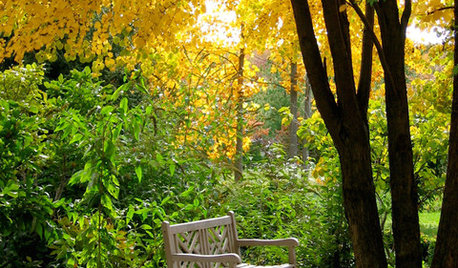
COLORNature’s Color Wisdom: Lessons on Yellow From the Great Outdoors
Let the sunshine in. These ways to use yellow will cheer up your interiors and make Mother Nature proud
Full Story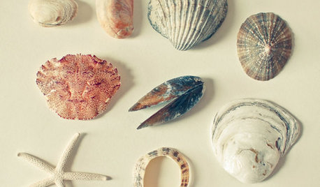
DECORATING GUIDESNature’s Color Wisdom: Lessons on Pink From the Great Outdoors
Leave your assumptions about pink at the princess playhouse door. Head outside instead for shades from shocking to subtle
Full Story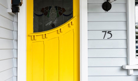
COLORSay Hello to Minion Yellow, Pantone’s Newest (and Happiest) Color
This Hollywood-inspired shade is anything but despicable. Here’s how to work the cheerful and cheeky color into your home
Full Story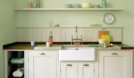
KITCHEN DESIGNSeeing Green: Some Kitchens Ditch White for Mother Nature’s Neutral
It’s typically the primary color in gardens. Now green is having a moment in the kitchen
Full Story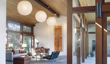
ACCESSORIESMake Things Magical With Paper Lanterns
Set some poetry in motion with affordable Asian-style paper lanterns that enchant as everyday or party decor
Full Story
COLORNature’s Color Wisdom: Lessons on White From the Great Outdoors
Blizzard fierce or butter soft, white can highlight shapes, unify a room and perform miracles on the cheap
Full Story
COLORNature’s Color Wisdom: Lessons on Earth Tones From the Great Outdoors
Look to the land for hues that are grounding, soothing and endlessly versatile
Full Story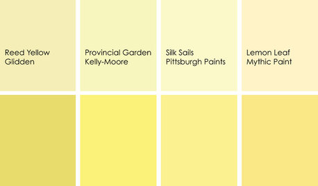
DECORATING GUIDESColor Feast: When to Use Yellow in the Dining Room
Make mealtimes a cheery affair with swaths of this sunshiny hue on your dining room walls, furniture or ceiling
Full Story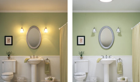
REMODELING GUIDESTubular Daylighting Devices Bring In Natural Light
More advanced and less pricey than traditional skylights, TDDs are the most modern way to let the light in
Full Story
COLORWelcome Yellow Around Your Home for an Instant Lift
Keep on the sunny side with shades of yellow from buttery and soft to dynamic and bright
Full Story


Olychick