


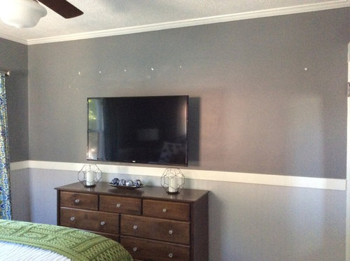
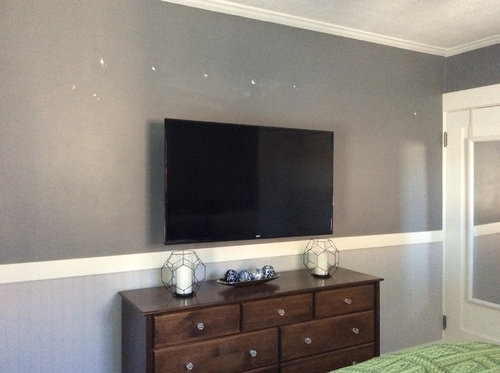
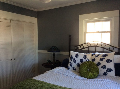
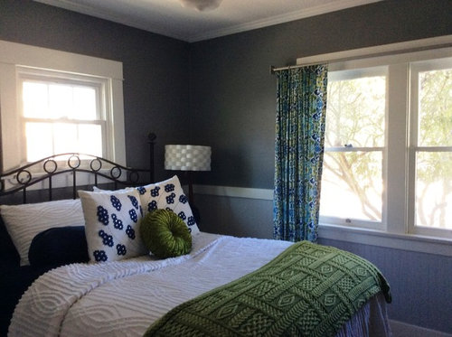
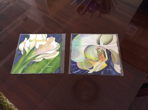
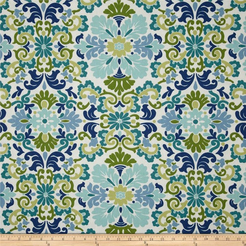
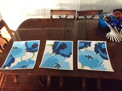
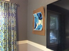
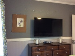
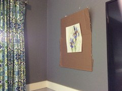
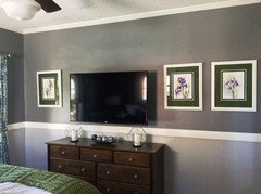
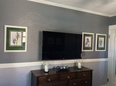
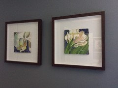
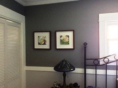
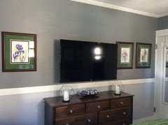
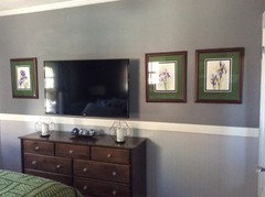
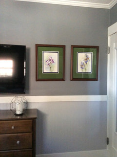
Which Artwork for my Bedroom?
aimeekm
7 years ago


Featured Answer
Sort by:Oldest
Comments (49)

sumac
7 years agoRelated Discussions
Help with art for master bedroom
Comments (11)Les - One of the things I like about the baker's rack in its current position is that I feel it balances the door to the bathroom. Before the piano came into our lives, my plan was to buy a linen press or other large piece for that spot. The chairs are probably in the only location that works. The door to the bedroom is directly opposite the wooden dresser. If the chairs are any closer to the fireplace, they're in the traffic pattern to the bathroom and closet, which is off the bathroom. There was supposed to be a bit more space there, but due to a miscommunication on my part, the contractor and I weren't on the same page. (The master suite s a recent addition to my 1950s ranch.) I love the bedding too. Thank you! It's made according to the whim of whoever makes the bed! Sometimes it lower. Sometimes it's not. As long as the bed gets made daily, I'm happy! That picture was snapped on day one. The curtains are pulled out to expose more of the windows now! The picture of DH's grandmother's brownstone isn't large enough to go over the fireplace. I had originally thought that the painting over the fireplace would go over the bed, but we had the area over the fireplace wired for TV, and I had to cover that up! Maybe I'll have to cave an buy a TV for over the fireplace and move the other painting. At least TVs are less expensive than art! I just don't like them in bedrooms. Sigh....See MoreBedroom Tweaking, Continued (art placement, etc.)
Comments (20)Kitch4me (I always thought the "kitch" in your name stood for "kitchen," though it just occurred to me that it could mean, well, kitch, which I like even better) I've chosen the last of the two pictures to hang between the windows, at least, for now. One of these days, my artist friend will make it over to help me (re)organize my artwork, and, then, all bets are off as to where they'll end up. I did reorganize my shelves a bit. I even took iphinkmountain's advice & added some baskets at the bottom - put photo albums and my old journals (dating back to high school, I think) in them. ShawNshawN - thanks for the calculations! I absolutely generally agree with you about hanging art eye height - and since I'm 5'3" and live alone, that's the standard I use - right? I don't really care what "average" eye height is in my home. That said, not all my art is eye height. For example, I have this vignette: The lower piece is hanging quite low, but it is eye height, for me, when I'm sitting on my sofa directly across from it. Which brings up the art above the bookshelves, directly across from my bed... that's art that I see when I'm in/on my bed. The photo above, taken from my bed, is how I see the art when I have a direct view of it. Are there exceptions made to the "eye level" rule when "eye level" is generally not a standing view?...See MorePlease show me your art in your master bedroom
Comments (17)The art in my bedroom is all over the map. It's where I put my art that doesn't work well elsewhere in my house, which means it is a bit of a motley crew. Even given that, it's not displayed to its best advantage. Textile piece over the bed (because I live in earthquake country and if something is going to fall on my head, I want it to be soft and light). This was a gift I received in the context of my work from some Chinese visitors. This one and the one on the left in the photo below are by a friend of mine. The orange and purple one was the first original art I ever purchased, right out of college. The two on the right I purchased at the annual open house for Creative Growth Art Center, which serves artists with developmental, mental and physical disabilities. The duck (or grebe) is a wood-black print and I love the color of the forest. These last to are also from Creative growth. This is by far my most controversial piece of art, which I've shared before. The consensus seems to be "I couldn't have that in MY bedroom." To which I can only say, then it's a good thing it is in my room instead....See MoreWhat other art should I hang in my pale pink bedroom?
Comments (2)The pink is pretty. There is already quite a lot of art and furniture, so I would not add more until you've lived with it a while. I like the grey and pink scheme....See More
aimeekm
7 years agoaimeekm
7 years agoaimeekm
7 years agoaimeekm
7 years agoaimeekm
7 years agoaimeekm
7 years agolast modified: 7 years agoaimeekm
7 years agoaimeekm
7 years agolast modified: 7 years agoaimeekm
7 years agoaimeekm
7 years agolast modified: 7 years ago


Related Stories
KITCHEN DESIGN12 Great Kitchen Styles — Which One’s for You?
Sometimes you can be surprised by the kitchen style that really calls to you. The proof is in the pictures
Full Story
DECORATING GUIDESWhich Rooms Get the Oscar?
On the eve of Hollywood’s night of nights, we bring you top films from the past year and their interior twins
Full Story
BATHROOM DESIGNWhich Bathroom Vanity Will Work for You?
Vanities can be smart centerpieces and offer tons of storage. See which design would best suit your bathroom
Full Story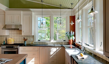
REMODELING GUIDESWhich Window for Your World?
The view and fresh air from your windows make a huge impact on the experience of being in your house
Full Story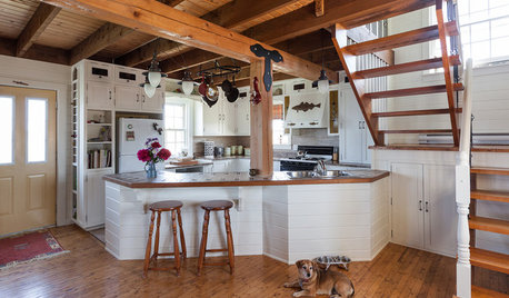
KITCHEN DESIGNOpen vs. Closed Kitchens — Which Style Works Best for You?
Get the kitchen layout that's right for you with this advice from 3 experts
Full Story
You Said It: ‘Which Color Truly Reflects You?’ and Other Quotables
Design advice, inspiration and observations that struck a chord this week
Full Story
FURNITUREWhich Dining Table Shape Should You Choose?
Rectangular, oval, round or square: Here are ways to choose your dining table shape (or make the most of the one you already have)
Full Story
DECORATING GUIDESExpert Talk: Lean or Hang Artwork?
Professional designers explain why a tilt is sometimes better than a nail for artwork around the home
Full Story
ART8 Ways to Arrange Artwork
Find the best way to configure your pictures, on or off the wall
Full Story


cpartist