


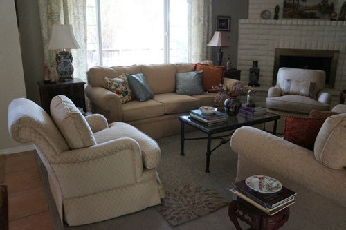
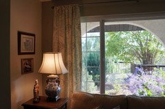
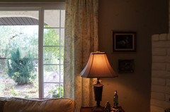
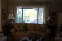
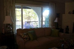
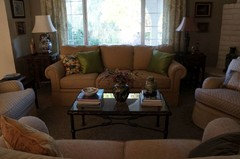
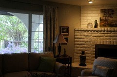
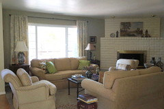
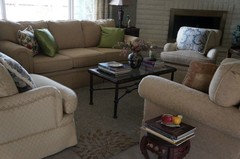
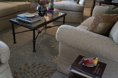
My New Curtains Just Came In
ingrid_vc so. CA zone 9
8 years ago


Featured Answer
Sort by:Oldest
Comments (51)

ingrid_vc so. CA zone 9
8 years agoRelated Discussions
My new potted maple came with trunk tied to a 'stick'. ...
Comments (5)If the label said only acer palamatum dissectum without a specific cultivar name such as Waterfall, Orangeola or Seiryu, for example, there is no way to tell if it is a weeping form or not although most a. p. dissectums do have a weeping or mounding growth habit. It also might mean that this particular plant was seed grown and therefore is no particular cultivar (or that the cutivar label had at some point been lost). Your description does sound like a grafted plant, however. Usually you can find the point at which the graft was made by looking for the slight swelling where the graft was joined to the understock. There is also frequently a noticeable difference in bark color between the understock and grafted material. The stick serves no other function except to keep the plant upright in its pot....See MoreOT - News Story came out today, my blog got 1,900 hits, hehe
Comments (14)Ok, Grrrr. It seems not only did I exceed the bandwidth of my photo sharing site (until tomorrow when my month is over I think), but it appears that I may have crashed the Ft2Garden.com server bandwidth as well. I was posting about the photo site when it gave me an error when I tried posting. After checking Judy's blog and the Ft2Garden.com forum, they were all down. I can only assume the two are related. Who knew my 15 minutes of fame would have such unintended consequences. Oops!...See MoreHelp,,,my things just don't look right in my new house
Comments (17)Wow guys... Thanks for all of the great suggestions and fun links! In our last home, the walls were sage green. It looked beautiful with our things. I was leaning toward more of a goldy tan here just for a change and for more versatility. My fear is that if I keep my current color theme that it will be out of style soon. I am seeing so many people painting over their golds and moving toward the greys and blue/greens. I love this look and see it in many of my inspiration pics. If I totally changed gears, I would likely need to get a new rug. So many decisions! I do love the look/ feel of soofrivers home. I love the wainscoting and her light walls, which is odd considering I am a color person. I had a blast going through the cottage of the month site- those are some amazing places! I was considering adding some wainscoting, but wasn't sure where. I am going to need major help with window treatments, as I really struggle with them. I do know that DH will not want any of the window covered. As for things I like...I love anything out of the Pottery Barn catalog and also like a mix with some antiques. Thank you!!!...See Morenew LO for small kitchen, my sister came up with this one...
Comments (13)hmm... agree regarding the opening frig door and little space between tall things. I am not liking frig/oven next next to each other because: the nearest landing spot is either a sidestepping 30" or a pivot across traffic to the opposite counter carrying hot and heavy items.. Opening the frig means you are opening it in front of the ovens or vice versa.... If the white is the stove area, then I would definitely suggest shortening the wall behind to allow plenty of room for people walking by you and getting into the frig or other "helping" activities. Or could you switch the sink and the cooktop areas? Just not sure about having cooktop and its grease and steam in narrow passage area.... How about moving the oven down one more section and making larger space in between the frig/oven stacks? The oven would be by the table if you needed extra landing space for cooling multiple racks of cookies ... :)...See Moreingrid_vc so. CA zone 9
8 years agoingrid_vc so. CA zone 9
8 years agoingrid_vc so. CA zone 9
8 years agoingrid_vc so. CA zone 9
8 years ago
peaches12345
8 years agoingrid_vc so. CA zone 9
8 years agoingrid_vc so. CA zone 9
8 years agoingrid_vc so. CA zone 9
8 years agolast modified: 8 years agoingrid_vc so. CA zone 9
8 years agolast modified: 8 years agoingrid_vc so. CA zone 9
8 years agolast modified: 8 years agoingrid_vc so. CA zone 9
8 years agoingrid_vc so. CA zone 9
8 years agoingrid_vc so. CA zone 9
8 years agoingrid_vc so. CA zone 9
8 years agoingrid_vc so. CA zone 9
8 years ago


Related Stories
DESIGNER SHOWCASESBefore and After: See How Rooms Came to Life at the Pasadena Show House
Read the design details behind transformations at the 2016 Southern California showcase house
Full Story
REMODELING GUIDESWhen Retirement Came Early, a Couple Headed for the Hills
A Seattle pair turn their part-time home into a full-time one, remodeling it to gain views and help it stand up to snow, sun and wind
Full Story
LANDSCAPE DESIGNHouse, Meet Landscape: How Integrated Gardens Came to Be
Trace the roots of union between home and the great wild to get ideas for merging the two on your own homesite
Full Story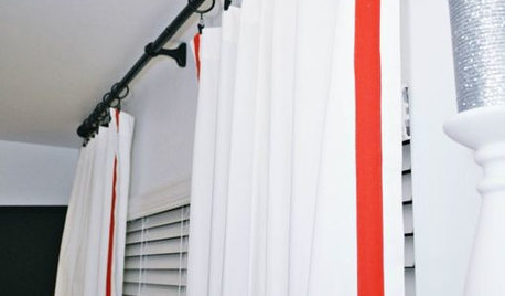
WINDOW TREATMENTSEmbellishing Tricks for Cost-Effective Custom Curtains
Get curtains that look high end — even if you don't sew — with just a little trim here or a little banding there
Full Story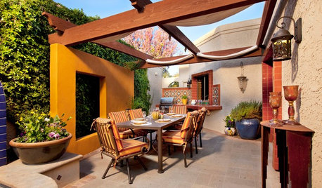
GARDENING AND LANDSCAPINGPatio Details: Sliding Fabric Panels Filter the Light Just Right
Stepping up to the harsh sun and heat of the desert Southwest, this intimate patio is an exotic escape right outside
Full Story
WORKING WITH PROSWorking With Pros: When You Just Need a Little Design Guidance
Save money with a design consultation for the big picture or specific details
Full Story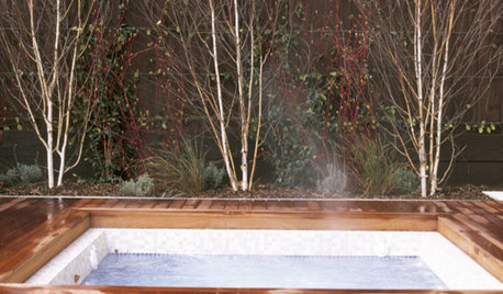
DREAM SPACESJust a Few Things for the Dream-Home Wish List
A sunken hot tub, dedicated game room, tree house, hidden wine cellar and more. Which of these home luxuries would you like best?
Full Story
LIFE9 Ways to Appreciate Your House Just as It Is
Look on the bright side — or that soothingly dark corner — to feel genuine gratitude for all the comforts of your home
Full Story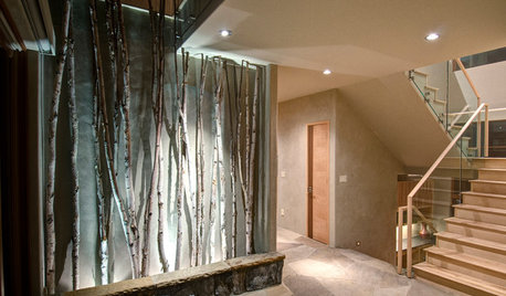
DECORATING GUIDESBranches and Twigs for More Than Just Decor
Think beyond the vase with twigged-out railings, gates, room dividers and more
Full Story
COLORGoing Bold With Just Enough Color
Using color with restraint inside and outside can be far more effective than a less subtle approach
Full Story


User