


Can't decide on bathroom color/curtain.
Kathsgrdn
8 years ago
last modified: 8 years ago
Featured Answer
Sort by:Oldest
Comments (16)

Kathsgrdn
8 years ago
murraysmom Zone 6a OH
8 years agoRelated Discussions
I just can't decide which bathroom color
Comments (3)You should get more help if you post in the Home Decorating area. I am not very familiar with SW colors. For the ceiling you could compare their ceiling white with your trim color and choose between those. If you like Steely Gray but worried that it might be too dark, you could get it mixed at 50% or 75%. I would get samples and paint sample boards to try out the colors in the room. Also consider what color towels. You have a lot of dark but also a good amount of white in the room....See MoreBathroom design ideas!! I cannot decide on a color scheme please help!
Comments (4)Painting only the wall cabinet will make it jump out. You really need to spread color around. Don't paint until you have selected your rug, towels and accessories. It's easier to match paint to accessories than the other way around. What is your favorite color. That is the place to start. The rug is the largest splash of color. I don't see where you will place towels so I can't tell how much of an impact they will make. You can spread some color via a soap dish, lotion dispenser, etc. Houzz has [SOME[(https://www.houzz.com/products/prbr6-br~t_13009~a_77-582-585-3249-3253-12976-13174?fi=36), but you can probably find many more in local stores....See MoreCannot Decide on a color to coordinate our bathroom
Comments (19)First off, you are all amazing. Thank you for the reassurance that the DIY nature of the design didn't result in a total screw up. I will admit that I do believe I maybe messed up (a little) when I assumed our tile looked like Carrera marble (to my untrained eye) and assuming that white and gray marble was white and gray marble (silly me). So, I know that pictures don't always tell the picture and its difficult to get contrast, hue and color temperature right in a picture (I am a semi-pro photographer). So, I really appreciate all of you really digging into the pictures as best as possible to make your suggestions. Your comments were all so on point and I just want to say I appreciate you all lending your advice to help us! To touch on a few points: 1. The can lights in there have selectable color temperature and I have them currently set at 3500K. I briefly had them at 4000K but felt perhaps that was a little too cool and sterile....its a fine line that's tough for me because I don't like overly warm light in a bathroom (unlike in a family room). 2. The yellow/green tones are definitely in the tile. This is where I said I kinda screwed up...the tile is porcelein emulating statuario tile. The "white" is a warm off white. The "gray" has some brown/green/gray tonality to it. The accent stripe contains what I believe to be carrera marble and it is slightly cooler with more a standard white/gray tonality. Separating the tile from the accent tile is marble pencil that varies from gray tones to warmer browns in some areas. I posted this picture after discussing those colors I originally posted with my wife and I thought they were going to be winners so I was really disappointed when she felt they were off. I couldn't quite figure out why the bathroom tile was feeling suddenly so warm to my eye compared to earlier when the tile was only on the floor. I have included a picture earlier in the project where only the floors were going in and, to me, the floors seemed what I expected...with carrera white and gray. So, long story short after diving into Beth's original comments I came to realize what my eye was doing. Early on in the project my eye was comparing the tile against the grey/black of the waterproofing substrate. This contrast made the tile feel brighter and less "off-white". Once the tiles went up the wall my eye compared it to the mostly primer-white of the walls and suddenly the tile became darker and yellow/green. So, K L and Diana Bier hit the nail on the head with hitting up the darker tones. Knowing this, I took the tile and accent tile to BM and spent tons of time exploring darker tones. K L had touched on green and that is actually what worked color wise. Blues were too cool and didn't agree with the tile (even though it worked with the accent tile). Solid greens were too warm and didn't agree with the accent tile but looked good with the wall/floor tile. Blue-greens worked well with both. We came back home with Templeton Gray and, in addition, I had pulled grays of similar tonality compared to Cinder (like Diana mentioned) and brought home Storm. Both look excellent at least on a swatch level. However as of right now my wife was super excited about Storm. So right now that is the plan but after re-reading all your suggestions, I think Stoneybrook is also interesting and may take another look at the tile with that....it may be slightly too warm. I think why this was so hard for me is, being no interior designers, we usually have fairly dark wood/furniture in our home. So naturally we gravitate towards lighter tones. My general rule to date has been find the color you like and go two swatches up on the card to find the color you should actually paint (I realize the flaw in that regarding that the colors are not necessarily just lighter versions of themselves but you get the idea. I just think that philophy didn't work in this bathroom where the tile is a dominant feature and is light in and of itself. By painting the walls white it actually made the tile feel darker which wasn't my goal. Beth, Your comments regarding accessories is excellent. This has really gotten me thinking as I haven't done much on the accessory front besides mirrors. I am definitely taking your advice to heart and will try to bring in some natural tones that will "soften" the space and diversify the color palette. I've also included a picture of my rendering I did of the bathroom in the design phase. The rendering is just my own CAD drawing so forgive the roughness of some features (like the lack of hardware). Just wanted you all to have a better idea of the finished space. The toilet area is blocked in the picture by the entryway door. This entryway door is changing to a barn door to remove this obstacle in the flow of the bathroom....See MoreWhat finish and color curtain rod for bathroom drapes?
Comments (4)Match the fixtures and other hardware. You’ve got all that matching, so not matching the rod will look odd....See More
socks
8 years ago
Yayagal
8 years agoKathsgrdn
8 years ago
Adella Bedella
8 years agochisue
8 years agoUser
8 years agorhizo_1 (North AL) zone 7
8 years agoKathsgrdn
8 years agorhizo_1 (North AL) zone 7
8 years agolast modified: 8 years agorhizo_1 (North AL) zone 7
8 years agopipsmom49
8 years agopipsmom49
8 years ago
ravencajun Zone 8b TX
8 years ago
Related Stories
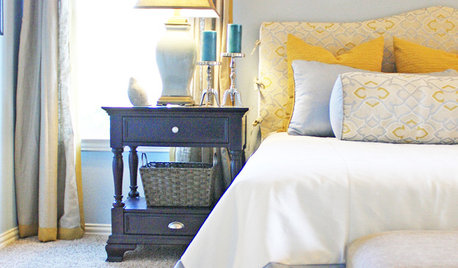
COLOR8 Color Palettes You Can't Get Wrong
Can't decide on a color scheme? Choose one of these foolproof palettes for a room that feels both timeless and fresh
Full Story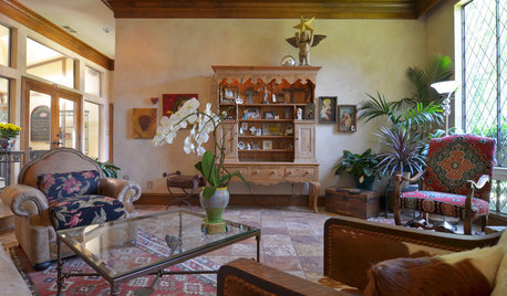
HOUZZ TOURSMy Houzz: Eclectic Meets Rustic in a Decidedly Different Dallas Home
This couple's highly personal style embraces found objects, thrift store scores, international art and a whole lotta grandkid love
Full Story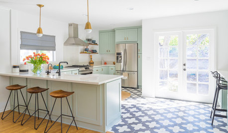
KITCHEN DESIGNTrending Now: 25 Kitchen Photos Houzzers Can’t Get Enough Of
Use the kitchens that have been added to the most ideabooks in the last few months to inspire your dream project
Full Story
LIFEHow to Decide on a New Town
These considerations will help you evaluate a region and a neighborhood, so you can make the right move
Full Story
PETS5 Finishes Pets and Kids Can’t Destroy — and 5 to Avoid
Save your sanity and your decorating budget by choosing materials and surfaces that can stand up to abuse
Full Story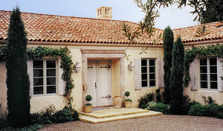
REMODELING GUIDES8 Natural Home Materials That Can't Be Beat
See how designing with natural stone, clay, wood and more can give a house luminosity, depth of color and lasting appeal
Full Story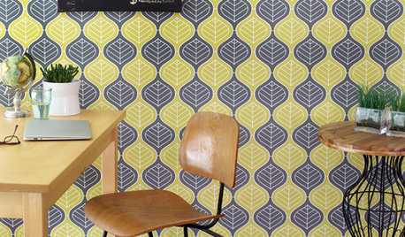
WALL TREATMENTSCan't Find the Right Wallpaper? Make Your Own
For one-of-a-kind walls, just use your imagination. Custom wallpaper is easier and less expensive than you might expect
Full Story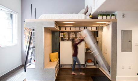
SMALL SPACESHouzz TV: You Won’t Believe Everything This Tiny Loft Can Do
Looking for more floor space, a San Francisco couple hires architects to design a unit that includes beds, storage and workspace
Full Story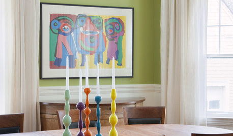
DECORATING GUIDESCan't-Beat Style: Candlestick Clusters
Create high decorating drama with the right mix of candleholders on table, sideboard, mantel and more
Full Story
murraysmom Zone 6a OH