


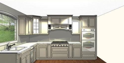
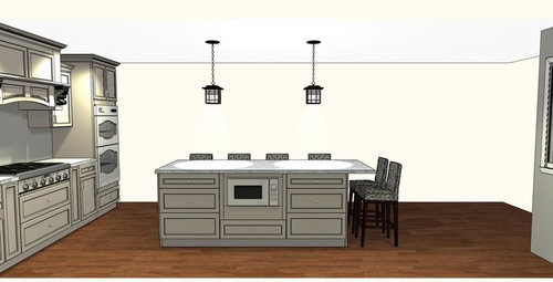
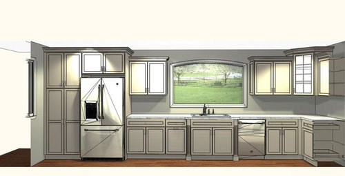
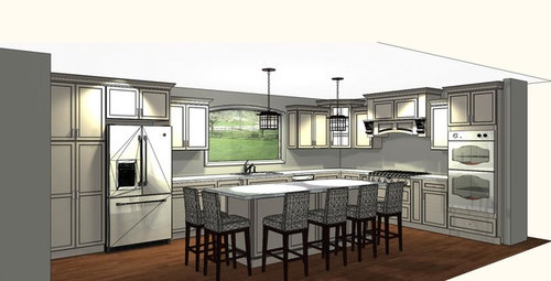
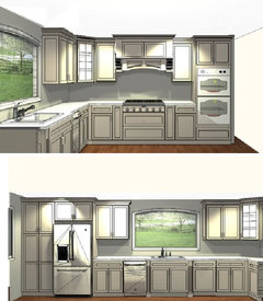
Please review kitchen design
fromgtoc
9 years ago

Featured Answer
Sort by:Oldest
Comments (24)

rebunky
9 years agolast modified: 9 years agoRelated Discussions
Please review my kitchen design!
Comments (6)consider partially blocking the view onto the fridge, by extending the pantry unit forward (tall cabinet next to the fridge), so that it sticks out and provides a visual break. What I see in your simulation drawings is a bit too much all-can-be-viewed-in-a-glance. When you pull the tall pantry unit forward, you can gain a broom closet space behind it. When you pull the tall pantry unit forward, you partially block the view onto the mud room. A good thing. if you swap the sink and the DW, you get the advantage of being closer to the dish storage, and you put a clean counter under the window. There will still be plenty of light in the sink, if the sink is near the left hand side. Worry not about symmetry with respect to the window trim, as nothing else in this house is based on pure symmetry. In fact, placing the sink in the middle of the counter there is a sign of ignorance, not symmetry. So, instead of having narrow banks of drawers on either side, do it this way, from left to right: big bank of drawers, sink, DW, corner. Hth. I would like to see frosted glass fronts in most of the upper cabinets. These cabinets are to show your nice things, not to hide them. When well lit inside, they make everything look good. The island can look good without the pillars. A wall of stone countertop can be used instead. See Dean_I 's kitchen island. It has so much more space than yours because it is made with 1" sides not pillars. These sides were cut beveled to make them look like furniture not butt-jointed slabs. Move the prep sink over 18" so as to free up some countertop space when you have to take things out of the fridge. The prep sink has to be undermounted to match the build quality of the space. There are thousands of other points that are Right about this space, but I will refrain from congratulating you or mentioning some of them. Although I would not have put the fridge where you put it, I am considering that this placement spot is non-negotiable at this point in time. The fridge and the aisle are right sized to let you pull the fridge out completely. Here is a link that might be useful: Dean_I island...See MoreKitchen Lighting Design: Please Review!
Comments (9)Do you have a lighting store in your area? Some offer a 'free' service either in home or at the store with your plan. Of course, they want you to make your purchases thru them but you don't have to. If you believe in spending money to save money, hire a lighting consultant. I have a full plan with placement, specs, wattage and her discount at several different lighting stores in the area. I found mine through a carpenter. Your kitchen would be perhaps two hours of work. To give you an idea, we planned a 600 sq. ft. space that included a kitchen, eating area and piece of great room in 3 1/2 hours and that included travel time that she charged at a lower rate. With bmorepanic's design in hand you have a great place to start....See MorePlease review my cabinet design options and soffit or no soffit?
Comments (7)I prefer simpler, cleaner lines, so mostly like the 2nd styles in each drawing. I especially like the area next to the pantry to have more counter and not have the long doors down to the counter. Also, in the first picture, that area next to the oven and pantry looks like it's trying to be a furniture piece, but everything on that wall looks like separate things all shoved together. I'm not sure how to explain that better, and less offensively! I just think there is a lot going on and, like I said, all lined up, shoulder-to-shoulder, doesn't work for me. How do you do soffits with the cabinets changing height at the top? Or would you do away with that? If you drop the ceiling in the butler's pantry, might you want to do cabinets to 9 ft and have the ceiling where the cabinets end? Or do you want to store serveware or have lighting above?...See Moreplease help review my kitchen reno...feedback on plans please!
Comments (15)Here's an idea: All perimeter counters and cabinets are 3" deeper than standard: -- Counters are 28.5" deep. This gives you more workspace as well as more room behind the sink for a faucet and to clean behind -- Base cabinets are 27"D. If your cabinetmaker does not offer deeper base cabinets, then pull standard 24" base cabinets out from the wall -- Upper cabinets are 15"D. This should not be a problem - most cabinetmakers today offer 15"D upper cabinets. All zones are nicely separated, which allows multiple people to work in the Kitchen at one time - preparing a meal/snack, cooking, and/or cleaning up. There are four defined Prep Zones, with potential for others throughout the Kitchen. There are 3 Prep Zones on the island - two of which are adjacent to the prep sink. The third is around the corner and while it is not directly adjacent to a sink, it's close to both sinks. There is a 2-bin trash pullout next to the prep sink. The Cooking Zone is on the wall for ease of venting. It is surrounded by ample work/landing space. There are two cabinets on the left for tray storage and pot & pan storage on the right. Additional pots & pans can be stored in the island. The Cleanup Zone is on the perimeter where dirty dishes are hidden from direct view from the Dining Room and Family Room. Both DWs flank the cleanup sink. There is also a 2-bin trash pullout b/w the cleanup sink and the range for easy access from both the Cooking Zone and the Cleanup Zone. Dish storage is located in several locations near the DWs and all to the left of the cleanup sink. This is so your dishes are located near their point of use - the Dining Room. Dishes are also stored near the DWs for ease of unloading. Finally, dish storage is located where someone can set the table or load/unload the DW without getting in the way of those preparing & cooking. Since you have a large family, you probably have more dishes than most (I grew up in a large family - six children as well - and we had more dishes than most.) Dish storage is located: -- A 24" Dish Hutch is to the left of the sink/DW. It has a 15" deep upper cabinet that goes to the counter above a 27" deep base cabinet. I recommend the first 6" to 9" of the upper cabinet be either a drawer or two or separate doors from above so you can open the doors above even when there are items on the counter. A nice thing about this arrangement is that if you are short or while your children are, dish storage is lower than in standard upper cabinets. Instead of starting 18" above the counter, storage starts 9" or so above the counter. [Note, I originally made it 36" wide, but then I remembered that you have a Utility Shaft at the end!] -- There is a 42" dish drawer in the island for additional dishes. The drawer faces the sink/DW side. With an aisle 51" wide, you should be able to have both the DW and the drawer open at the same time - nice and easy for putting dishes away! -- Finally, assuming the Utility Shaft is not as deep as the counter, I propose putting a tall dish cabinet in front of it for additional dish &^ glass storage. The refrigerator and freezer are on the periphery so both those working in the Kitchen and those just looking for a snack or putting away groceries can access it without getting in each other's way. They are also located so non-Kitchen workers do not have to cross through the working part of the Kitchen to get to them. The MW drawer is located on end of the island - near the refrigerator/freezer and a water source. Most MW'd food comes from the refrigerator or freezer and many need water added to them when MWing. As with the refrigerator, the MW is located such that both Kitchen workers and non-workers can access it without getting in each other's way. The Pantry is located just outside the main Kitchen work area. A walk-in/step-in/reach-in pantry is a much better use of space for pantry storage - it's more flexible, it costs much less, and storage is more efficient. The island has seating for eight. Two seats have 18" of knee/leg space for tall family members or visitors. The other six seats have the minimum recommended 15" overhang. This will be find for short to average height folks. There is a 12"w x 27" tall Utility pullout for broom, dustpan, swifter, etc. If you prefer, it could also be turned 90 degrees so it's a 27"W x 12"D cabinet. To the left of the pantry is a Tea/Coffee/Beverage Center. It's located outside the Kitchen proper to allow anyone to make tea/coffee, etc., without encroaching on the Kitchen's main work area. If you'd like, you could add a bar sink and, possibly, a refrigerator drawer or under-counter beverage refrigerator. Note that a bar sink is smaller than a prep sink, so it will not take up as much room. A bar sink is usually small b/c the most use it gets is to fill glasses for water or to fill a coffee maker, etc. Prep sinks, on the other hand, get a lot more use and more space is needed so they are generally larger. . . Zone Map:...See More
tmy_jax
9 years agotmy_jax
9 years ago
a2gemini
9 years ago
funkycamper
9 years ago
bpath
9 years agopalimpsest
9 years agoblfenton
9 years agofromgtoc
9 years ago
Carol Vickery
9 years agomaggieq
9 years agohomechef59
9 years agofunkycamper
9 years agoblfenton
9 years agoa2gemini
9 years agobpath
9 years agopalimpsest
9 years ago
autumn.4
9 years agosjhockeyfan325
9 years ago
laughablemoments
9 years ago
cpartist
9 years agoBuehl
9 years agolast modified: 9 years agoBuehl
9 years agolast modified: 9 years ago

Related Stories
ARCHITECTUREThink Like an Architect: How to Pass a Design Review
Up the chances a review board will approve your design with these time-tested strategies from an architect
Full Story
PRODUCT PICKSGuest Picks: 21 Rave-Review Bookcases
Flip through this roundup of stylish shelves to find just the right book, toy and knickknack storage and display for you
Full Story
DESIGN PRACTICEDesign Practice: The Year in Review
Look back, then look ahead to make sure you’re keeping your business on track
Full Story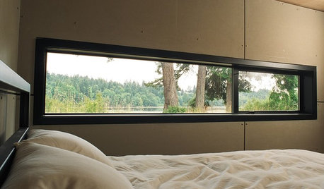
ARCHITECTUREDesign Workshop: Just a Sliver (of Window), Please
Set the right mood, focus a view or highlight architecture with long, narrow windows sited just so on a wall
Full Story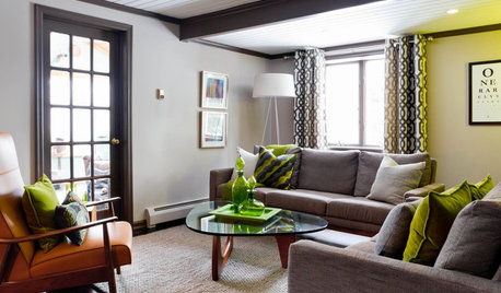
LIVING ROOMSCurtains, Please: See Our Contest Winner's Finished Dream Living Room
Check out the gorgeously designed and furnished new space now that the paint is dry and all the pieces are in place
Full Story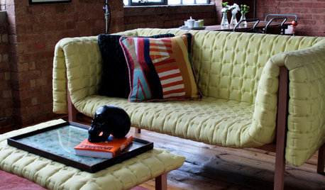
DECORATING GUIDESPlease Touch: Texture Makes Rooms Spring to Life
Great design stimulates all the senses, including touch. Check out these great uses of texture, then let your fingers do the walking
Full Story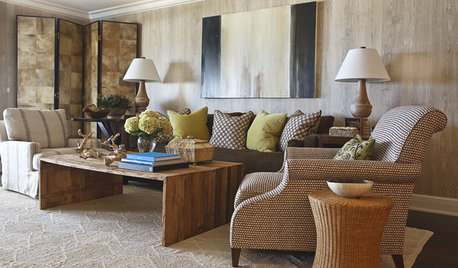
HOUZZ TOURSHouzz Tour: A Neutral Palette Pleases By the Sea
Designer Phoebe Howard creates earth-toned elegance for a family's Florida beach getaway
Full Story
GARDENING AND LANDSCAPINGSpring Patio Fix-Ups: Earn Rave Reviews for Your Patio's Entrance
Consider innovative doors, charming gates or even just potted plants to cue a stylish entry point for your patio
Full Story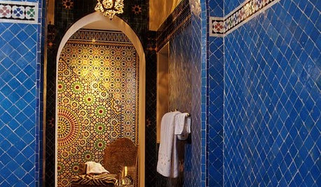
TILEMoor Tile, Please!
Add an exotic touch with Moroccan tiles in everything from intricate patterns and rich colors to subtle, luminous neutrals
Full Story

funkycamper