


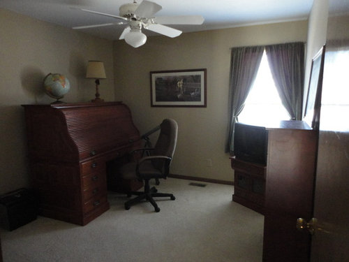
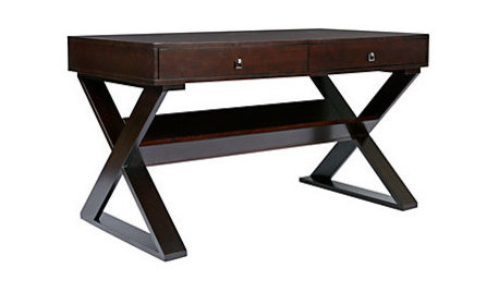
Paint color for dark office with cherry desk?
Jennifer_in_KS
9 years ago
Featured Answer
Sort by:Oldest
Comments (31)
Related Discussions
Kitchen paint color- dark cherry cabinets
Comments (3)Any shade of gray, beige, red, maroon. Are you seeking a light or a dark color? I really like mixing beiges and grays. It reminds me of slate stone. If you can mix in some slate as a backsplash, cutting board, or decor, it REALLY works! Here is a link that might be useful:...See MoreWhat color walls for home office with this rug, panels and desk?
Comments (1)See the search window up at the top right? Put "how post picture" in there and it will come up with several great posts explaining how better than I can explain it. Then you can always find it again if you forget how. The rug looks nice but it sure would help if we could see the room. Is this a boy office? A girl office? Or a unisex office? Did you look at the home offices thread in the Gallery? Did you find and save to your computer an inspiration picture or two you like in there? That's where I'd start....See MoreMini-office makeover...new paint and a cheapie desk!
Comments (8)lynn, the boxes of hardwood were labeled "red cumaru" but I don't know if that's correct. We had several problems with the NC company we ordered from and (while we think the floors are pretty) they're not the Brazilian Teak we ordered. dilly, I can't wait to add some storage containers under the desk but we have a 17month old right now and she would have too much fun pulling everything out of the drawers. I think by the end of summer I may be able to get away with some storage under there. I love the picture of the wicker drawers...where did you find that?...See MoreProgress...Office painted - my desk area set up
Comments (17)WOW someone thought of me and a blog?! I'm quite flattered! It would be lovely to be able to do that but computers and I really do not get along on most levels. At least mine at home. Red - don't you think that massive picture would be just awesome behind my desk!!!!!!!!! It'd be almost like my own window on Paris! Over the wknd I got some more pics hung up in the office and I have to say I am really, really loving it. I know that that having so many pictures covering almost every sq. inch of wall space and horizontal surface is a realtors nightmare and most people would probably say - nope that's too much or what is she thinking, but I just love it! Every picture has a story behind it (even if I don't know who the person is or I haven't been to that place yet). My walls are like a visual library for me and I can't wait until the tiniest detail is done to show you all! This wknd I hope to get my floating shelves up on the wall beside my desk. I'm going to try and find my old mason jars and load them up w/ my pencils and other desk stuff as well as give DS1 a place to keep his collections of rocks and marbles out of reach of the younger ones. Yesterday afternoon I laid down on my kids car map rug in the office while the baby played(I was so tired). I looked around and it was soooooo peaceful and warm and family like....See More
Jennifer_in_KS
9 years ago
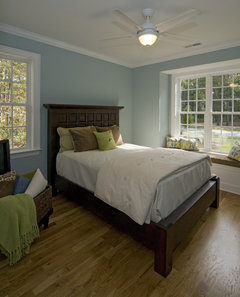
Annie Deighnaugh
9 years agolast modified: 9 years ago
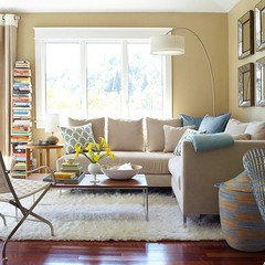
tibbrix
9 years ago
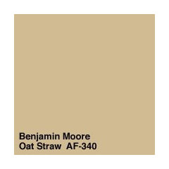
graywings123
9 years agonosoccermom
9 years agotibbrix
9 years ago
Jean Damad
9 years agotibbrix
9 years agoUser
9 years agolast modified: 9 years agonosoccermom
9 years agograywings123
9 years ago
Zoyka Borukhova Hakimian
6 years ago


Related Stories
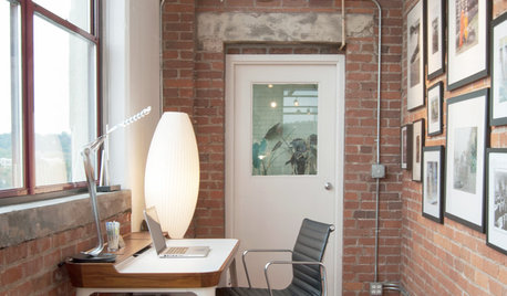
HOME OFFICESWarm Up the Home Office With a Fine Wooden Desk
Let corporate settings keep their steely formality. These wooden desks for a home office celebrate natural beauty in all its glory
Full Story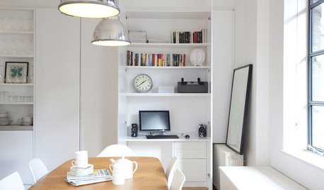
HOME OFFICESA Nice Little Desk Just Where You Want One
Do you have a desk area hiding in plain sight? These stylish work perches give rooms extra purpose
Full Story
HOME OFFICESGuest Picks: 20 Desks for a Stylish Office
Find the perfect desk to make your home office a functional and enjoyable space
Full Story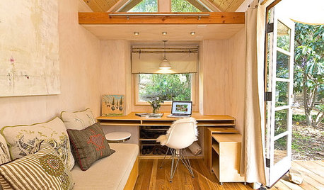
HOME OFFICESLittle Room for a Desk? 7 Spaces Show How to Make It Work
If a 140-square-foot home has room for a desk, you probably do too. Get ideas from these smart space savers
Full Story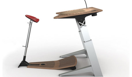
HOME OFFICESStand-Up Desks Rise to Health Challenges
Sitting all day may be wrecking your health. Are you going to stand for that?
Full Story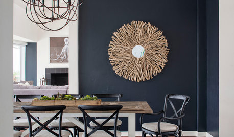
DECORATING GUIDESWhat Goes With Dark Walls?
Bring out the beauty of dark blue, charcoal and black walls with these decorative matchups
Full Story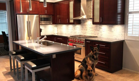
BEFORE AND AFTERSReader Project: California Kitchen Joins the Dark Side
Dark cabinets and countertops replace peeling and cracking all-white versions in this sleek update
Full Story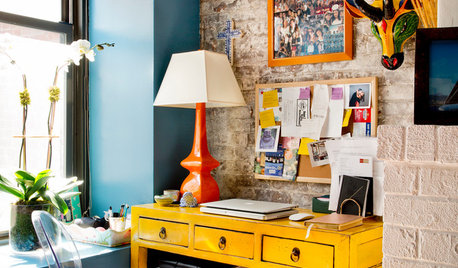
HOME OFFICES15 Home Office Areas Houzzers Love to Save
See the new desk areas with the most saves to ideabooks. Is there a detail here you can use?
Full Story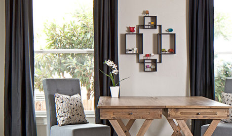
DECORATING GUIDESDark Curtains See the Light
For a cozy feel or a visual trick for ceilings and windows, dark, moody curtains and drapery treatments have a bright outlook
Full Story


MagdalenaLee