


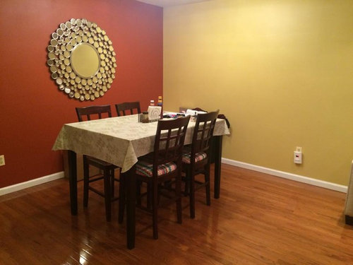
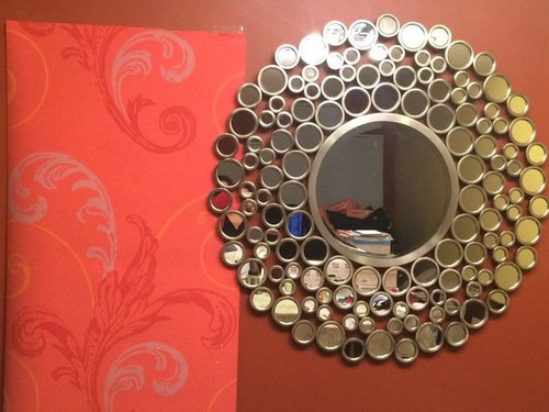
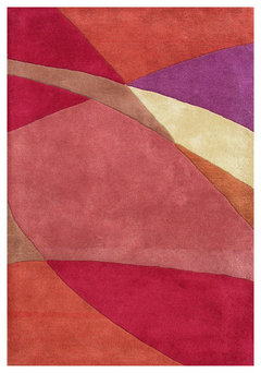
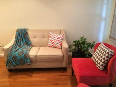
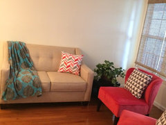
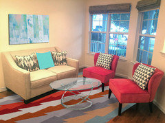
Wallpaper for Accent wall in Living/Dining Room
Pracheeti
9 years ago

Featured Answer
Sort by:Oldest
Comments (587)

Susan Davis
8 years ago
Pracheeti
8 years agoRelated Discussions
Which wallpaper pattern do you prefer for an accent wall
Comments (18)It looks like the wallpapers that you have shown us are all over the place. I think you may want to back off and start with creating a color palette that includes the furniture, as well as bedding and flooring. I'm not big on the idea of finding wallpaper first and then designing around it....See MoreDIY Wallpaper accent in a powder room
Comments (4)Good advice from Pennydesign about letting it dry for a bit before trimming. I wish I’d known that before my first wallpaper project! Don’t be nervous. Unlike paint, wallpaper can be shifted and adjusted before you smooth it down, so it’s very forgiving. Also, since you’re doing a small area, you’ll probably have some extra paper in case you have to redo a piece. Take your time. You’ll learn as you go, and I bet it will be beautiful....See MoreWhich wall should I use an accent wall paper in living room
Comments (6)Jenna, the 'Well, duh' was a bit condescending, considering you have given people nothing to look at in an attempt to help you. How can we help you when we have no idea what the room looks like and where the sofa is? Celerygirl does AMAZING mock-ups for people when they supply pictures, so they can see how something will look. We don't know your colors, what your sofa looks like or what the wallpaper looks like. If someone came up to you and said, 'Accent wall.', wouldn't you ask them what they were talking about? Here's an example of a post that gives enough info and a pic, so people can give their opinions - [https://www.houzz.com/discussions/will-a-white-cream-carpet-be-a-mistake-dsvw-vd~5463113?n=48[(https://www.houzz.com/discussions/will-a-white-cream-carpet-be-a-mistake-dsvw-vd~5463113?n=48)...See MoreHelp with dining room coloring/wall paper
Comments (2)I would pick color from your rug for upper wall....See MoreSusan Davis
8 years agolast modified: 8 years ago
lessismoore
8 years agoPracheeti
8 years agoPracheeti
8 years agoSusan Davis
8 years agolast modified: 8 years ago PRO
PROCarlos De La Puente Antiques
8 years agoSusan Davis
8 years ago PRO
PROLB Interiors
8 years agolast modified: 8 years ago- PRO
LB Interiors
8 years agolast modified: 8 years ago - PRO
LB Interiors
8 years agolast modified: 8 years ago - PRO
LB Interiors
8 years agolast modified: 8 years ago Pracheeti
8 years agolast modified: 8 years agoPracheeti
8 years agoPracheeti
8 years agolast modified: 8 years agoPracheeti
8 years agolast modified: 8 years ago- PRO
LB Interiors
8 years ago - PRO
LB Interiors
8 years agolast modified: 8 years ago lessismoore
8 years ago- PRO
LB Interiors
8 years ago Pracheeti
8 years agoPracheeti
8 years agoPracheeti
8 years ago- PRO
LB Interiors
8 years agolast modified: 8 years ago Pracheeti
8 years ago- PRO
LB Interiors
8 years agolast modified: 8 years ago lessismoore
8 years agolessismoore
8 years ago- PRO
LB Interiors
8 years agolast modified: 8 years ago - PRO
LB Interiors
8 years agolast modified: 8 years ago Pracheeti
8 years ago- PRO
LB Interiors
8 years agolast modified: 8 years ago Pracheeti
8 years ago- PRO
LB Interiors
8 years ago - PRO
LB Interiors
8 years ago - PRO
LB Interiors
8 years ago - PRO
LB Interiors
8 years ago Susan Davis
8 years agoPracheeti
8 years agoPracheeti
8 years agoSusan Davis
8 years agoPracheeti
8 years agoPracheeti
8 years ago- PRO
LB Interiors
8 years agolast modified: 8 years ago Pracheeti
8 years agoSusan Davis
8 years ago


Related Stories
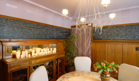
DECORATING GUIDESHow to Create a Great Dining Room Wall
Shelves, candles, stonework, wallpaper and chalkboard paint make dramatic backdrops for feasts
Full Story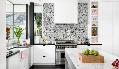
WALL TREATMENTSKitchen Confidential: 13 Places to Hang Wallpaper
Whether it’s on an accent wall or affixed to an island, wallpaper can make a big impact on the look of your kitchen
Full Story
DECORATING GUIDESTextured Walls: Inspiration Beyond Paint and Wallpaper
See what happens when you cover a wall with glass, metal, leather, upholstery, or a mass of living green
Full Story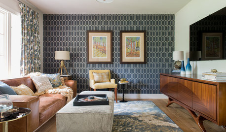
ROOM OF THE DAYRoom of the Day: Geometric Wallpaper Pulls Together Midcentury Style
Slate blues and lots of pattern balance the warm midcentury wood tones in this Austin, Texas, home
Full Story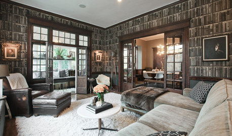
WALL TREATMENTSPersonal Spaces: 11 Inventive Ways With Wallpaper
See the great wallpapered rooms our photographers spotted in Houzzers’ homes from coast to coast in the U.S.
Full Story
PATTERN13 Creative Ways With Patterned Wallpaper
Treat your walls to captivating splashes of color or texture, for rooms that shut the door on boring
Full Story
DECORATING GUIDESDesign Tastemaker: Catalina Estrada's Fantastical Wallpapers
Wondrous wallpaper designs in unusual hues will carry your rooms into the land of imagination
Full Story
DECORATING GUIDESCase Study: Wallpaper in Just About Every Room
Follow this Oregon home's lead to mix wallpaper patterns, colors and applications without chaos
Full Story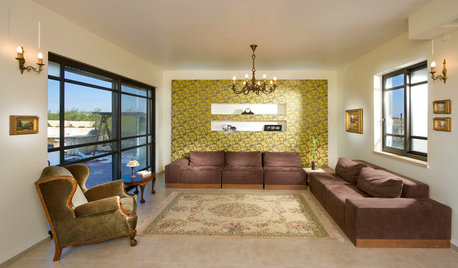
WALL TREATMENTSGetting the Accent Wall Right
Celebrate a Glorious Color or Material Without Overpowering Your Space
Full Story


LB Interiors