SHOP PRODUCTS
Houzz Logo Print
dkg362_gw

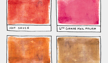
Yet another request for paint color help :)

dkg362
12 years ago

Hi everyone,

I mostly lurk here (in fact, I think it's been ages since I've posted anything). However, I've reached a point of frustration and have decided to request (ok, beg) for assistance.

I've been gradually making improvements to my home since I moved in 7 years ago... remodeling, painting, you name it. I haven't touched my kitchen and now it needs help.

The previous owners tore out the old cabinets and built their own out of pine and left them natural. They also put in laminate floors that are made to resemble pine. They painted the walls yellow. At one time, I found the room charming. Now that I've lived in it, all the yellow is getting on my nerves (not to mention the cabinets and floor aren't holding up well). Unfortunately, all I can afford to do at this time is paint and I'd really like to find something OTHER THAN YELLOW. :)

The kitchen opens up to my living room. The living room has a chair rail around it (the kitchen does not) - the top is SW Ivoire and the bottom is SW Blonde (yes, I realize this is just more yellow, but I do like it in there). My sofa is a sage green and I have a red brick fireplace and white trim.

I had originally thought I'd carry Ivoire into the kitchen for continuity, but it looks muddy in that room next to the pine, so that's a no-go. I then thought I'd try some kind of green, but everything I've tried has either looked too minty or too dark. I then thought maybe a grayish-blue, but the ones I've tried so far are too blue or too dark (and I'm hesitant because I really have no other blue decor in my house).

In the last week, I've put up probably 20+ color samples (no joke). My walls now look like a kaleidoscope. I haven't fallen in love with any of the colors yet and I think I'm at my wits end.

Here are the colors I've tried:

SW Ivoire, SW Interactive Cream, SW Sagey, SW Chamomile,

SW Rainwashed, SW Hearts of Palm, SW Shagreen,

SW Tradewind

BM Covington Blue, BM Palladian Blue,

BM Kittery Point Green, BM Guilford Green,

BM Castleton Mist, BM Woodlawn Blue, BM Yarmouth Blue,

BM Gossamer Blue, BM Polar Ice, BM Ambiance,

BM Sweet Butter, BM Mellowed Ivory

... and I can't remember the rest off the top of my head. :)

Below is a link to an old picture of my kitchen (before I bought the house, actually). Ignore the country decor and stuff on top of cabinets (no longer there). The island has since been painted white in an effort to tone down the yellow in the room.

Any suggestions are greatly appreciated. I can post more photos on this thread once I remember how...

Dawn

Lawrenceburg, KY

Here is a link that might be useful: My yellow kitchen

Comments (15)

  • mtnrdredux_gw
    12 years ago

    I feel your pain. I tried 14 shades of blue for my porch ceiling, and then went with the first one I had tried!

    I used almost all white in my house, except for the trim in my DR and my front door, which is a barn door. There I used a color called BM Hampshire Grey. It is a grey green. I also like Revere Pewter, which I used in my pantry ... a taupy grey.

    best of luck

  • Related Discussions

    Yet another 'Help me pick a paint color!' post

    Q

    Comments (2)
    I got a few fabric samples in the mail yesterday, and one of them has almost all the colors that are in the lighting, plus a nice shade of green that I think would work as a complementary accent wall. What do you all think?
    ...See More

    Yet another request request for BS help.

    Q

    Comments (2)
    Sorry, I didn't imbed the first time... Lisa. Thanks for your help. Anyone else have a suggestion? I tried contacting the designer, but no response.
    ...See More

    yet another softener sizing assistance request

    Q

    Comments (37)
    "Is just putting it in the open drain at the floor and tying it down considered and air gap?" Short answer... NO Longer answer... "The key characteristics for an air gap is protection from back flow and back siphonage. Back flow occurs when there is a clog or blockage downstream in the drain line which with more water entering causes the nonpotable water to back up fully engulfing the air gap unit or at least reach in the back siphonage critical level (C/L) of the air gap unit. Back siphonage happens when there is suction on the potable water line and air gap inlet that sucks non-potable water port back into the potable (drinking) water line. The ideal air gap would provide protection from back flow and back siphonage."
    ...See More

    Boxerpups - Yet Another Request.

    Q

    Comments (4)
    I am of zero help, but happened to be walking through Lowes the other day and walked past a black dishwasher that was in a matte looking finish, it was the first I have seen that before. I liked it! I haven't looked at black appliances, maybe they have been around forever (the matte finish vs a shinier finish) but it was a first for me :)
    ...See More
  • chocolatebunny
    12 years ago

    We have Ivorie in our foyer and the living room and dining room are painted SW Wool Skein. It is a very neutral with no yellow at all.

    Our master bedroom is painted SW Relaxed Khaki. It definitely has a green undertone especially in the evening.

    Another color in the gold family with a green undertone is SW Whole Wheat. My kitchen and family room are currently this color.

  • remodelfla
    12 years ago

    I have Rainwashed at 25% made up by BM (Aura paint). If you find a color you really like but feel it's too saturated... get a sample at 50%. It makes a difference. We tried about 12 samples on the wall before settling.

  • lynn85
    12 years ago

    What color are the walls in your other rooms? Do you just want to lighten the kitchen by changing the paint color or are you trying to go with a color that will compliment the cabinets? I think the cabinets have a great look to them but I have always like a log cabin/pine look. Can you update the knobs on them along with the paint to give the kitchen a lift. I would think a deep red would make the cabinets pop but I also like red! : )

  • beachpea3
    12 years ago

    The colors I saw in your kitchen were Farrow and Ball's Cooking Apple Green or a 50% of Saxon Green to complement your sage green sofa or a soft, warm light buttermilk red - like Farrow & Ball's Book Room Red or Red Earth - either 50% or 100% depending on how much light you have in the room. To stay within your budget you can take any of the FB colors to your BM or SW dealer for matching.

  • colorfast
    12 years ago

    Hi, paint is so very difficult. I would not put a true gray in your kitchen. Could you upload 1-2 more photos of your kitchen, including a closeup of your countertop? Your instinct for a sage resonated with me.

    I'm a fan of the color palette of Devine Paints. It appears they are sold in your state. I took your kitchen photo and scooted onto my screen next to different sample colors. I liked:

    1. Devine Victoire
    2. Devine Cypress
    3. Devine Manzanita
    4. Devine Reflection
    5. Devine Breeze

    The Victoire is under Well Traveled Colors, palette French Casino. Cypress and Manzanita are under Trend-Proof Colors, palette Cool Grasses. Breeze and Reflection are under Trend- Proof Colors, Ocean Pools.

    Then I looked up a lot of your BM colors next to your kitchen photo. How did these 3 look in real life?

    1. Kittery Point Green has a lot of strengths. Not too dark. Not too gray. Not yellowish. Did it look minty on the wall? What was the drawback?
    2. Palladin Blue. Not too gray and really kind of between green and blue.
    3. Ambiance is a good choice, but it may be too close to the yellow you are sick of?

    BM colors I did not like with your photo:
    1. No on Castleton Mist; too yellow-green and will jar with your cabinets which have true yellow undertones.
    2. No on Guilford Green. Doesn't complement cabs. And, it really pains me with your countertops.
    3. No on Yarmouth Blue, too gray for your cabs.
    4. No on Sweet Butter, too strong given your yellow preferences.
    5. No on Mellowed Ivory, again those mossy yellow green undertones.
    6. Gossamer Blue--a lovely color but with your pine cabs might read "too country."
    7. Kinda liked SW Shagreen but suspect it read too minty?

    Here is a link that might be useful: Devine Paints

  • dkg362
    Original Author
    12 years ago

    Thank you everyone for your suggestions and photos! Much appreciated.

    Some things I forgot to mention about my kitchen - first, it is small. Secondly, there are two windows, but there is a covered porch outside of them, so it doesn't get a ton of natural light.

    I don't mind the pine cabinets, but I prefer more of a rustic look than a country look (if that makes sense). The hardware on the cabinets now is a dark pewter color and the tile on the counter tops has beige/peachy/terracotta tones in it. I would totally redo this kitchen if I could afford it, but it isn't an option at this time financially.

    I do currently have two rugs of decent size that have warm reds, beige, sage colors in them in the room.

    I should also add that I'm considering selling my home in the next 6 months, so I have to take that into account when choosing a paint color.

    I took some additional photos tonight. Forgive the quality of the photos - I had to turn off the flash to get a more accurate color representation.

    Here is the tile countertop, with the pine floor color:

    {{!gwi}}

    Here is my wall of colors. I've tried to label the ones you've mentioned Colorfast (thank you so much for your detailed thoughts!).

    {{!gwi}}

    Here are two additional photos showing the island after I painted it.

    The Kittery Green Point was too dark for my taste. So was the Shagreen. The Sagey was too light/minty. Palladian Blue I liked, but it was a bit dark and the shade seemed to clash with the sage green sofa in the room next to it. I forgot to mention that when I tried Rainwashed and Tradewind, I did them at 50%. The "MI" in the photo is Mellowed Ivory. "GG" is Guilford Green.

    Colorfast, I looked up the colors you mentioned from Devine on their site and I did like them. I will try to swing by the store on my lunch hour tomorrow to take a look in person. Thank you!!

    I'm starting to think that maybe I should just forget color on these kitchen walls and go with a cream/ivory/off-white (although I'm not sure how that would look with my white trim). Then bring in color through accents.

    The frustration has become paralyzing! :)

  • dianalo
    12 years ago

    Try BM's Quiet Moments. It is such a pretty shade IRL.

    Here is a link that might be useful: Quiet Moments

  • colorfast
    12 years ago

    Sorry I did not get back here sooner. Selling your home soon does change the game plan, in my opinion. You may find the greens I suggested are too strong too, I am not sure how they compare with the Kittery Green.

    I would consider the Ambiance, perhaps with less than full tint in it? It looks "right" for the space. And check out Diana's.

  • herbflavor
    12 years ago

    yellow is tough in a kitchen. The dark hardware is good-I'd get a shade of off white that has some cool pewter-grayish feel to it...but not really gray. should go nicely with the barn red stool and the neutral stripes in your floor mats. I used pratt and lambert accolade when I painted the kitchen in 1997-hands down-best paint ever-washes beautifully-too bad I didn't know more about color-could use a change for that reason but the paint is the best.Don't skimp-I've had variable luck with Sherwin Williams and Ben Moore..I know people use those a lot.What's wrong with your cabs?? I love the pine-can they be used..have a carpenter add molding to the fronts and then glaze with a pewter color-change counters to soapstone and wow!!

  • colorfast
    12 years ago

    Herbflavor, I agree and your ideas are great. My impression was that she primarily wanted to paint the walls only.

  • ptamom
    12 years ago

    My vote is for SW Sanderling. It's a bit darker that what youve picked so far. It would look gorgeous with the knotty pine( love the cabinets!). Add some elongated matte white subway tile to tie in the white appliances. Daltile Modern Dimensions has a nice 2x8 tile. I like the area rugs, too. Strongly agree with herbflavor about barn red accents.

  • lynn85
    12 years ago

    Of the colors you have on the wall I like the "MI" greenish color best, not sure what the exact color of it is but it is the larger green spot in the middle of the paint wall and it is also against the left side door frame. I think it would look very nice with your tile and cabinets, still earthy colors.

  • blondeziggy2
    12 years ago

    If you're looking in the muted "green tones" I would highly recommend SW Ramie. It is a brown green. I've had it in my kitchen and family room for many years, and I get tons of compliments on it.

    Good luck!