


Color Help!!! Argh!!! Vote needed.
hestia_flames
14 years ago


Sort by:Oldest
Comments (29)
Related Stories
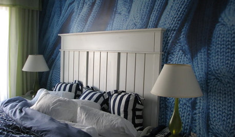
DECORATING GUIDESA Vote for the Cable Stitch in Home Decor
Warm Up a Room With the Look, Feel and Memories of Knitting
Full Story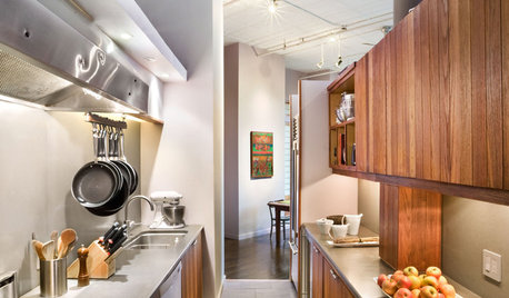
KITCHEN DESIGNKitchen Layouts: A Vote for the Good Old Galley
Less popular now, the galley kitchen is still a great layout for cooking
Full Story
SMALL SPACESDownsizing Help: Where to Put Your Overnight Guests
Lack of space needn’t mean lack of visitors, thanks to sleep sofas, trundle beds and imaginative sleeping options
Full Story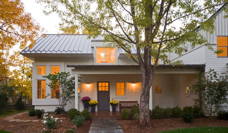
SELLING YOUR HOUSEHelp for Selling Your Home Faster — and Maybe for More
Prep your home properly before you put it on the market. Learn what tasks are worth the money and the best pros for the jobs
Full Story
ARCHITECTUREHouse-Hunting Help: If You Could Pick Your Home Style ...
Love an open layout? Steer clear of Victorians. Hate stairs? Sidle up to a ranch. Whatever home you're looking for, this guide can help
Full Story
REMODELING GUIDESWisdom to Help Your Relationship Survive a Remodel
Spend less time patching up partnerships and more time spackling and sanding with this insight from a Houzz remodeling survey
Full Story
GREEN DECORATING8 Questions to Help You See Through Green Hype
With the ecofriendly bandwagon picking up some dubious passengers, here's how to tell truly green products and services from the imposters
Full Story
MOST POPULAR7 Ways Cats Help You Decorate
Furry felines add to our decor in so many ways. These just scratch the surface
Full Story
COLORPick-a-Paint Help: How to Create a Whole-House Color Palette
Don't be daunted. With these strategies, building a cohesive palette for your entire home is less difficult than it seems
Full Story
REMODELING GUIDES8 Tips to Help You Live in Harmony With Your Neighbors
Privacy and space can be hard to find in urban areas, but these ideas can make a difference
Full Story
fleur222
Gena Hooper
Related Discussions
argh! DW changes mind again...stainless range or color?
Q
argh...I need help with my master bedroom
Q
Kitchen cabinet paint color help......please vote:)
Q
Please vote and help me choose sofa cushion color
Q
rhome410
plllog
bmorepanic
hestia_flamesOriginal Author
bella_victoria
plllog
timber.j
hestia_flamesOriginal Author
plllog
hestia_flamesOriginal Author
plllog
timber.j
mereanne
hestia_flamesOriginal Author
bmorepanic
antiquesilver
mereanne
fleur222
plllog
lat61
hestia_flamesOriginal Author
antiquesilver
karena_2009
hestia_flamesOriginal Author
plllog
hestia_flamesOriginal Author
plllog