


Paint and backsplash ideas
Kristi
13 years ago
Sort by:Oldest
Comments (23)
Related Stories
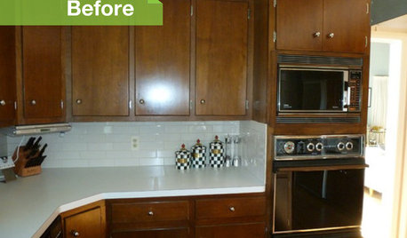
KITCHEN DESIGN3 Dark Kitchens, 6 Affordable Updates
Color advice: Three Houzzers get budget-friendly ideas to spruce up their kitchens with new paint, backsplashes and countertops
Full Story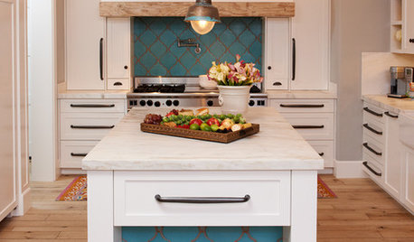
KITCHEN DESIGN10 Gorgeous Backsplash Alternatives to Subway Tile
Artistic installations, back-painted glass and pivoting windows prove there are backsplash possibilities beyond the platform
Full Story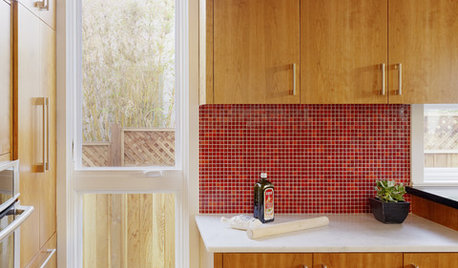
KITCHEN DESIGNKitchen Color: 15 Ravishing Red Backsplashes
Bring some zing to your kitchen with a backsplash of ruby-colored tiles or back-painted glass
Full Story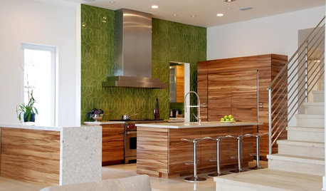
COLORKitchen Color: 15 Fabulous Green Backsplashes
Get the feel of spring all year round with a tiled, painted or glass backsplash in colors from pale celery to deep olive
Full Story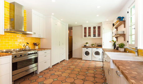
KITCHEN DESIGNNew This Week: 4 Surprising Backsplash and Countertop Pairings
Make your kitchen workspace stand out with colored ceramic tile, back-painted glass, butcher block and more
Full Story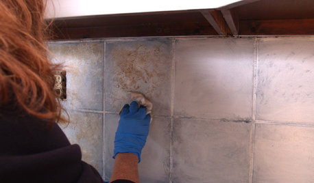
DIY PROJECTSDIY Backsplash Makeover: Get a New Tile Look for Less Than $50
Give old tile a painted faux-stone facade for a brand-new look at a superaffordable price
Full Story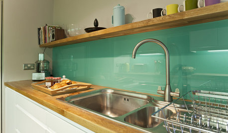
KITCHEN DESIGNHow to Pick a Kitchen Backsplash That Wows
Design your ideal backsplash with help from these Houzz guides and inspiring ideas for every kitchen style
Full Story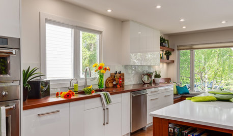
KITCHEN DESIGNThe Best Backsplashes to Pair With Wood Counters
Simplify your decision-making with these ideas for materials that work well with wood counters
Full Story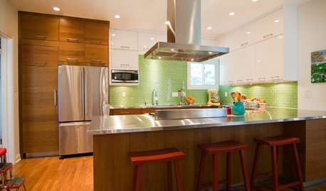
KITCHEN COUNTERTOPS10 Great Backsplashes to Pair With Stainless Steel Counters
Simplify your decision-making with these ideas for materials that work well with stainless steel counters
Full Story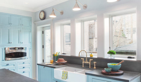
KITCHEN BACKSPLASHES10 Top Backsplashes to Pair With Concrete Counters
Simplify your decision making with these ideas for materials that work well with concrete
Full Story
sparklekitty
jterrilynn
Related Discussions
Vertical Backsplash? A Backsplash Regret?
Q
BackSplash Choices, long story, lots of pics!
Q
Pics of my countertop/paint - any backsplash ideas?
Q
What color to paint backsplash
Q
KristiOriginal Author
KristiOriginal Author
KristiOriginal Author
KristiOriginal Author
doraville
limom_2bts
beachbum
KristiOriginal Author
jterrilynn
KristiOriginal Author
jterrilynn
KristiOriginal Author
jterrilynn
KristiOriginal Author
jterrilynn
honorbiltkit
KristiOriginal Author
KristiOriginal Author
KristiOriginal Author
jterrilynn
gillylily