


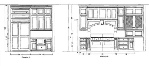
Do you agree with my desiger to eliminate this cabinet.....?
threeapples
11 years ago


Sort by:Oldest
Comments (70)
Related Stories
HEALTHY HOMEWhat to Know About Controlling Dust During Remodeling
You can't eliminate dust during construction, but there are ways to contain and remove as much of it as possible
Full Story
KITCHEN STORAGECabinets 101: How to Get the Storage You Want
Combine beauty and function in all of your cabinetry by keeping these basics in mind
Full Story
KITCHEN CABINETS9 Ways to Configure Your Cabinets for Comfort
Make your kitchen cabinets a joy to use with these ideas for depth, height and door style — or no door at all
Full Story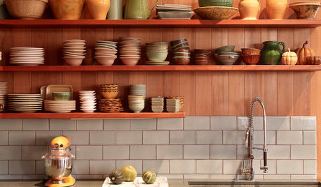
KITCHEN CABINETS9 Ways to Save Money on Kitchen Cabinets
Hold on to more dough without sacrificing style with these cost-saving tips
Full Story
KITCHEN DESIGNHow to Lose Some of Your Upper Kitchen Cabinets
Lovely views, display-worthy objects and dramatic backsplashes are just some of the reasons to consider getting out the sledgehammer
Full Story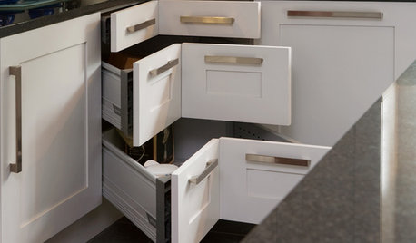
KITCHEN STORAGE8 Cabinet Door and Drawer Types for an Exceptional Kitchen
Pick a pocket or flip for hydraulic. These alternatives to standard swing-out cabinet doors offer more personalized functionality
Full Story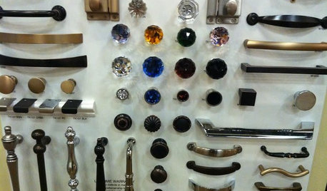
KITCHEN DESIGNGet a Grip on Kitchen Cabinets With the Right Knobs and Pulls
Here's how to pair the right style, type and finish of cabinet hardware with your kitchen style
Full Story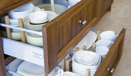
UNIVERSAL DESIGNKitchen Cabinet Fittings With Universal Design in Mind
These ingenious cabinet accessories have a lot on their plate, making accessing dishes, food items and cooking tools easier for all
Full Story
MOST POPULAR8 Great Kitchen Cabinet Color Palettes
Make your kitchen uniquely yours with painted cabinetry. Here's how (and what) to paint them
Full Story
KITCHEN CABINETSNew This Week: 3 Modern Kitchens That Rock Warm Wood Cabinets
Looking for an alternative to bright white? Walnut cabinetry offers the perfect tone to warm things up
Full StorySponsored
Columbus Area's Luxury Design Build Firm | 17x Best of Houzz Winner!


palimpsest
michellemarie
Related Discussions
I Think I found Tile do you agree????
Q
Do you agree with this decorator?
Q
How to reduce cabinet quote? What to eliminate?
Q
Laurel raves about these. Do you agree?
Q
mydreamhome
threeapplesOriginal Author
lavender_lass
threeapplesOriginal Author
mydreamhome
palimpsest
threeapplesOriginal Author
palimpsest
User
kimiko232
threeapplesOriginal Author
palimpsest
threeapplesOriginal Author
palimpsest
threeapplesOriginal Author
palimpsest
threeapplesOriginal Author
palimpsest
threeapplesOriginal Author
palimpsest
threeapplesOriginal Author
threeapplesOriginal Author
palimpsest
threeapplesOriginal Author
palimpsest
threeapplesOriginal Author
palimpsest
palimpsest
threeapplesOriginal Author
palimpsest
palimpsest
threeapplesOriginal Author
lavender_lass
palimpsest
threeapplesOriginal Author
lavender_lass
palimpsest
threeapplesOriginal Author
lavender_lass
threeapplesOriginal Author
palimpsest
threeapplesOriginal Author
palimpsest
threeapplesOriginal Author
palimpsest
threeapplesOriginal Author
palimpsest
threeapplesOriginal Author