


worn out from tweaking our layout... could use your help
aokat15
13 years ago


Sort by:Oldest
Comments (61)
Related Stories
SELLING YOUR HOUSE10 Low-Cost Tweaks to Help Your Home Sell
Put these inexpensive but invaluable fixes on your to-do list before you put your home on the market
Full Story
ARCHITECTUREHouse-Hunting Help: If You Could Pick Your Home Style ...
Love an open layout? Steer clear of Victorians. Hate stairs? Sidle up to a ranch. Whatever home you're looking for, this guide can help
Full Story
ANTIQUESRoom of the Day: A Well-Worn Look for a Brand-New Home
Forays into antiques markets and online auctions bring old-time flavor to a sleek and soaring living-dining space
Full Story
COLORPaint-Picking Help and Secrets From a Color Expert
Advice for wall and trim colors, what to always do before committing and the one paint feature you should completely ignore
Full Story
HOUZZ TOURSHouzz Tour: A Modern Loft Gets a Little Help From Some Friends
With DIY spirit and a talented network of designers and craftsmen, a family transforms their loft to prepare for a new arrival
Full Story
SELLING YOUR HOUSE5 Savvy Fixes to Help Your Home Sell
Get the maximum return on your spruce-up dollars by putting your money in the areas buyers care most about
Full Story
MOST POPULAR7 Ways to Design Your Kitchen to Help You Lose Weight
In his new book, Slim by Design, eating-behavior expert Brian Wansink shows us how to get our kitchens working better
Full Story
BATHROOM WORKBOOKStandard Fixture Dimensions and Measurements for a Primary Bath
Create a luxe bathroom that functions well with these key measurements and layout tips
Full Story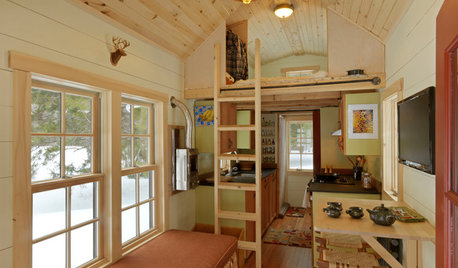
SMALL SPACESCould You Live in a Tiny House?
Here are 10 things to consider if you’re thinking of downsizing — way down
Full Story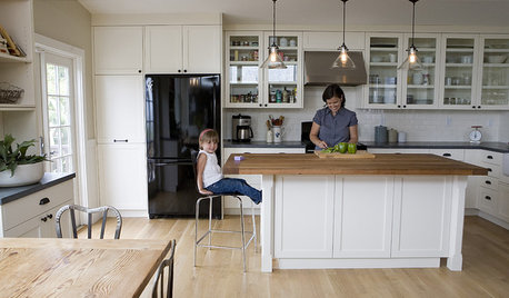
ORGANIZINGDo It for the Kids! A Few Routines Help a Home Run More Smoothly
Not a Naturally Organized person? These tips can help you tackle the onslaught of papers, meals, laundry — and even help you find your keys
Full StorySponsored
Your Custom Bath Designers & Remodelers in Columbus I 10X Best Houzz

rhome410
rhome410
Related Discussions
Help on tweaks of Layout
Q
help with layout tweaking, or should I just walk away?
Q
Help me tweak final layout...
Q
Tweak this layout please! Pretty please! TImes out
Q
aokat15Original Author
rhome410
aokat15Original Author
rookie_2010
aokat15Original Author
User
lascatx
chicagoans
lisa_a
rhome410
aokat15Original Author
chicagoans
malhgold
aokat15Original Author
malhgold
rhome410
lascatx
littlesmokie
aokat15Original Author
aokat15Original Author
aokat15Original Author
lisa_a
kmsparty
rhome410
lisa_a
malhgold
lascatx
aokat15Original Author
malhgold
User
tracie.erin
rhome410
malhgold
aokat15Original Author
User
malhgold
rhome410
bmorepanic
lisa_a
littlesmokie
aokat15Original Author
willis13
kmsparty
rhome410
lascatx
aokat15Original Author
lascatx
rhome410