


I really need advice!
booper717
15 years ago

Sort by:Oldest
Comments (21)
Related Stories
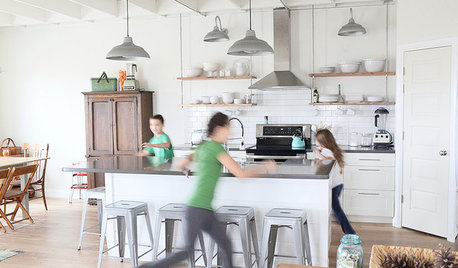
LIFEGet the Family to Pitch In: A Mom’s Advice on Chores
Foster teamwork and a sense of ownership about housekeeping to lighten your load and even boost togetherness
Full Story
TASTEMAKERSBook to Know: Design Advice in Greg Natale’s ‘The Tailored Interior’
The interior designer shares the 9 steps he uses to create cohesive, pleasing rooms
Full Story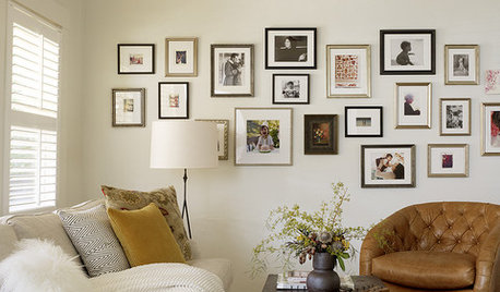
LIFEEdit Your Photo Collection and Display It Best — a Designer's Advice
Learn why formal shots may make better album fodder, unexpected display spaces are sometimes spot-on and much more
Full Story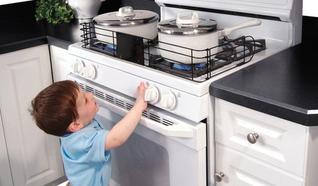
HEALTHY HOMEHow to Childproof Your Home: Expert Advice
Safety strategies, Part 1: Get the lowdown from the pros on which areas of the home need locks, lids, gates and more
Full Story
DECORATING GUIDESDecorating Advice to Steal From Your Suit
Create a look of confidence that’s tailor made to fit your style by following these 7 key tips
Full Story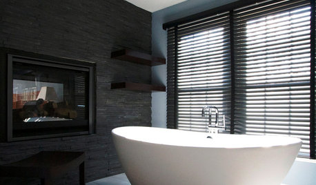
BATHROOM DESIGNDreaming of a Spa Tub at Home? Read This Pro Advice First
Before you float away on visions of jets and bubbles and the steamiest water around, consider these very real spa tub issues
Full Story
FARM YOUR YARDAdvice on Canyon Farming From L.A.'s Vegetable Whisperer
See how a screened garden house and raised beds help an edible garden in a Los Angeles canyon thrive
Full Story
THE ART OF ARCHITECTURESound Advice for Designing a Home Music Studio
How to unleash your inner guitar hero without antagonizing the neighbors
Full Story
Advice to Kate Middleton: Keep Calm and Carry On
Royal-Wedding Jitters? Let This Ubiquitous British Print Soothe Your Nerves
Full Story
DECORATING GUIDES10 Design Tips Learned From the Worst Advice Ever
If these Houzzers’ tales don’t bolster the courage of your design convictions, nothing will
Full Story


stu2900
lorriekay
Related Discussions
I really need your advice..............
Q
I really need some advice.. im new here...
Q
I really need camera advice!!!!!!!
Q
I really need an advice for this backsplash condition.
Q
ingrid_vc so. CA zone 9
User
lauraa
orie
dilly_dally
cooperbailey
booper717Original Author
phoggie
sandra12
booper717Original Author
booper717Original Author
housefairy
housefairy
housefairy
texashottie
housefairy
Lyban zone 4
Sujafr
housefairy