


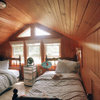
So excited - painted my house black! Trim?
daisychain01
12 years ago
Sort by:Oldest
Comments (43)
Related Stories
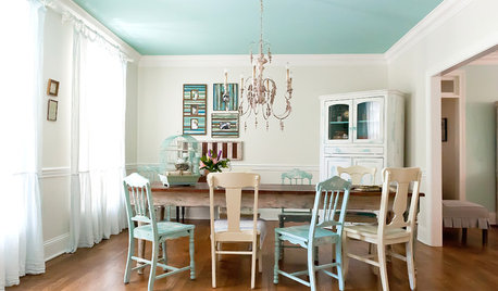
COLORAdd Excitement With Vibrant Ceiling Color
Slather on some bold ceiling color for an instant — and eye-catching — transformation
Full Story
COLOR8 Reasons to Paint Your Interior Trim Black
Hide imperfections, energize a space, highlight a view and more with a little bit of darkness that goes a long way
Full Story
PATTERNFit to be Tiled: Get Some Pattern on the Floor for Excitement Underfoot
Get all the visual delight of a rug with more durability by treating your floors to a pattern done up in tile
Full Story
MOST POPULARSo You Say: 30 Design Mistakes You Should Never Make
Drop the paint can, step away from the brick and read this remodeling advice from people who’ve been there
Full Story
LIGHTINGSo You Bought a Cave: 7 Ways to Open Your Home to Light
Make the most of the natural light your house does have — and learn to appreciate some shadows, too
Full Story
DECORATING GUIDESSo Your Style Is: Arts and Crafts
With a dual focus on nature and craftsmanship, Arts and Crafts home interiors have a wholesome, organic appeal
Full Story
COLORWake Up Your Woodwork With Black
Strike a dramatic note with black window frames, shelves, stairs and more, making features stand out or blend in
Full Story
DECORATING GUIDESSo Your Style Is: Black, White and Read All Over
Make headlines at home with newsworthy decor
Full Story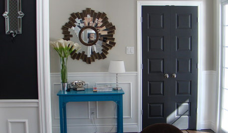
MOST POPULAR11 Reasons to Paint Your Interior Doors Black
Brush on some ebony paint and turn a dull doorway into a model of drop-dead sophistication
Full Story
COLOR11 Reasons to Paint Your Ceiling Black
Mask flaws, trick the eye, create drama ... a black ceiling solves a host of design dilemmas while looking smashing
Full Story

ttodd
jennifer_in_kansas
Related Discussions
I did it! I found MY color! I am so excited...
Q
So stumped on what colors to paint my house! would love help...
Q
FINALLY got my 1st samples of F&B...so excited : )
Q
So excited to share my sneak peek! PX
Q
beekeeperswife
daisychain01Original Author
Valerie Noronha
Andresrr
daisychain01Original Author
daisychain01Original Author
Olychick
ttodd
cyn427 (z. 7, N. VA)
Oakley
User
ttodd
User
lizzie_nh
lizzie_nh
adriennemb2
lizzie_nh
adriennemb2
yayagal
daisychain01Original Author
daisychain01Original Author
roarah
ttodd
daisychain01Original Author
roarah
cyn427 (z. 7, N. VA)
adriennemb2
kellyeng
dianalo
ttodd
palimpsest
daisychain01Original Author
steph2000
daisychain01Original Author
Kathleen McGuire
awm03
daisychain01Original Author
dixiedo
ttodd
busybee3
lucillle