


Pirula, Other Color Gurus, need warm off-white help, please!
abundantblessings
15 years ago
Sort by:Oldest
Comments (3)
Related Stories

MOST POPULARMust-Try Color Combo: White With Warm Off-White
Avoid going too traditional and too clean by introducing an off-white palette that brings a touch of warmth and elegance
Full Story
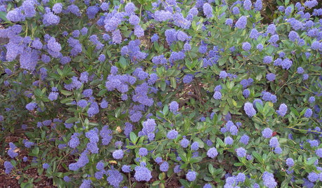
GARDENING GUIDESGreat Design Plant: Ceanothus Pleases With Nectar and Fragrant Blooms
West Coast natives: The blue flowers of drought-tolerant ceanothus draw the eye and help support local wildlife too
Full Story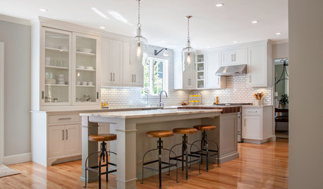
KITCHEN DESIGNKitchen of the Week: Warm and Industrial in New Hampshire
Generous helpings of wood keep white subway tile and cabinets from feeling cold in a kitchen redesigned long-distance
Full Story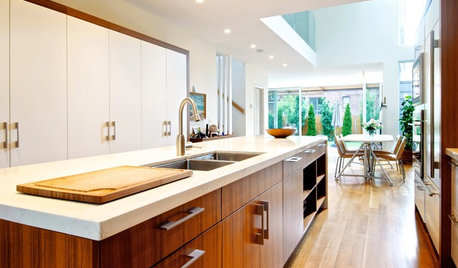
KITCHEN DESIGNSee How Wood Warms Modern White Kitchens
Have your shining all-white kitchen and warmth too, with this natural material that keeps starkness at bay
Full Story
HOME OFFICESQuiet, Please! How to Cut Noise Pollution at Home
Leaf blowers, trucks or noisy neighbors driving you berserk? These sound-reduction strategies can help you hush things up
Full Story
COLORColor of the Year: Off-White Is On Trend for 2016
See why four paint brands have chosen a shade of white as their hot hue for the new year
Full Story
UNIVERSAL DESIGNMy Houzz: Universal Design Helps an 8-Year-Old Feel at Home
An innovative sensory room, wide doors and hallways, and other thoughtful design moves make this Canadian home work for the whole family
Full Story
DECORATING GUIDESDownsizing Help: Color and Scale Ideas for Comfy Compact Spaces
White walls and bitsy furniture aren’t your only options for tight spaces. Let’s revisit some decorating ‘rules’
Full Story
LIFE12 Effective Strategies to Help You Sleep
End the nightmare of tossing and turning at bedtime with these tips for letting go and drifting off
Full Story


walkin_yesindeed
squirrelheaven
Related Discussions
Search Gurus - I need help please
Q
Color guru's: i need color help!
Q
Color gurus! Wall color help needed please
Q
Tibbrix- need some help with off-whites, please
Q
kailleanm