


Please Vote on Powder Room Decor
biochem101
14 years ago

Sort by:Oldest
Comments (24)
Related Stories
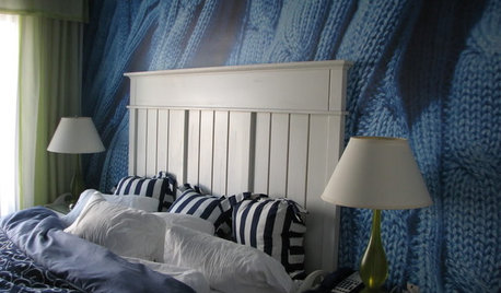
DECORATING GUIDESA Vote for the Cable Stitch in Home Decor
Warm Up a Room With the Look, Feel and Memories of Knitting
Full Story
HOME OFFICESQuiet, Please! How to Cut Noise Pollution at Home
Leaf blowers, trucks or noisy neighbors driving you berserk? These sound-reduction strategies can help you hush things up
Full Story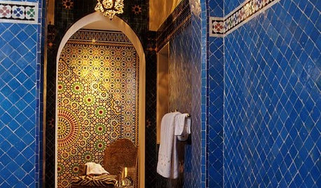
TILEMoor Tile, Please!
Add an exotic touch with Moroccan tiles in everything from intricate patterns and rich colors to subtle, luminous neutrals
Full Story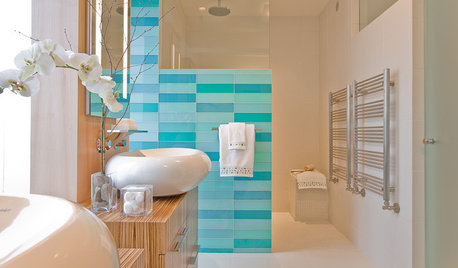
DECORATING GUIDESPalatable Palettes: 9 Bold Bathroom Color Schemes
Give your bathroom or powder room a bright new look with beautiful colors that energize the space and please the eye
Full Story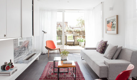
DECORATING GUIDESAsk an Expert: How to Decorate a Long, Narrow Room
Distract attention away from an awkward room shape and create a pleasing design using these pro tips
Full Story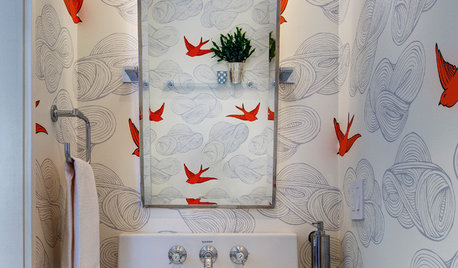
MOST POPULAR102 Eye-Popping Powder Rooms
Flip through our collection of beautiful powder rooms on Houzz and fill your eyes with color and style
Full Story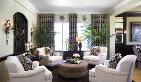
LIVING ROOMS8 Living Room Layouts for All Tastes
Go formal or as playful as you please. One of these furniture layouts for the living room is sure to suit your style
Full Story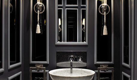
POWDER ROOMSDream Spaces: 12 Ultraglam Powder Rooms
These luxurious loos show how extravagance can come through color, wall coverings, fixtures or just a simply beautiful concept
Full Story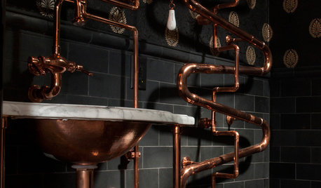
INDUSTRIAL STYLESteampunk for the Powder Room
Pipes, gauges, dirigibles — old, in-your-face technology has romantic appeal in the iPhone age. Here's how to celebrate its glories at home
Full Story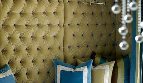
COLOR12 Fresh Palettes for Color Lovers
These unexpected color pairings create compelling displays in everything from powder rooms to great rooms
Full StorySponsored


squirrelheaven
declansmom
Related Discussions
Please help redesign/decorate our Dog Room/Fire Room
Q
Powder room decorating help?
Q
Powder room decor?
Q
HELP decorating powder room
Q
allison0704
dilly_dally
dilly_dally
luckygal
dlspellman
pugga
biochem101Original Author
hoosiergirl
dilly_dally
biochem101Original Author
coloredthumb
dilly_dally
nhb22
angelcub
Lyban zone 4
biochem101Original Author
squirrelheaven
dilly_dally
dilly_dally
biochem101Original Author
pugga
dilly_dally