


How far apart to hang these?
2ajsmama
14 years ago
Sort by:Oldest
Comments (48)
Related Stories
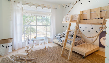
KIDS’ SPACESThe 15 Most Popular Kids’ Rooms on Houzz So Far in 2016
Natural materials, bright colors, hanging chairs and clever storage are some of the features found in these bedrooms and outdoor spaces
Full Story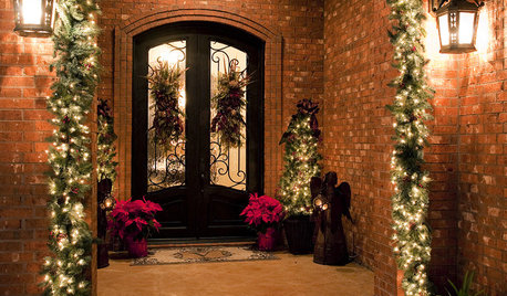
MOST POPULARA Contractor's Secrets to Hanging Holiday Decor
Hang a wreath or garland on brick, concrete, Sheetrock or wood the professional way — and avoid the potential pitfalls
Full Story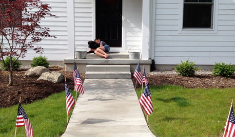
MOST POPULARHow to Hang the American Flag at Home
We’ll show you how to display the American flag on your house for Memorial Day, the Fourth of July or all year round
Full Story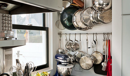
KITCHEN DESIGNHang 'Em or Hide 'Em: 10 Stylish Ways to Store Pots and Pans
Keep cookware neat and at the ready with racks, drawers and creative storage solutions
Full Story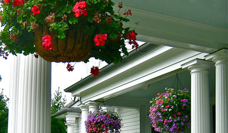
PORCHESGet the Hang of Hanging Flower Baskets
Learn all about container materials, soil and designing a hanging flower arrangement for a bountiful look on your porch or deck
Full Story
ROOM OF THE DAYRoom of the Day: Storage Becomes a Feature in a Brooklyn Apartment
City dwellers often face a storage shortage, but not these New Yorkers. See how they made room to hide their stuff in style
Full Story
DECORATING GUIDESMission Possible: A Designer Decorates a Blank Apartment in 4 Days
Four days and $10,000 take an apartment from bare to all-there. Get the designer's daily play-by-play
Full Story
HOUZZ TOURSMy Houzz: A Stylish Brooklyn Apartment Filled With Memories
Collected pieces from travels, family heirlooms and contemporary finds turn an apartment into a home for 3
Full Story
ECLECTIC HOMESHouzz Tour: Family-Friendly Apartment in a Converted School
A reconfigured London home goes from cool couple’s hangout to fun family home
Full Story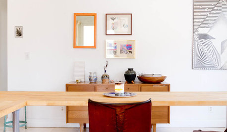
HOUZZ TOURSHouzz Tour: Eclectic, Minimalist Brooklyn Apartment
Can you create a home that feels like you even if you rent? A jewelry and textile designer in New York has done just that
Full Story


bronwynsmom
2ajsmamaOriginal Author
Related Discussions
How far apart to plant?
Q
How to space island pendants
Q
How far apart to hang 12" pendants over 66" island?
Q
How far apart pendant lights on 7.5' island?
Q
bronwynsmom
2ajsmamaOriginal Author
squirrelheaven
2ajsmamaOriginal Author
2ajsmamaOriginal Author
megsy
kgwlisa
2ajsmamaOriginal Author
les917
2ajsmamaOriginal Author
mitchdesj
2ajsmamaOriginal Author
squirrelheaven
andee_gw
bronwynsmom
justgotabme
2ajsmamaOriginal Author
2ajsmamaOriginal Author
justgotabme
2ajsmamaOriginal Author
Happyladi
patricianat
justgotabme
kgwlisa
2ajsmamaOriginal Author
justgotabme
justgotabme
squirrelheaven
2ajsmamaOriginal Author
justgotabme
les917
2ajsmamaOriginal Author
deborahnj
2ajsmamaOriginal Author
squirrelheaven
2ajsmamaOriginal Author
megsy
deborahnj
squirrelheaven
2ajsmamaOriginal Author
kgwlisa
kgwlisa
squirrelheaven
justgotabme
les917
2ajsmamaOriginal Author