


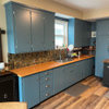
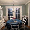
Do you see what I see?
Annie Deighnaugh
11 years ago
Sort by:Oldest
Comments (46)
Related Stories
MORE ROOMSRooms I'd Like to See Wrapped Up as Gifts for the Holidays!
What Room Do You Have on Your Gift List This Year?
Full Story
INSIDE HOUZZInside Houzz: See the Houzz App’s Latest Features
Update your Houzz app for iPhone®, iPad® and iPod touch® for your new profile page, enhanced searching and easier uploads
Full Story
DECORATING GUIDESSee How Wabi-Sabi Can Bring Harmony and Beauty to Your Home
Create your own wabi-style style with beautifully weathered, humble materials around the house
Full Story
KITCHEN DESIGNSee-Through Refrigerators Dare to Go Bare
Glass-front fridge doors put your food and drinks on display, for better or worse. See the benefits and disadvantages
Full Story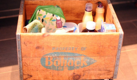
ORGANIZINGDIY: See How to Make a Rolling Vintage Storage Crate
Corral those bottles of lotions and creams in wheeled cubbie for under the sink
Full Story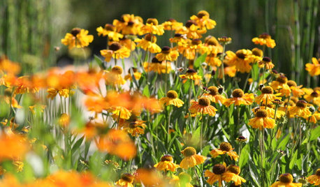
GARDENING GUIDESWhat’s in a Name? See 6 Wildflowers That Aren’t ‘Weeds’ at All
Dispel the stereotypes of weeds and try these wildlife-supporting native wildflowers in your garden
Full Story
CONTEMPORARY HOMESHouzz Tour: Curves Ahoy! See a Unique Floating Home
It appeared on ‘Portlandia,’ but it doesn’t take a camera crew to see how special this home on a river is
Full Story
DECORATING GUIDESSee a Seattle-Area Home Steeped in Graciousness
Brimming with welcoming touches, this condo shows that a home short on space and decorating funds can still go long on personal style
Full Story
DECORATING GUIDESDark Curtains See the Light
For a cozy feel or a visual trick for ceilings and windows, dark, moody curtains and drapery treatments have a bright outlook
Full Story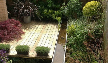
LANDSCAPE DESIGNSee Chelsea Flower Show Ideas Flourishing in a Real Backyard
Can trends in high-design show gardens translate to everyday yards? The proof is in the plantings
Full Story

sweeby
palimpsest
gmp3
bronwynsmom
mama goose_gw zn6OH
bronwynsmom
bestyears
palimpsest
bronwynsmom
Annie DeighnaughOriginal Author
bronwynsmom
Claire Buoyant
breenthumb
sweeby
cal_dreamer
mama goose_gw zn6OH
porkandham
mama goose_gw zn6OH
hhireno
Annie DeighnaughOriginal Author
User
denali2007
gmp3
tetrazzini
desertsteph
mama goose_gw zn6OH
bronwynsmom
girlville
segbrown
Annie DeighnaughOriginal Author
Annie DeighnaughOriginal Author
jessicaml
Annie DeighnaughOriginal Author
jessicaml
Annie DeighnaughOriginal Author
magnaverde
jlsch
mama goose_gw zn6OH
Bumblebeez SC Zone 7
mary_ruth
jessicaml
Annie DeighnaughOriginal Author
magnaverde
amykath
sweeby
alicate