


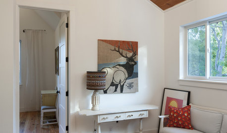
Art - I stacked it but have been told would be better side by sid
User
14 years ago
Sort by:Oldest
Comments (81)
Related Stories
MOST POPULARThree Magic Words for a Clean Home and a Better Life
Not a natural tidying and organizing whiz? Take hope in one short phrase that can change your life forever
Full Story
MOVINGRelocating? Here’s How to Make the Big Move Better
Moving guide, Part 1: How to organize your stuff and your life for an easier household move
Full Story
LIFE11 Tiny Tricks That Make Life a Tad Better
Make these small tweaks to your home and daily routine, and life will be easier, less rushed and maybe healthier too
Full Story
BEDROOMSDesigner Tips for Creating a Better Bedroom
In the dark about bedside lamps? Waffling over pillows at the store? Try these ideas for a more comfortable bedroom
Full Story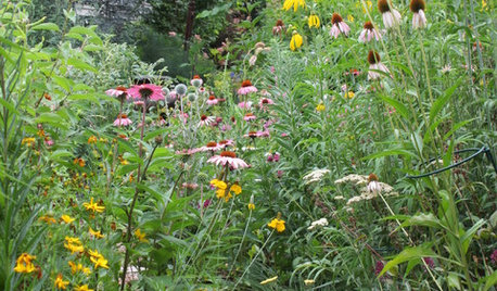
GARDENING FOR BUTTERFLIES3 Ways Native Plants Make Gardening So Much Better
You probably know about the lower maintenance. But native plants' other benefits go far beyond a little less watering and weeding
Full Story
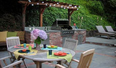
MOST POPULAR8 Ways to Improve Your Grill Setup
Rethinking the old grilling station? Here’s how to pack more function and style into your backyard cooking zone
Full Story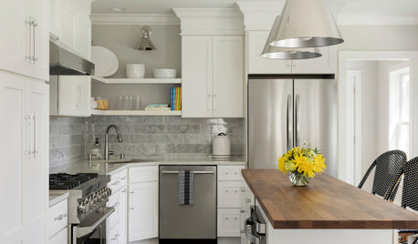
HOUSEKEEPINGTackle Big Messes Better With a Sparkling-Clean Dishwasher
You might think it’s self-cleaning, but your dishwasher needs regular upkeep to keep it working hard for you
Full Story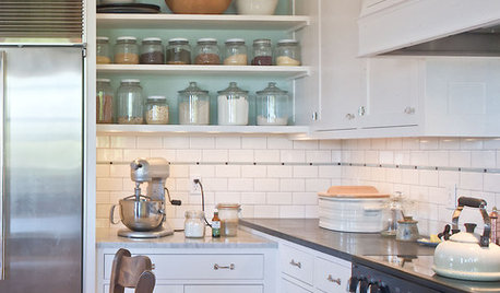
KITCHEN DESIGNLove to Bake? Try These 13 Ideas for a Better Baker's Kitchen
Whether you dabble in devil's food cake or are bidding for a bake-off title, these kitchen ideas will boost your baking experience
Full Story
UNIVERSAL DESIGNHow to Light a Kitchen for Older Eyes and Better Beauty
Include the right kinds of light in your kitchen's universal design plan to make it more workable and visually pleasing for all
Full Story


UserOriginal Author
bronwynsmom
Related Discussions
Art Work - Too Small for Wall?
Q
Art or No Art, that is the question?
Q
Where to place art work around this buffet
Q
Art or no Art over stone fireplace?
Q
anele_gw
UserOriginal Author
pris
UserOriginal Author
pris
anele_gw
UserOriginal Author
anele_gw
UserOriginal Author
sable_ca
UserOriginal Author
anele_gw
UserOriginal Author
Lyban zone 4
UserOriginal Author
pris
anele_gw
andee_gw
bungalow_house
anele_gw
nanny2a
bungalow_house
UserOriginal Author
UserOriginal Author
Oakley
anele_gw
squirrelheaven
squirrelheaven
Kathleen McGuire
nanny2a
crazyone
ttodd
UserOriginal Author
squirrelheaven
ctlane
ttodd
bronwynsmom
UserOriginal Author
anele_gw
UserOriginal Author
bronwynsmom
squirrelheaven
squirrelheaven
pammyfay
UserOriginal Author
squirrelheaven
oceanna
bronwynsmom