


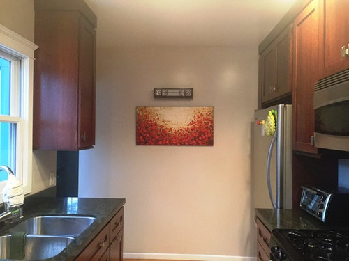
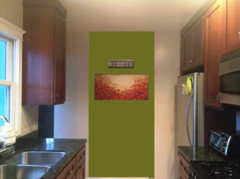
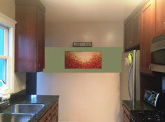
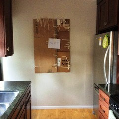
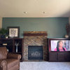
Art Work - Too Small for Wall?
aimeekm
7 years ago

Featured Answer
Comments (60)

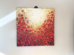
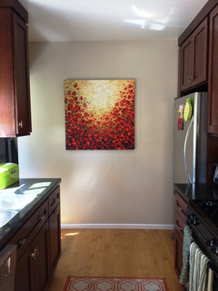
aimeekm
7 years agoRelated Discussions
Using Mirror instead of Art Work
Comments (3)Personally I think 2 mirrors is plenty, but I love artwork and think it adds a lot more interest and color than another mirror. I rarely say this, but I think your husband is right this time....See MoreIs this wall art too small for my ginormous couch?
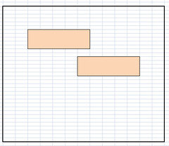
Comments (8)The width isn't bad. The rule of thumb is 2/3 to 3/4 of the sofa width. The iron work is nice but I'm not sure if it has enough visual weight to balance out with the sofa. Have you considered something with more color and presence? Here is a triptych from the Houzz store....See MoreWall art too small
Comments (4)Before you purchase something else...get a sense of how big your art should be for this space. Get some blue painters tape and start measuring! Your sofa can use a much larger piece. Check out what is available on Greatbigcanvas.com or Art.com. Great pieces of art at reasonable prices....See MoreHELP!!! Art work placement plus Entryway console
Comments (33)I have no help to add about the art but I do love the colorful rug @celery showed I the last post. Something dramatic with that gorgeous green in it will tie the room together. Your dining table is stunning! And the green chairs are a happy surprise ( most dining rooms have all chairs the same)....See Moreaimeekm
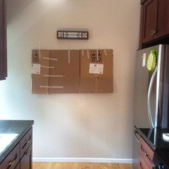
7 years agolast modified: 7 years agoaimeekm
7 years agoaimeekm
7 years agoaimeekm
7 years ago
littlebug zone 5 Missouri
7 years agolast modified: 7 years agoaimeekm thanked littlebug zone 5 Missouri
sunfeather
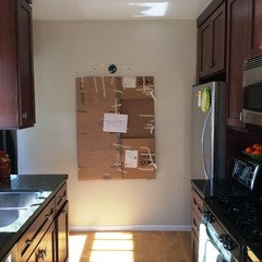
7 years agoaimeekm
7 years agoaimeekm
7 years agoaimeekm
7 years agoaimeekm
7 years agoaimeekm
7 years agolast modified: 7 years agoaimeekm
7 years agoaimeekm
7 years agolast modified: 7 years ago


Related Stories

SMALL HOMESMy Houzz: Walls of Art and Glass in a Brooklyn Loft
Eclectic collections, vintage furniture and favorite artworks personalize this 1,000-square-foot open-plan loft
Full Story
LANDSCAPE DESIGNThe Art of the Espalier
Go ahead, let limited garden space drive you up the walls. With these 6 ways to train plants vertically, it can be a beautiful thing
Full Story
DECORATING GUIDESCasual Wall Art Arrangements Show Deliberate Style
No time or desire to carefully plot a wall-art arrangement? Grab a hammer and throw tradition to the wind
Full Story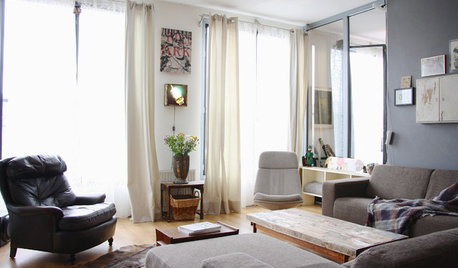
HOUZZ TOURSMy Houzz: Street Finds and Art in Amsterdam
Salvaged furniture and ever-changing contemporary art take a Netherlands rental from bleak to neat
Full Story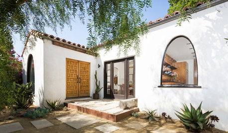
BEFORE AND AFTERSHouzz TV: See Recycled Walls and Cool Cassette Art in a Woodsy DIY Home
Walnut countertops join hardwood floors and pieces made from leftover framing in a bright Spanish colonial
Full Story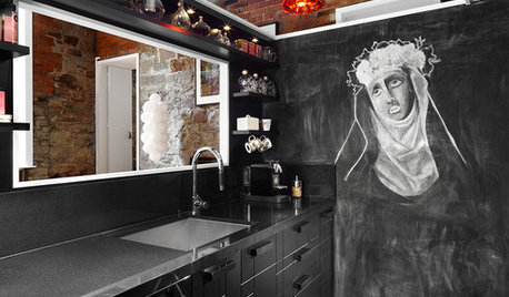
WALL TREATMENTSThe Best Chalkboard Wall Art on Houzz
Who knew Houzzers could be so artistic with a little chalk? We did
Full Story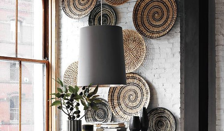
ACCESSORIES3D Wall Art for Your Home
Add interesting dimension and texture to your walls with collected artwork
Full Story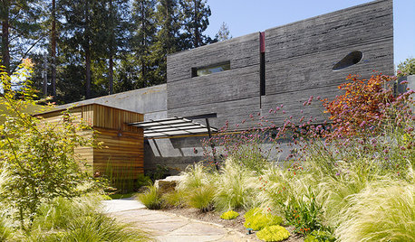
ARCHITECTUREArchitecture and the Art of the Wall
See how common building materials can become uncommonly beautiful displays of color, pattern, texture and light
Full Story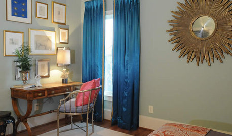
ROOTS OF STYLEArt Deco, Art Nouveau, Arts and Crafts: What’s the Difference?
If the zigzag and swirly designs of the past leave your head spinning, these descriptions will straighten you right out
Full StorySponsored
Industry Leading Interior Designers & Decorators in Franklin County


Annie Deighnaugh