


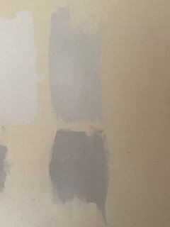
Benjamin Moore's "Pale Oak" undertones??
jilltigs
10 years ago
Featured Answer
Sort by:Oldest
Comments (53)

peaches12345
10 years agomcgillicuddy
10 years agoRelated Discussions
Benjamin Moore’s white opulence paint color
Comments (75)It has been a while since the last activity on this thread, and I felt it might be beneficial to give my updated perspective on White Opulence #879 from Benjamin Moore as a paint color for main areas. Having lived with this color for a bit longer now since my last comment, I am beginning to understand how tightly it regulates what other colors can be placed with it for anyone who cares about a homogeneous scheme and also how undeniable the pink tone can be when applied over large surface areas. White Opulence is a tint of red, but it is so light that in ample daylight or under bright white lighting it can "read" as white. In average daylight, it produces a whisper-light pink hue. The effect of this is magnified the larger the area that is covered by it. Using this color on the walls in the main space of a large, open-plan layout with high ceilings, for example, will imbue the area with a light, yet undeniable, pale pink cast in average lighting. It would be a good idea to prepare not only yourself but also any other significant users of the space of the pink tinge before selecting this color because some people truly dislike pink, and it is courteous to work with all regular users of spaces during design planning to try to ensure no one will be overly uncomfortable with the final effect. One thing that hasn't been discussed is how White Opulence can cast a peach tone under warmer lighting colors, especially in the absence of any compensating daylight, meaning nighttime in most home spaces. If peach is a color you want to avoid and you utilize warm lighting -- that is, progressively orange-tinged the further under a 4000K color temperature you go -- then this is a paint color to avoid. The general recommendation is that 4000K is quite cool for home environments, so if you don't know what color temperature your home lighting is, you can probably assume it is warmer than 4000K if you selected average bulbs from your home supplies provider. White Opulence as a red-based white was an attractive choice for my main space because I already had a red accent in a permanent finish and personally prefer the fresh look that a red-white lends versus common alternate choices for main area wall colors like yellow-based beiges or blue-based grays. The problem is that so many home goods available are manufactured in colors that go with beige and gray wall colors rather than the faint red-white of White Opulence that color coordination requires more work than may be expected. Of course, you could decorate using pure white items, but what you really need are options for whisper pink basics which are hard to find. Adding stronger pink or red items is not always the solution either because you cannot feasibly fill the room with accents; you need some basics that blend with the wall tone. Then there is the issue of coordinating White Opulence with colors for auxiliary rooms if you wish to have some variety throughout the home while still maintaining the feel that all of the home's colors work together. Most blues coordinate with White Opulence, but if you have already used red accents in rooms painted with White Opulence, then red is challenging to pair with blue in most instances unless it is a dark, cool blue like navy. Where this has been a dilemma for me has been my hallway colors connecting the main open space to the bedrooms which are all different pastels. The color plan I have will work, and I'll enjoy the variety of colors that I have been able to make flow together, but to be honest, at times I have wondered how much easier the design process might have been if I had picked plain white for the main space. White is the ultimate neutral some might say. At the very least, a basic white for the main area would have given me more freedom in selecting fabrics and other home products for the main space as well as coordinating colors for other rooms. It is all too easy to second-guess decisions that will affect your life long-term. I am using Benjamin Moore's durable Aura formula in a satin finish, so I expect the new White Opulence paint will last decades. Had I selected a plain white or yellow- or blue-based off white, I might be back on this very forum wishing I had gone with White Opulence to add appeal beyond the standard choices. I hope this is helpful to anyone still considering this color....See MoreTrim Colors for Pale Oak Wall Color
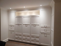
Comments (20)Here are a few photos of my house where I photoshopped a render/mockup of what the white walls could look like. FYI, the dining room windows with the black wood blinds will be replaced with white cellular shades (the dark blinds make it so dark in there). I am also playing around with the idea of doing Kendall Charcoal on the window trim, which you can see in the office render. I like the baseboards being the same white as the walls, but not sure about the windows, although the dark trim around the windows on every window might be a bit much. Any thoughts? Do you think white walls and white-on-white works for my flooring, etc?...See MoreDarker color to go with Benjamin Moore's Pale oak?
Comments (4)Accent walls are best of furniture is taken into consideration so rug, fabrics, etc. pale oak is neutral enough that you can go lots of different ways. Why the need to select an accent wall now - focus on trim and cabinet colors. An accent wall can come into play even after move in once all furniture and lighting is in place. It’s just a couple of hours work to knock out one dining room wall assuming it’s not a 2 story space....See MorePale Oak Benjamin Moore
Comments (0)Hey all! So I'm in a hard spot. I tried some paint colours around the house and I'm liking pale oak. Only problem is it looks way too stark in my kitchen and the kitchen opens up to everywhere else. Any ideas or tips? I need it to be able to flow....See Moremcgillicuddy
10 years agothlim001
8 years ago PRO
PROLori A. Sawaya
8 years ago
sprtphntc7a
8 years ago- PRO
Lori A. Sawaya
8 years ago sprtphntc7a
8 years ago- PRO
User
8 years ago 
dixiesmiths
6 years agodixiesmiths
6 years ago
janny3
6 years agolast modified: 6 years agoBarb
5 years ago- PRO
Lori A. Sawaya
5 years agolast modified: 5 years ago michelleborde
5 years ago
Gina Richards
5 years ago- PRO
Lori A. Sawaya
5 years ago - PRO
Lori A. Sawaya
5 years agolast modified: 5 years ago - PRO
Lori A. Sawaya
5 years ago 
Melissa Yarbrough
5 years agoUser
5 years agolast modified: 5 years agodixiesmiths
5 years ago
Rachael Thompson
5 years agolyay
5 years agoGina Richards
4 years agosjeschke
4 years ago
Cassie Bayack
4 years ago
Jennifer Hartung
3 years agosteviepridenow
3 years ago- PRO
Lori A. Sawaya
3 years ago dixiesmiths
3 years agodixiesmiths
3 years ago
Jill S
3 years agoJill S
3 years agoCassie Bayack
3 years agoJill S
3 years ago PRO
PROHeather Bryce Designs
3 years agoHU-702621304
3 years agoHU-702621304
3 years agoHU-702621304
3 years agolast modified: 3 years agoHU-702621304
3 years agoJill S
3 years agoHU-702621304
3 years agoCarmel
2 years ago
Brenda Hagel
2 years agoBrenda Hagel
2 years agolast modified: 2 years ago
userLA57
2 years agouserLA57
2 years ago
Candice McCarthy
2 years agolast modified: 2 years ago

Related Stories

COLORBenjamin Moore Floats Breath of Fresh Air as Its Color of 2014
Touted as a new neutral, this baby blue can stand on its own or support bolder colors. Here's how to use it
Full Story
COLORBest Ways to Use the Neutral Green Color of 2015
Benjamin Moore’s Color of the Year is soft and natural
Full Story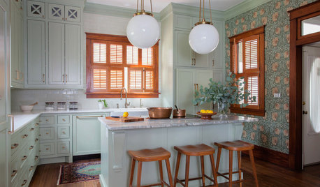
KITCHEN OF THE WEEKKitchen of the Week: Goodbye, Honey Oak — Hello, Minty Green
After more than 30 years, the Kloesels revamped their space to reflect their rural country town and Victorian-style home
Full Story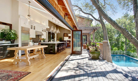
HOUZZ TOURSHouzz Tour: Luxury With a Treehouse Feel
Step inside a beautiful Marin County remodel nestled in the oaks
Full Story
COLORHow to Create Calm and Character With Light Colors
Light paint and pale woods can feel rich and cozy too. Here are 7 design twists and colors to try
Full Story
SHOP HOUZZShop Houzz: Decorating With Guilford Green
Add a crisp, classic feel with this fresh and subtle color of the year for 2015
Full Story
NEUTRAL COLORSColor Guide: How to Work With Beige
If you yawn and dismiss it, you're missing out on beige's infinite subtleties and the possibilities it brings to room designs
Full Story
MOST POPULAR50 Shades of Gray
Gray is hotter than ever, thanks to a hit novel full of risks and dark secrets. Tell us: Which paint shade possesses you?
Full Story
COLORBest Ways to Use the Soft Yellow Color of 2014
You may fall for PPG Pittsburgh Paints’ Turning Oakleaf if you like your hues warm, mellow and cheery
Full Story
GRAYColor Guide: How to Work With Light Gray
The hottest new neutral can be cool or warm, formal or casual, and feminine or masculine. Talk about versatile
Full StorySponsored


Lori A. Sawaya