


Finally, they meet! My granite, sink and faucet. (pic heavy)
poohpup
12 years ago


Sort by:Oldest
Comments (45)
Related Stories
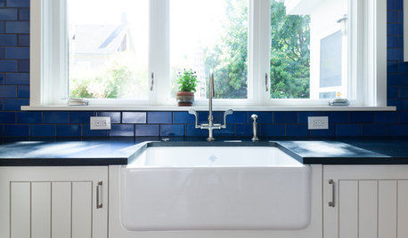
KITCHEN DESIGNKitchen Sinks: Fireclay Brims With Heavy-Duty Character
Cured at fiery temperatures, fireclay makes for farmhouse sinks that just say no to scratches and dents
Full Story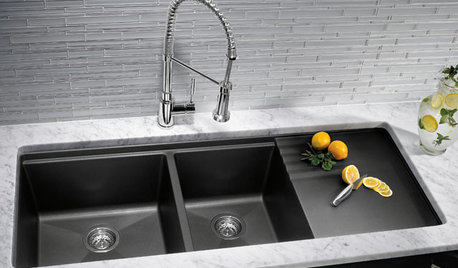
KITCHEN DESIGNKitchen Sinks: Granite Composite Offers Superior Durability
It beats out quartz composite for strength and scratch resistance. Could this kitchen sink material be right for you?
Full Story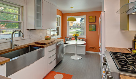
KITCHEN OF THE WEEKKitchen of the Week: Midcentury Meets Sweden in Minneapolis
A fun, retro-style makeover gives an aging galley kitchen a fresh look with a nod to the past
Full Story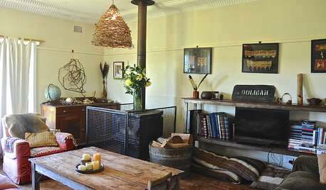
HOUZZ TOURSMy Houzz: Cozy Country Meets Bohemian Artistic in Australia
Healthy helpings of salvage and rustic art give a pastureland home free-spirited style
Full Story
DECORATING GUIDESHouzz Tour: Traditional Meets Transitional in a Townhouse
A Southern California couple downsizes, and their designer helps them push past traditional boundaries
Full Story
KITCHEN DESIGNKitchen of the Week: Modern and Rustic Meet in the Woods of Quebec
Tall windows open this handcrafted wood-and-white loft kitchen to the beautiful outdoors
Full Story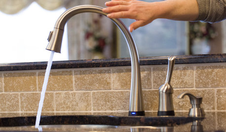
KITCHEN SINKSJust a Touch: Faucets Without the Fuss
Faucets that turn on with a tap of the finger, forearm or hand are great for messy hands or full arms
Full Story
HOUZZ TOURSMy Houzz: French Country Meets Southern Farmhouse Style in Georgia
Industrious DIYers use antique furniture, collections and warm colors to cozy up their traditional home
Full Story
HOME TECHMeet the New Super Toilets
With features you never knew you needed, these toilets may make it hard to go back to standard commodes
Full Story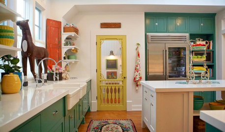
VINTAGE STYLEHouzz Tour: Farmhouse Meets Victorian in Los Angeles
Fanciful scrolls and sweet botanical prints join playful vintage touches for a home that’s altogether charming
Full Story
desertsteph
breezygirl
Related Discussions
Finally, pics of our completed beach house -- pic heavy!
Q
Preview of some of my design choices: pic heavy
Q
Meet my new kitchen/laundry room---pics (I hope!)
Q
Ok, here goes... My half-finished kitchen [very long & pic heavy]
Q
biochem101
sas95
a2gemini
decordummy_gw
bmorepanic
SaraKat
lascatx
michellemarie
pricklypearcactus
CEFreeman
poohpupOriginal Author
Mistman
sas95
Mizinformation
modern_mom35
bellsmom
bellsmom
breezygirl
a2gemini
sweeby
iroll_gw
poohpupOriginal Author
sweeby
poohpupOriginal Author
sprtphntc7a
a2gemini
poohpupOriginal Author
deedles
sweeby
poohpupOriginal Author
deedles
deedles
poohpupOriginal Author
a2gemini
poohpupOriginal Author
mdispensa
poohpupOriginal Author
a2gemini
mpmg46
poohpupOriginal Author
cj47
sweeby
a2gemini