


Ugghh! I think I picked the wrong waterline tile!
K Jensen
16 years ago
Featured Answer
Sort by:Oldest
Comments (40)

skinnydipper
16 years agojblairgolf
16 years agoRelated Discussions
HELP! Think I picked wrong pool tile and ledger combo
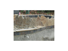
Comments (22)Hi Krista! Wow, it’s been so long since I shared this, I had forgotten about it. i decided against the concrete coping and went with stone. I selected the Pennsylvania stone and so happy i did! It looks gorgeous and blends in so well with my color scheme with its gray/blue color. I took the picture I posted above and enlarged it below so you can see the stone better. I hope this helps…would love to know your thoughts. Remember that concrete has a greater chance of cracking in time and I think the stone looks more elegant as well as being stronger....See MoreI don't think I'm happy with my backsplash :/
Comments (72)Have to agree with the above - it looks on my monitor that all of the backsplash tiles read green/blue and the countertop reads grey/brown and none of them seem to work together. The fireclay tiles posted by eam44 would look to be a much better match. I disagree above that you need some kind of focal point. I think it's a smallish kitchen and has lovely pendants, and windows and island and a bold backsplash is just competing with that. Keep it simple! In fact, i was the above writer who earlier said they pretty much always dislike the inset backsplash and i think your current BS is a perfect example of how those insets rarely look good. Even when the underlying colors are similar, as yours are, there's just something "off" about them. I think the only exception is when they are using almost the same tile (like, carerra subway tile BS with a carerra herringbone pattern inset). I still think this is busier than i like, but isn't an eyesore as so many other insets are. I think this inset mistake is actually a good opportunity to replace the whole thing!...See MoreI think I made the wrong choice
Comments (8)I agree - sometimes there is a shock affect when new paint goes up, but then as it sets, your eyes adjust. After you get the furniture in and wall hangings hung, along with any other lighting from lamps, etc., then you will be able to decide if it's what you truly like. If not, the great thing about paint is that it can be changed! I won't say it's easy to change, but it's not like a tile that has to be ripped out - paint just has to be covered up with more paint!! Good Luck!...See MorePlease help pick grout color for pool waterline tile
Comments (6)This can't be evaluated properly at a distance because there's no guaranty that anyone's monitor is going to reproduce true colors. You can only get estimates. I would go with grout that most closely matches the tile that's being grouted. With different tiles colors you have to pick your poison....See Morexnightowl
16 years agobeachdiva
16 years agogk5040
16 years agobanana_fanna
16 years agokitchenshock
16 years agoK Jensen
16 years agogk5040
16 years agobeachdiva
16 years agotess_tx
16 years agofauxnecian
16 years agodgmarie
16 years agotinamccullagh
16 years agogeminijenn
16 years agovanvmom
16 years agoK Jensen
16 years agocharlie123
16 years agoK Jensen
16 years agocharlie123
16 years agoK Jensen
16 years agobeachdiva
16 years agoK Jensen
16 years agocoolkat97
16 years agoK Jensen
16 years agoxnightowl
16 years agocoolkat97
16 years agolisa_sandiego
16 years agoarielitas_mom
16 years agobeachdiva
16 years agolobstertail
16 years agoK Jensen
16 years agojcoburn532
16 years agoK Jensen
16 years agojcoburn532
16 years agokristenfl
16 years agoK Jensen
16 years agokristenfl
16 years agosd21
13 years ago
Related Stories
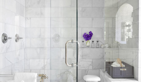
REMODELING GUIDESWhy Marble Might Be Wrong for Your Bathroom
You love its beauty and instant high-quality appeal, but bathroom marble has its drawbacks. Here's what to know before you buy
Full Story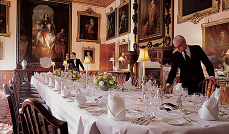
FUN HOUZZEverything I Need to Know About Decorating I Learned from Downton Abbey
Mind your manors with these 10 decorating tips from the PBS series, returning on January 5
Full Story
EXTERIORSHelp! What Color Should I Paint My House Exterior?
Real homeowners get real help in choosing paint palettes. Bonus: 3 tips for everyone on picking exterior colors
Full Story
FURNITUREGuest Picks: Fantasy Furniture
20 totally extravagant pieces from the outré to the "I want that!"
Full Story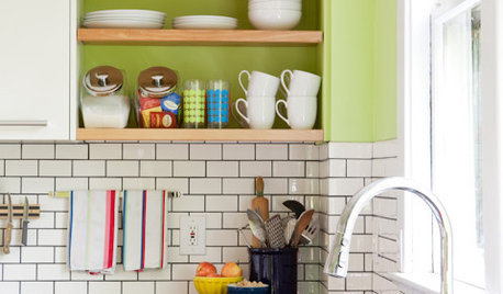
KITCHEN DESIGNSubway Tile Picks Up Gray Grout
Heading into darker territory, subway tile offers a graphic new look for kitchens, bathrooms and more
Full Story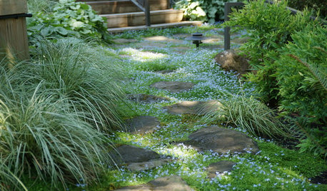
LANDSCAPE DESIGNHow to Pick the Right Floor for Your Garden Room
Crunch the facts on gravel, flagstone, brick, tile and more with our mini guide to outdoor flooring surfaces
Full Story
BATHROOM DESIGNGuest Picks: A Dreamy Bathroom Update
Everything from the sink to the tiles to give your bathroom a dreamy overhaul
Full Story
GARDENING AND LANDSCAPINGHow to Pick a Nice Wall for Your Garden Room
Made by hand, prefab or growing from the ground, garden walls are key landscaping elements. Here's what to think about for your yard
Full Story
DECORATING GUIDESPro to Pro: Learn Your Client’s Thinking Style
Knowing how someone thinks can help you determine the best way to conduct an interior design presentation
Full Story
BATHROOM WORKBOOKStandard Fixture Dimensions and Measurements for a Primary Bath
Create a luxe bathroom that functions well with these key measurements and layout tips
Full Story

steve_fl