


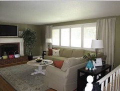
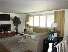
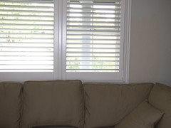
I've spent oodles on paint :-( Could someone please help me?
megpie77
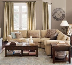
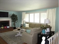
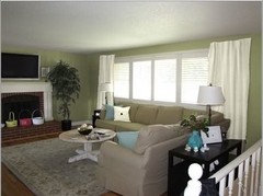
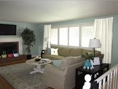
14 years ago
Featured Answer
Sort by:Oldest
Comments (34)

dawnp
14 years agoscanmike
14 years agoRelated Discussions
Cheap mulch ideas - I've already spent a fortune!
Comments (32)Any kind of organic material that's not visually offensive and of an acceptable size/texture can be used as mulch. I quit buying mulch many years ago, and instead put leaves, yard trimmings, pine needles, coffee grounds, grass from mower bag, whatever presents itself, when it presents itself. Green grass turns brown and mulch-y looking in a couple days, and the mixture of materials provides a wider range of nutrients for plants and the microbes that decompose materials into a form plants can use. More frequent additions of fresh materials keep the soil food chain alive. Here is a link that might be useful: Brief but extemely informative lecture about soil microbiology...See MorePhotoshopping--could someone please help me w/a kitchen?
Comments (18)What a nightmare! This is so ridiculous I'm embarrassed to post it, but I'm gonna do it anyway cause it took so long ;) Clone tool in PSP froze up and won't work. That's a first, and why I have nooo idea. You can see where it did part of the floor and then went kaput. So that's why the floor and back splash look crappy. (I had some nice tile for backsplash and a countertop, but since I can't clone it in I just had to flood fill those areas with color instead, darn it.) Can't remove the white valance, either, so I had to put the new one right over top of the original. Maybe someone with software that's not pitching fits can tweak it, I'm ready to pull my air out with PSP today. Mom's really going to have to use her imagination with this one!...See MoreI think I've fallen in love, please tell me he's ugly and not goo
Comments (65)I think raee put her finger on what I found "off" about it. It would pair up very well with a warm wood stained finish, its the white and the dark brown tile that is just a bit jarring to me. Having said that, romy718's photo of the white cabinets/dark backsplash does look lovely, so who can say? Choosing a backsplash is hard, I didn't realize it until we had to pick ours. We brought home several samples of tile, all which looked like they would be perfect for us in the showroom. Until we got them home, under our lighting conditions that is. Then, we found a lot of them were not even close to working for us. Finally, finally, after many trips back and forth, we found the right one. Take your time, no rush to get the backsplash done. Bring home samples, see how they look in your kitchen, with your lighting. But, when you do finally decide, get what you love and don't worry so much about what others think....See MoreCan Someone PLEASE Help Me With A Mock Up ?
Comments (32)Sometimes you can understand color relationships better by putting the samples together. If it doesn't work that way, it won't work on the house. Just be aware that colors get stronger and darker as the sample size gets larger and they change with horizontal vs vertical orientation to the light but not enough to overcome a poor color relationship. What I have very little confidence in is visualizing colors on a computer screen. It simply too inaccurate to be useful. I have always relied on taking color samples to the site or at least outdoors. I think focusing on color descriptions and computer mockups is a specious approach. Personally I think the dullness of most of these stain colors contrasted with the brightness of the white trim is distracting. I would wrap the corners with the shingles or at least paint the trim a more subdued color. Here is a house on the cape that takes advantage of a more subtle trim color and shingle shapes....See Moremegpie77
14 years ago
msrose
14 years agomsrose
14 years agodawnp
14 years agoliljenster
14 years agoUser
14 years ago
susanlynn2012
14 years agoles917
14 years agofatquarters
14 years ago
lazy_gardens
14 years agoscanmike
14 years agottodd
14 years agomsrose
14 years ago
graywings123
14 years agoscanmike
14 years agoUser
14 years agoscanmike
14 years agomegpie77
14 years agorobin_g
14 years agograywings123
14 years agoscanmike
14 years ago
redbazel
14 years agokimiko232
14 years agoscanmike
14 years agodjsaw
14 years agojuddgirl2
14 years agoscanmike
14 years agoloribee
14 years agosydardev
14 years ago
Aileen Macqueen
7 years agolascatx
7 years ago


Related Stories

DISASTER PREP & RECOVERY7 Ways to Help Someone Hit by a Hurricane
The best things you can do in the wake of devastation are sometimes the most surprising
Full Story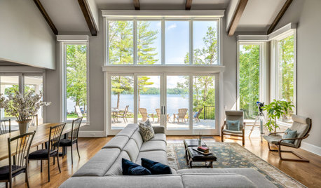
DECORATING GUIDESCould a Mission Statement Help Your House?
Identify your home’s purpose and style to make everything from choosing paint colors to buying a new home easier
Full Story
EXTERIORSHelp! What Color Should I Paint My House Exterior?
Real homeowners get real help in choosing paint palettes. Bonus: 3 tips for everyone on picking exterior colors
Full Story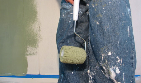
PAINTINGHelp! I Spilled Paint on My Clothes — Now What?
If you’ve spattered paint on your favorite jeans, here’s what to do next
Full Story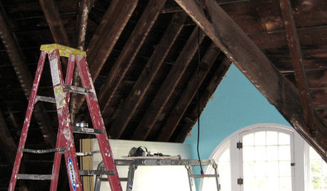
REMODELING GUIDES8 Lessons on Renovating a House from Someone Who's Living It
So you think DIY remodeling is going to be fun? Here is one homeowner's list of what you may be getting yourself into
Full Story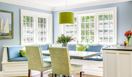
DECORATING GUIDESThe Dumbest Decorating Decisions I’ve Ever Made
Caution: Do not try these at home
Full Story
FEEL-GOOD HOME12 Very Useful Things I've Learned From Designers
These simple ideas can make life at home more efficient and enjoyable
Full Story

Sponsored


megpie77Original Author