SHOP PRODUCTS
Houzz Logo Print
soshh

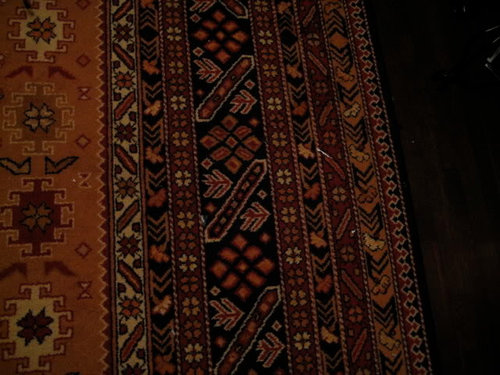
Rug as DR wall color inspirationor not?

soshh
16 years ago

Below is a pic. of my DR rug. I got it after the death of a family member, so though I do like the colors I might not have chosen it myself. I am a little stuck choosing a wall color to coordinate with the rug, and the rest of my first floor.

The chairs below are what I would eventually like to put in my DR. We have a farm table that I will probably restain to coordinate with the med-dark wood of the chairs, floor and trim in the room. The room is about 14x17, with a bank of 4 windows that faces west, so it is very bright in the late afternoon. There are archways on each side, and another window that faces north. Eventually, there will be even more archways to a new kitchen, pantry, etc. and very little wall space.

Since the trim is a dark wood, I feel the wall needs to be pretty deep to stand up against it.

The adjacent living room is BM Quarry Rock, a deep slate/blue/green/gray color that we love. The pantry will probably be a warm mid-toned gray (possible BM Pashmina or BM Sandy Hook Gray.) Future kitchen will be tons of subway tile, and (as of now) pale gray cabs, some stainless steel, a natural wood island, maybe some marble or soapstone.

The other element is window treatments. I bought tonal silk striped panels from RH in sangria that I will hang on each side of the bank of 4 west facing windows, not to cover them but to add a touch of elegance. I think we will keep the windows bare other than that.

So, what color would you choose? A deep gold, like BM Dorset Gold? A deeper tan? A muddy brick red that will blend with the rug and the silk curtain panels? A super dark inky black, to play off the color in the rug (it seems to have a hint of blue in the black, it's not jet black).

I am not afraid of color but I am scared the gold will seem out of place if there is no other gold on that level of the house. Also, the center of the rug where the majority of the gold is would be covered by the table and chairs.

I am pretty eclectic in my furnishings and decor. I don't like a ton of accessories, like a bold accent or two, fairly streamlined otherwise.

Would love to hear opinions!


Comments (46)

  • prairiegirlz5
    16 years ago

    I am sorry for your loss soshh, but I absolutely LOVE that rug and those chairs! I just had a similar chair recovered.

    I have to admit from the git-go that I don't know those other colors offhand, but if they're all shades of gray, and there's not too much wall space anyway in the DR, why not try matching the warm ivory tone in the rug?

    Sometimes less really IS more.

  • pbrisjar
    16 years ago

    I'd match the red.

  • Related Discussions

    color choices for LR/DR/K in new house - DULL?

    Q

    Comments (32)
    Thanks, blf. That is exactly what I love about this site. Honest criticism! It doesn't tie in with anything. The closest tie-ins might be the leather recliner and the fact that we used to live in Texas! Houzz shows tons of cowhide rugs these days, but maybe the rooms are more contemporary than mine. Maybe the cowhide rug in my room is just trying to hard to be different! Here is a link that might be useful: [Houzz cowhide rugs[(https://www.houzz.com/products/cowhide-rugs-prbr1-br~t_515~a_623-12946)
    ...See More

    Craig's List/Ebay DR: was vintage DR chairs

    Q

    Comments (18)
    Gee, thanks for all the compliments everyone! Squirrel, my local Craig's List is pretty bad too. I think you need to get near a metropolitan area to find the good stuff. That's why I drove to the Boston area to get the chairs. Actually Squirrel, I do have big favor to ask. If you ever have time, could you photoshop the Ballard Designs garden district mirrors where the current gold mirror is? I have a pair of them that I have been struggling to find a place for, and considered buying a couple more to make a foursome on the wall behind the table. Here is a photo from the catalog: I could also take photos of the two I have if that would help. If you're too busy, don't worry! kgwlisa, the buffet must stay right where it is! I just love it. And it was so fun getting it because it was a bizarrely warm day in January when we drove to NH, so warm in fact that we ended up at Hampton Beach walking barefoot at low tide and then going out for fried clams! So there are good memories with that buffet. If anything, it's really making my table look bad! Gardnergwen, the paint is Ralph Lauren Venetian Red. We used a gray primer and 3 coats on top (ouch!) Oh, and I forgot to add--the antique oil painting over the buffet was a gift from my Mom for my 40th birthday. It was $40 at an antique shop. I found the old gilt frame years before in someone's trash and it fit perfectly! The small oil landscape over the door was bought on Ebay several years ago as well (couldn't afford it now!)
    ...See More

    Should I consider this rug for my DR?

    Q

    Comments (46)
    I agree with you, eastautumn. I have had nearly all great experiences with CL, and most of the people are so nice. This rug came from a single guy who had bought it at a yard sale, and was leaving the area to move to Boston, where he had found a girl who he said is "the one". It was fun hearing his story, and his pricing was very fair. He found a stain that he had not disclosed originally and right away offered to reduce the price. He liked the rug but at this time was more concerned about moving quickly and efficiently, so the less "stuff" the better, and was happy to see it go. This transaction benefitted both parties, and those are the best kind. I'm sorry you had to deal with a seller that was a little less than honest,....all of us have run into that at one time or another. Thanks for your kind words about the rug. I really love it!!
    ...See More

    DR rug still out there.....could this be it?

    Q

    Comments (25)
    I have a PB 'Franklin' rug that I bought several years ago in a bedroom. I have had no issues with it at all. I suspect that the Eva is the same, a tufted wool rug. You can read about them on the PB web site, where the Eva is $999 for an 8 x 10. The eBay seller takes returns, but you'd have to pay for return shipping. They have 100% positive feedback, with 408 commenters. From PB on their Eva rug - "We are proud to offer our artisan-made rugs – each is hand tufted and washed for heft, beautiful luster and subtle color. Blooms of an ancient Mughal motif are surrounded by a wide palmette border and slim guard bands. Our rug is hand tufted in the ancient tradition of durable Heriz carpets. Rendered in jewel tones on a warm ivory ground. Handcrafted of pure, yarn-dyed wool by artisan rug makers. Luster washed for rich, mellow color and a silky feel. Sheared pile is velvety to the touch. Self bound for quality that endures. Use with our Rug Pad (sold separately). Rug swatches, below, are available for $25 each. We will provide a merchandise refund for rug swatches if they're returned within 30 days. Watch a video about the entire process of crafting our handmade rugs. Imported."
    ...See More
  • jejvtr
    16 years ago

    sorry for you loss

    The rug & chair are lovely - my 1st thought was ivory, then red - but seeing a pic of the existing space, table & perhaps drapery (even if not hung) would help

    Any chair rail there?

  • soshh
    Original Author
    16 years ago

    No recent loss (well, not this particular relative!) but thanks. My aunt passed away a few years ago and my brother helped pack up her home and took this rug for me knowing red and black are my favorite colors.

    No chair rail, but the ceiling has dark beams running across.

    This is the LR in progress, with the DR (used as FR) through the archway (soon to be trimmed out in wood, a PO removed).


    Below is a swatch of the curtain fabric. In person, it's very tonal and the stripe is subtle. They are just rod pocket panels that will hang from above the window moulding to the floor. The table is similar to my farm table, but mine is natural maple that I will stain darker (gel stain?). My legs are slightly different, but same idea. Eventually I might replace with a chunkier double pedestal, but it's solid maple and virtually indestructible!


  • teacats
    16 years ago

    A vote for a deep rich gold on the walls. My dining room is painted in Laura Ashley's Old Gold #5 -- a darker brown-gold. Works so well with the wood tones!


  • neetsiepie
    16 years ago

    Oh, your chairs are sooo gorgeous. I was going to say red, but after seeing your WT, I'm opting for the ivory color. Gold will compete too much with your furniture and chairs, red won't work with the LR, so I'd like to see a rich ivory.

    What do you have for a chandie? I'd put in a lot of wrought iron, play up the black in the rug, and it would fit well with the style of the furnishings & rug. What about the WT rod? Wrought iron would be good too.

  • squirrelheaven
    16 years ago

    I like the idea of a white too. Sossh, have you cleaned the rug yet? Is that a blue or a black? It looks like the colors could be freshened is why I ask -- thinking that 'blue' would come out more in the border. (Was just reading about old rugs on AtticMag : )

    Beautiful rug and those chairs are drop-dead gorgeous! I get a 'Spanish' feel from the pieces and the colors -- a European villa white on the walls would be awesome : ) Maybe look at some pics like that for overall color ideas : )

    Your lr is really looking great! and much like your inspiration virtuals.

  • Valerie Noronha
    16 years ago

    An ivory. Since you already have the rug before paint, you get the luxury to pull from the rug colors. Try to match to the lightest color in the rug (that little 12 footed character with the gold flower in the center).

  • soshh
    Original Author
    16 years ago

    Thanks all. In person the colors are most similar to the top rug pic, but IRL that ivory is really pretty deep (has a lot of "muddiness" in it). My house gets a lot of natural light so colors wash out very quickly.

    So, when pulling this color from the rug, how close do I try to match it?

    FWIW, I might not do the chair leather in that gold color, though I think it's beautiful. There is a chocolate brown or even black I might choose, just because I think it will work better with the rest of our stuff.

    There is a definite Spanish/mission feel to the house, so that works well, and part of the reason I thought those chairs would work with the house. It has a Spanish tile roof and is stucco! Hmm, maybe like a stucco color for the walls? It also has some Victorian and Colonial elements.

    For the chandelier, I have a few ideas. Part of me loves the idea of a lantern style. Not sure if these are big enough (17 inches square, and it is a pretty big room). Logically, the square makes more sense because of the rect. table and geometric patterns in the rug, but I do like the design of the round one too. Plus, they are fairly simple and not too ornate.


    I also like these, or my other idea is a more contemporary take, a big shade chandie.


  • loribee
    16 years ago

    Pretty rug! Wouldn't the room be gorgeous in a rich carmel color with chocolate chairs and the bottom light fixture?!?!?

  • squirrelheaven
    16 years ago

    I can so picture a stucco color for the walls. Not too yellow, imo. There's a lot of yellow in the rug, I think it would feel too yellow overall.

    Stylewise I like the first of fixtures best. Wondering if it's' massive enough. A big round like the last would be great, although that looks too light to me. Open to any Spanish influence there???

  • squirrelheaven
    16 years ago

    Was trying to find another big round and saw some others that might look nice.

    Chandy 1

    Chandy 2

    Chandy 3

    Chandy 4

    Chandy 5

  • soshh
    Original Author
    16 years ago

    Squirrel, those Chandy's are not really my taste, other than the last one, but even that I think is too ornate and I'd sooner go for the simpler RH version.

    Re: the colors is the rug and cleaning...the black isn't blue (even with cleaning) though there is a hint of blue in it, it's really dark. You are right, there is a lot of gold/yellow-orange in the rug and I DON'T want to accentuate that (my big dilemma with this one). It reads really orange, which is why I am almost afraid to go too light. I think then the orange will pop more.

    So a good question to ask is what will tone down the orange? Knowing color theory, I know using a complementary color with pop the orange, so perhaps the inky dark color would NOT be a good choice.

  • Robbi D.
    16 years ago

    What a great inspiration piece that rug is! I think a lighter version of the gold from the rug would be a good choice. And I love those chairs! When I decide to get some new dining room furniture, that is the style I'm leaning towards. Are there arm chairs to go with it?

  • squirrelheaven
    16 years ago

    I knew you wouldn't like the chandies : ) I did think maybe the pillar candle-like style might look nice on a big round. Ya never know! You seem to like clean lines. The last is more what I was thinking, a little heavier and Mediterranean with some detail, although the chains could stand replacing.

    Hard to escape the bold hot colors of the rug, but maybe lower the contrast with brown. A light to medium brown along with your rich browns in the chairs, a brown-white. Neutral or maybe a bit warm. Greens and blues will accentuate.

  • Kathleen McGuire
    16 years ago

    Those gorgeous chairs paired with the rug instantly gave me the feeling of rustic, spanish farmhouse. I also like the chandy's you pictured. If going for a soft white, than try SW Moderate White. Not too white, not yellow, but a warm white that would let the furnishings speak for themselves. I think Moderate White is what Allison has in her home. Maybe she will come by and give her opinion on it. I do see the yellow orange you speak of and would be afraid of adding more of it on the walls, but who knows? Maybe it would be gorgeous as well!

  • les917
    16 years ago

    Looking at the rug, I see the three figural pieces on the left in the pix - the top one is kind of an ivory tone. I would do that on the walls, with a texture to look like stucco, and then use an antiquing glaze over that to deepen the walls a bit and bring out the texture of the stucco. With all the dark wood in the room, and the strong colors in the rug and drapery, the antiqued stucco would be a nice balance. Then you could hang art or plates on the wall to further bring color into the space.

    Not crazy about the lantern chandeliers - to me they say entry hall. I think something like this, that has the iron look but not too Spanish in feel, though I would change out to warmer shades:

    solway collection chandelier

    I could see the chairs in a rich black suede/leather/microsuede seat, and a beautiful fabric for the seat back, rather than all leather, with bronze nailheads on both. It would give the visual weight of leather, but add some softness and interest with the fabric back.

  • Valerie Noronha
    16 years ago

    Regarding the chairs, I agree a brown or black would look better. I also agree with Les the first two fixtures are more for an entryway. I think the last one has potential (with the circular ring), though don't much care for the shades. Looks like you are on the right track. With the paint, I like the idea of some type of rustic textured look/glaze--that gives it a feel like plaster. Perhaps some type of sponge or ragging technique?

  • soshh
    Original Author
    16 years ago

    Les, I like the stucco/glaze idea. Might have to try that. I do not like that chandelier in this house.

    The chairs are from RH and only come with one fabric, so I would stick with leather for the durability, though I do like the idea of using a fabric on the seat back.

    I took pics and played in Photoshop. I should have deepened the wood color of the table, oops. But, at least you can see the room. The back wall with have a 5 foot archway to the kitchen and on the right will eventually be three archways so the room will be really perforated with light! Oh, the sofa and armoire will go to the family room soon, and this will become a full fledged DR. I do love an English library type look too.

    Thus far this is what I've come up with. In the pic I like the dark color better, not sure about IRL. It's tricky.


  • soshh
    Original Author
    16 years ago

    Here it is with a textural finish, darker table and lantern.


  • prairiegirlz5
    16 years ago

    I think in the last pic, you're more on track, but I personally really liked the caramel colored leather of the chairs in your first post.

    The only color fan I have at home here is Behr's White & Light Collection, so out of those I would pick Candlelight Ivory PWN-31 for the walls, also like the suggestion to add some texture. Venetian Plaster is a look I've only seen on TV, but it may be right for your home.

    I love these PB lanterns, you have just the right space for them.

    Here is a link that might be useful: Poterry Barn Hundi Lantern

  • soshh
    Original Author
    16 years ago

    Thanks! I DO think it could work with the light color. So unlike me! I liked the gold leather too, but if I do the light walls I think I might do the black leather.

    Any ceiling suggestions if I go light?

    I DO also like the dark color but I am afraid it would be too much with my dark living room. It would be like the left half of the house is dark and the right half light.

    Still not 100% sure on the lighting, but that and the chairs do not need TBD immediately.

  • syllabus
    16 years ago

    I'm seeing more of that type of lantern being used in DR decor in the mags. At least 3 mags in the past few months have had them in showcased homes. I love the look and think it fits right in w/ the direction you are going w/ the room. Love the idea of a textured stucco color for the walls.

    Don't get too hung up on "matching" colors to the rug. These rugs really can get along w/ just about any. Sometimes a broader contrast can be a good thing!

  • funkyart
    16 years ago

    My vote is for the caramel chairs.. and I'd still go with a gold wall with a fair amount of brown in it to tone everything down. I am already in the minority here so I am going to go ahead and share my other thought that won't be so popular.. If you want to tone down the yellow in the rug, I'd pass on the sangria curtains-- they will definitely make the yellow pop. I'd bring red into the mix-- but with artwork and dishware.. nothing with a sheen.

    I LOVE LOVE LOVE the lantern light. Did you keep the proportions somewhat close? I think it does a lot for the feel of the room.

  • soshh
    Original Author
    16 years ago

    The more I see it the more I love the lantern too! That is one thing I am sure about!

    Yes, I did keep the proportions of the lantern to room pretty true to life, it's about 17 inches wide and the table is 30 or so.

    I played around with golds in Photoshop and I just wasn't feeling them. I am also concerned about how gold would go with the rest of the main level of the house. I do love gold; painted the stairwell Ancestral Gold by SW but it's wayyyy too light (will probably make it a gray-green color) and DD3s room is BM Adam's Gold which I love. Maybe I will look at Adam's Gold in there. It's fairly neutralized and might pick up just enough of the gold in the rug.

    In that room, against the dark woodwork and with all the light streaming in everything just gets SO washed out.

  • squirrelheaven
    16 years ago

    Sossh, some stuff to look at. Hope you don't mind my doodling around here. I do love a color challenge : ) I'd take the walls down more, which is basically what I was doing, then played with the other colors a bit -- ie, ceiling and drapes. Tried on your brown chairs and then the black towards the end.

    It may just be the photo, but the drape fabric looks too rosy. Here are some other drape colors just to see how they look also. The last red may be more accurate to the Sangria that you have and is not as sharp as the first red.

    An olive type color looks great in there. Something like their Lichen fabric on the chairs -- although I know you want leather and I think that's perfect and perfect for those chairs in your room : ) Colorwise the overall is pretty nice though : )


    #1 Warmer red drape:


    #2 Warmer red drape:


    #3 Warmer red drape:


    #4 Burnt Spice drape:


    #5 Burnt Spice drape:


    #6 Another red, maybe the Sangria?


    #7 Another red, maybe the Sangria?


    #8 Another red, maybe the Sangria?


    #9 Lichen green, brown drape:


    #10 Lichen green, brownish drape:


    #11 Another red, maybe the Sangria?


    #12 Another red, maybe the Sangria?
    {{!gwi}}

  • soshh
    Original Author
    16 years ago

    Squirrel, you are awesome! The red drape is the Sangria, and online it does look very pink. In person it is warmer, but it may not be perfect. (I bought them at deep discount, so no biggie.) I also bought Textured Belgian Linen in Flax, so I've been hard at work myself trying out the caramel colors.

    I do like how it warms it up! You all are so cool, and I am grateful for the opinions! I was playing around with a color inspired by Richmond Gold from BM Historic Colors.

    Tell me what you all think? It really does look like a warm, cozy space which I love! I put the other colors on the first floor next to it, and I really don't think it's bad.

    Be honest! It helps. (On my other monitor this color is much warmer but on this laptop it gets a little washed out.) I think using so much of a muddy gold lessens the effect of it? Would you color theorists agree? It seems much more neutral.


  • soshh
    Original Author
    16 years ago

    Oh, and in the above color scheme I DO love the black chairs! So there we go, lantern, check, black chairs, check. Perhaps even flax linen curtains, check!

    I could see accessorizing with more black and whites, zebra, leopard, etc, all things I love. (In small doses of course.)

    We are considering building a high window seat above the radiator. I could do linen cushions with some kilim pillows and a few animal prints too. I think it really could work.

  • squirrelheaven
    16 years ago

    I think it looks great. Very nice work!! The black chairs work this way, not so much with the light walls (I see to much orange and black, although my chairs are just black blobs, lol). If what you're asking is if brown in the gold helps to tone down the rug and overall, I think it does, by creating a lower contrast and a warm balance. It looks rich and warm, but not so 'yellow' or orange. I think your accessories, like artwork, will bring enough red and green around and up off the floor. Those arches will be simply awesome with this room!

    Now for a chunkier table! : )

  • funkyart
    16 years ago

    I really think the "muddy" gold walls and brown furniture do what you were asking for-- I am no color guru but it sure seems to tone down the gold in the rug and it truly IS such a warm and inviting room. I love it!

    I still think it's possible that the sangria curtains will work... so don't lose hope. I've seen them and know that they are more rich than rosy (and lucky you-- my ex bought them full price heh)

  • squirrelheaven
    16 years ago

    So, I guess you need a gold that reads that deep with all the daylight you get streaming in. Otherwise, you might end up with a more 'yellow' effect. Hm?

    Warm cozy rooms are spectacular, esp in the dining room, too! Maybe you could get some of those realistic candle bulbs for the lantern : )

    Here is a link that might be useful: Moving Candle Flame Bulbs

  • squirrelheaven
    16 years ago

    I'd do an Old World finish with that color, but not a stucco, myself.

  • mommyto4boys
    16 years ago

    Your room is going to look awesome. Love the rug, chairs and table! One more lighting collection, suggestion for you...Bellacor.com as a collection from iron works that are beautiful. The pictures don't do them justice...I've ordered 4 from that collection. The prices are great too!

  • soshh
    Original Author
    16 years ago

    Squirrel, what do you mean by "I'd do an Old World finish with that color, but not a stucco, myself."

    What type of Old World finish? And you are correct. With all the light coming in (esp afternoon to evening when the room will most often be used) there is a lot of light streaming in so the color does need to be quite rich or everything gets so washed out. I love it, don't get me wrong, but with that dark wood I definitely need a balance. It will definitely take some samples to find the right caramelly-tan-gold color. I don't want it to read yellow, but don't want it to look just tan either. It definitely has to have some "dirt" in it.

    With my LR in the Quarry Rock, my good friend ((an artist who loves white and her house (just down the street) is mostly China White with Dove White trim)) says the rich color makes the woodwork sing. I would love this room to have the same feeling.

  • squirrelheaven
    16 years ago

    Something with a lot of depth and tonal variations (not sponge-work). I guess it's what you get with stained smooth plaster? Since you have a contemporary edge, I wonder if a suede treatment would work nicely.

    I get an ochre over here.

  • susanlynn2012
    16 years ago

    I loved the sangria curtains and I love those chairs in either the caramel or the black color. I like the lantern chandelier look also. So many of the colors look wonderful to me and I would go with what you like. I love the rug and the colors within it.

  • squirrelheaven
    16 years ago

    Looking for Spanish ochre walls, lol. Found these beautiful Spanish tables. The one is similar to what you have but beefier. No sizes indicated, just an advertising site. Your farm table looks quite light in scale and proportion. I'm not sure it holds up to your chairs.

    Spanish Farm Table

    Spanish Double Pedestal Table

  • squirrelheaven
    16 years ago

    Here's Ralph Lauren's link to the suede. I was thinking a broader pattern, but this is really nice. Rich and sophisticated. Can definitely picture it in there.

    Maybe something between Adobe and Mochernut?

    Here is a link that might be useful: Lauren Suede Paint

  • neetsiepie
    16 years ago

    My 2 cents...if it were my room I'd go with the lighter color you posted in the first set of pix. Stay with the red WT, and the original gold leather. Love the lantern chandy. I'd do the ceiling in the gold in your last photo.

    I am not loving the greenish chairs in that room. It seems like yet another color competing with the vibrant colors of the rug.

    Alternatively, if you go with the last color you posted, stay with the red drapes. They really work great.

    I did a faux stucco finish in my kitchen, and I love it so much that I did it in the master bath, too. I used joint compound (used for sheetrock seams) and spread it on thinly. Then went over it with a damp sponge, pushed it in, then pulled off, leaving spikes. Then knocked that down with a trowel. Once it dried (waited a couple days) I painted it an ivory color then went over that with an antique glaze.

    I find it quite easy to clean, the glaze acted like a sealer. I can't photograph it well, so no pic, but if you really wanted one I'd try to do it again.

  • soshh
    Original Author
    16 years ago

    Squirrel, I could totally see some of those tables in that room. I love the double pedestal, but then I loved so many more too.

    We bought that maple table about 11 years ago and it has served us well. I saw on tablelegs.com I can buy chunkier legs and a stringer type base. Not sure it would work. I will look at CL too, you never know.

    I have the RL suede book, so I will look at the colors IRL.

    Pesky, a subtle gold on the ceiling, like RL candlelight, is a great idea. I do think I like the warmer wall color better, just knowing the space and the feel that's my instinct right now, but the red curtains may still work. I have both so no big deal to decide after the paint is in. Black chairs are it for me, I decided against the Moss.

    Thanks for your input!

  • Robbi D.
    16 years ago

    I just wanted to say, I really like the direction this room is going!! It's got me rethinking how I want to decorate my living room. Now, if I can just find the right love seat and over sized chair.

    Also, I had BM Richmond Gold as one of the two finalists in the colors to paint my living room (covering paneling). It is a beautiful color and the only reason I didn't was because it was a little dark. Since I was trying to cover the dark paneling, I was defeating my purpose. I didn't paint the ceiling, it is still paneling and the Richmond Gold was just too close to the wood tones, though it did blend nicely. I ended up using BM Twilight Gold.

    Again, I can't wait to see how the room comes out. I also like the idea of texture on the walls (I'm too much of a chicken to use them myself).

  • Kathleen McGuire
    16 years ago

    Haven't read all the posts yet. I stopped after you put the Richmond Gold up there. That was what I was going to suggest! I was looking in House Beautiful last night and they had a room in Richmond Gold and I thought THAT would be the color I wanted to suggest! You beat me to it! The mag had it in a venetian plaster. Gorgeous, but unless you've done VP before, it is a LOT of work! Simply painting in RG would be beautiful! Very warm caramel-y color!

  • Kathleen McGuire
    16 years ago

    Here is the DR in BM Richmond Gold HC-41 venetian plaster. Notice it is paired with silvery blue drapes and lavender cotton chairs. The parquet floors are a similar tone as the walls.
    {{!gwi}}

  • soshh
    Original Author
    16 years ago

    KMCG, thanks! Funny how they put that with the gray and lavender, I never would have thought that but cool that my adjoining rooms will all be in the gray family.

    I keep looking at my final mock up and can't believe how much I love it! And I was just about to give up and put the rug in the basement!!!

  • Valerie Noronha
    16 years ago

    I also like where this is going colorwise. The gold (w/ or w/o some type of venetian plaster/suede treatment). I think you are right on with taking into account the light that floods your room each day. I would just make sure you account for that effect in the evenings with light fixtures. Perhaps add a sideboard with a couple of buffet lamps and or a couple of wall sconces that complement your ceiling fixture--so it feels warm and cozy at night. I also would like to see the Sangria drapes in that space. I have seen those at RH before so I know what you mean--they are not pink, more of a bronzish red if I recall. When I was choosing colors recently, one of the salespersons at BM was saying in color theory when you combine colors in same vincinity, to match that saturation or hue. I think either the brown or black leather chairs would work, though I would suggest choosing the one that best compliments your ceiling fixture.

  • Kathleen McGuire
    16 years ago

    Definately worth sampling! I love your mock-up also! I keep scrolling up and down because the similarity is amazing! Not usually seen in a virtual. Great work! Keep us posted. P.S. I think the lighter drapes help it from coming across as too dark. No matter what color you choose, the drapes wiil fall into place. You will know if the red will work or not. FYI, the adjoining room to this photo is painted in BM Desert Tan 2153-50 and the accent colors used throughout are orange, lavender and yellow.
    It definately will work with your rug! Good luck!

Sponsored
Daniel Russo Home
Average rating: 4.7 out of 5 stars13 Reviews
Premier Interior Design Team Transforming Spaces in Franklin County