


Has anyone used BM Mascarpone?
lisa_mocha
14 years ago
Featured Answer
Sort by:Oldest
Comments (28)

beadweaver
14 years agowi-sailorgirl
14 years agoRelated Discussions
Has anyone used BM White Opulence as a trim paint?
Comments (1)White Opulence gives off an undeniably pink hue when used over a large surface area, and I would personally recommend against using it in isolation for trim. It might work well if your walls are also White Opulence or another red-based color. There is another long thread here at Houzz discussing all angles of White Opulence you may wish to review: https://www.houzz.com/discussions/5358233/benjamin-moore-s-white-opulence-paint-color...See MoreWhich cabinet color-Simply White vs. White Dove?
Comments (134)I always use an extender with Aura. It gives you more time before drying. If you're painting a bathroom, research "surfactant leaching." This happens when the paint in a bathroom isn't fully cured, and you use the shower. Google photos of surfactant leaching. Most paint stores will say latex cures in a few days, but I had this problem in two homes and did extensive research. You get ugly drips down the walls, and they are yellow or brown. You can wash it off, but it comes back. Now, when I paint a bathroom, I wait 30 days before using the shower. That may be overkill, and if you only have one shower, that would not be possible....See MoreHas anyone used BM Titanium or White Diamonds Paint
Comments (12)A note to remember that color is *so* influenced by light, as les reminded on another thread. We have a beautiful BM light silvery blue in DD's bath, just the most amazing tone but I painted it on a door that adjoins the bath, literally right next to it but different light because it's not lit by daylight directly (the bath has a large skylight) and it comes out reddish gray! Seriously. We have titanium in a hallway and it reads silvery blue. No direct natural light (the hall opens to rooms with windows, but has no direct access to windows itself). Short version: I'd suggest getting a sample, painting it on a board or on some watercolor paper, and holding it up in your space for 24 hours to see what overtones come out. You might be surprised. For instance, enduring's version comes out green because green is the complement of the reddish tone in the cherry. If you have other tones, you might end up with what you want....See MoreIf anyone has used BM's Harmony could I get your thoughts
Comments (6)Tibbrix- I loved Frappe but it was way too light , especially on the stairwell. Hollykay is correct about Straw Hat having green undertones. Because of living in the woods I already have a greenish light coming in that area so I am finding anything yellow or yellow green goes greenish. While I don't like reddish undertones, I am finding that I need a color to counter the greenish light. I'm also looking at Mushroom by Ellen Kennon that was suggested by Funcolors. I sure don't want to do any worse than the orangey beige I have currently....See More
lisa_mocha
14 years agowi-sailorgirl
14 years agoamberley
14 years agoloreebee
14 years ago
southern_vesta
14 years agobwhite_starnet_com
13 years ago
amck2
7 years agolexiedog3
4 years agogoodiesforus
3 years agoHU-11430583
3 years agolast modified: 3 years agolexiedog3
3 years agolast modified: 3 years agoHU-11430583
3 years ago
susanparker
3 years agoHU-11430583
3 years agoMara100
3 years ago
barbie08075
3 years agoukessea
3 years agosusanparker
3 years ago
cat_mom
3 years ago
Becky H
3 years agoaprall
2 years agoBecky H
2 years agoBecky H
2 years agojillkinney00
2 years agonilarose
5 months ago
Related Stories
LAUNDRY ROOMSThe Cure for Houzz Envy: Laundry Room Touches Anyone Can Do
Make fluffing and folding more enjoyable by borrowing these ideas from beautifully designed laundry rooms
Full Story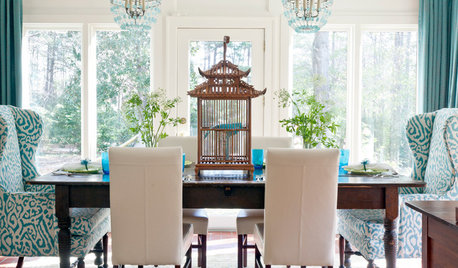
DECORATING GUIDESDecorating 101: How to Use White Right
If you’ve ever been in white-paint-swatch limbo, you know white can be tricky to work with. Here’s how to get the fresh look you’re after
Full Story
MOST POPULAR7 Soothing Spaces: How to Use Color to Create Calm at Home
Started your new year on the wrong foot? Feeling the February blahs? Maybe you need a color fix in your home
Full Story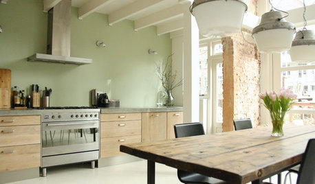
COLOR4 Cool Paint Colors Touted for 2014 — and How to Use Them
Muted but complex, these hues from Farrow & Ball can stand on their own or play supporting roles
Full Story
COLORBest Ways to Use the Soft Yellow Color of 2014
You may fall for PPG Pittsburgh Paints’ Turning Oakleaf if you like your hues warm, mellow and cheery
Full Story
DINING ROOMSColor Feast: When to Use Gray in the Dining Room
The right shade of gray pairs nicely with whites and woods to serve up elegance and sophistication
Full Story
COLORBest Ways to Use the Neutral Green Color of 2015
Benjamin Moore’s Color of the Year is soft and natural
Full Story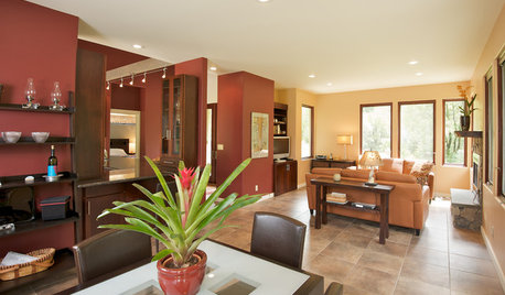
COLORHow to Use Marsala, Pantone’s 2015 Color of the Year
Pantone digs deep and goes earthy with its selection. Here are ways to make it work in your home
Full Story
FEEL-GOOD HOME12 Very Useful Things I've Learned From Designers
These simple ideas can make life at home more efficient and enjoyable
Full Story
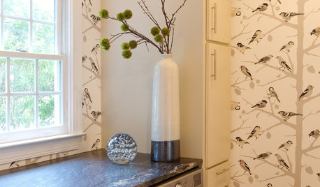
KITCHEN DESIGNCooking With Color: When to Use White in the Kitchen
Make sure your snowy walls, cabinets and counters don't feel cold while you're riding white's popularity peak
Full Story

janetrperlmutter