


Begging for neutral paint color help!!! Please!
nutmegxo
14 years ago
Featured Answer
Sort by:Oldest
Comments (112)

scanmike
14 years agolast modified: 9 years agonutmegxo
14 years agolast modified: 9 years agoRelated Discussions
I beg of you, please help with wall colors for whole house!
Comments (7)ammysrq: Soonish did mean this spring but we're not ready, probably next spring. We live in what most people would consider the boonies although we do live on a road with multiple houses on it, none of which has been on the market recently. Not a development kind of thing. annie1971: Good point, got any suggestions :) Thank you both for taking the time to read my post and then responding....See MorePaint Color Experts - please help - neutral grey for exterior
Comments (0)Hello All, Please give me your choices for the best neutral grey color for exterior. I have painted several sample boards - they either read too brown, purple or blue. Looking for the most neutral read with a medium LRV 32-39 please. So far, the best has been Dorian Grey SW- but hoping for more suggestions. I will cross post this in decorating as well. Thank you in advance....See MorePlease suggest a nice, neutral warmish paint color.
Comments (14)Thanks for all of the feedback so far. I'm not being rude. I really am looking at all of these colors. Just haven't gotten back here yet to address you all in more detail. So far the Accessible Beige is really a winner... tried to google images to discern the difference between the Accessible Beige and the Kilm Beige that I have now. Maybe a little less tan and a little lighter? Talked to dd last night since I love her color. Some kind of something ...pewter, but really looks very neutral. But it is a BM color and I have to choose SW. I will keep looking today at more of your suggestions! Thank you....See MorePaint Help please!!! Looking for warm neutral.
Comments (66)Kautry, There is a Sherwin Williams Crisp Linen my friend used on the walls in her house. I just looked it up and there is also a Benjamin Moore Crisp Linen by the same name. We would love pictures. https://www.benjaminmoore.com/en-us/color-overview/find-your-color/color/csp-305/crisp-linen?color=CSP-305...See More
jane__ny
14 years agolast modified: 9 years agonutmegxo
14 years agolast modified: 9 years agoscanmike
14 years agolast modified: 9 years ago
Kathleen McGuire
14 years agolast modified: 9 years ago
rococogurl
14 years agolast modified: 9 years agomy3babypeaches
14 years agolast modified: 9 years agoscanmike
14 years agolast modified: 9 years agonutmegxo
14 years agolast modified: 9 years agorococogurl
14 years agolast modified: 9 years agoamysrq
14 years agolast modified: 9 years agonutmegxo
14 years agolast modified: 9 years agoscanmike
14 years agolast modified: 9 years agoamysrq
14 years agolast modified: 9 years agoaddyson_andrews
14 years agolast modified: 9 years agoscanmike
14 years agolast modified: 9 years agopumpkin_spice
14 years agolast modified: 9 years agonutmegxo
14 years agolast modified: 9 years agoscanmike
14 years agolast modified: 9 years ago PRO
PROLori A. Sawaya
14 years agolast modified: 9 years agonutmegxo
14 years agolast modified: 9 years agonutmegxo
14 years agolast modified: 9 years agonutmegxo
14 years agolast modified: 9 years agoscanmike
14 years agolast modified: 9 years ago
Lyban zone 4
14 years agolast modified: 9 years agonutmegxo
14 years agolast modified: 9 years agopumpkin_spice
14 years agolast modified: 9 years agoscanmike
14 years agolast modified: 9 years agonutmegxo
14 years agolast modified: 9 years agoscanmike
14 years agolast modified: 9 years agodawnp
14 years agolast modified: 9 years agonever_ending
14 years agolast modified: 9 years agonutmegxo
14 years agolast modified: 9 years agoKathleen McGuire
14 years agolast modified: 9 years agoscanmike
14 years agolast modified: 9 years agonutmegxo
14 years agolast modified: 9 years agotfm1134
14 years agolast modified: 9 years agopumpkin_spice
14 years agolast modified: 9 years agobiochem101
14 years agolast modified: 9 years agonutmegxo
14 years agolast modified: 9 years ago
redbazel
14 years agolast modified: 9 years agobiochem101
14 years agolast modified: 9 years agoloribee
14 years agolast modified: 9 years agonutmegxo
14 years agolast modified: 9 years agogreenthumbfish
14 years agolast modified: 9 years ago
denali2007
14 years agolast modified: 9 years ago- PRO
Lori A. Sawaya
14 years agolast modified: 9 years ago nutmegxo
14 years agolast modified: 9 years ago- PRO
Lori A. Sawaya
14 years agolast modified: 9 years ago

Related Stories


HOUZZ TOURSHouzz Tour: A Neutral Palette Pleases By the Sea
Designer Phoebe Howard creates earth-toned elegance for a family's Florida beach getaway
Full Story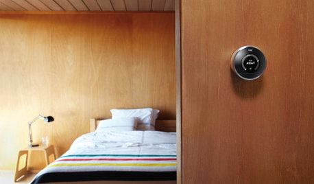
ACCESSORIESEveryday Home Must-Haves Beg for a Makeover
The Nest's much-improved take on the thermostat has us pondering reinventions of other necessities around the house
Full Story
LIVING ROOMSCurtains, Please: See Our Contest Winner's Finished Dream Living Room
Check out the gorgeously designed and furnished new space now that the paint is dry and all the pieces are in place
Full Story
EXTERIORSHelp! What Color Should I Paint My House Exterior?
Real homeowners get real help in choosing paint palettes. Bonus: 3 tips for everyone on picking exterior colors
Full Story
HOME OFFICESQuiet, Please! How to Cut Noise Pollution at Home
Leaf blowers, trucks or noisy neighbors driving you berserk? These sound-reduction strategies can help you hush things up
Full Story
COLORPick-a-Paint Help: How to Quit Procrastinating on Color Choice
If you're up to your ears in paint chips but no further to pinning down a hue, our new 3-part series is for you
Full Story
COLORPaint-Picking Help and Secrets From a Color Expert
Advice for wall and trim colors, what to always do before committing and the one paint feature you should completely ignore
Full Story
COLORPick-a-Paint Help: How to Create a Whole-House Color Palette
Don't be daunted. With these strategies, building a cohesive palette for your entire home is less difficult than it seems
Full Story
SELLING YOUR HOUSE10 Tricks to Help Your Bathroom Sell Your House
As with the kitchen, the bathroom is always a high priority for home buyers. Here’s how to showcase your bathroom so it looks its best
Full Story


Melissa Shelton