


Cast your vote please! Bedroom color pics...
kabergs
16 years ago
Sort by:Oldest
Comments (40)
Related Stories
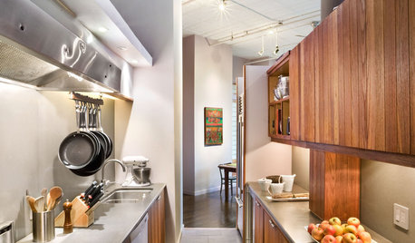
KITCHEN DESIGNKitchen Layouts: A Vote for the Good Old Galley
Less popular now, the galley kitchen is still a great layout for cooking
Full Story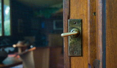
REMODELING GUIDESOriginal Home Details: What to Keep, What to Cast Off
Renovate an older home without regrets with this insight on the details worth preserving
Full Story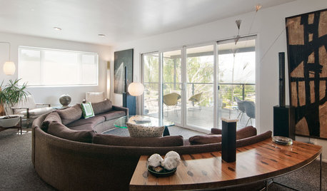
HOUZZ TOURSMy Houzz: Midcentury Cool With a Killer View in Salt Lake City
An all-star cast of iconic vintage furnishings makes this Utah home period perfect through and through
Full Story
DECORATING GUIDESPaint Color Ideas: 8 Uplifting Ways With Yellow and Green
Dial up the cheer with yellow and green paint combinations sure to cast off winter doldrums
Full Story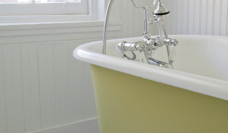
BATHROOM DESIGNRub-a-Dub-Dub, Add Color to Your Tub
Perk up that old claw-foot with a hit of paint that’s as bold or subtle as you please
Full Story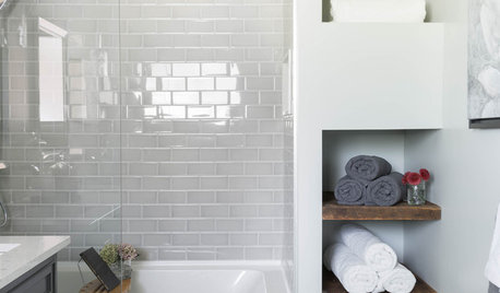
BATHROOM MAKEOVERSHouzz Call: Tell Us About Your Bathroom Remodel!
Did you recently redo your bath? Please tell us about your upgrade and what it took to get there
Full Story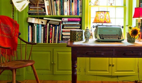
GREENColor Guide: How to Work With Chartreuse
As earthy or electric as you please, this yellow-green hue brings the zing or just freshness to homes from traditional to modern
Full Story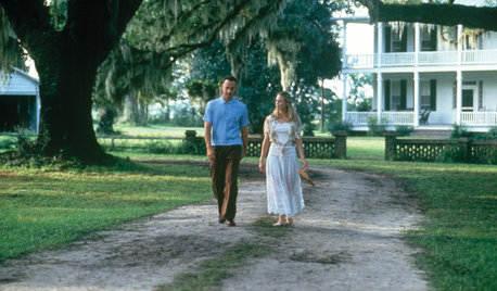
The Unofficial Houzz Academy Awards for Movie Homes
Grab a front-row seat as we hand out honors to superb homes featured in 10 flicks. The envelope, please ...
Full Story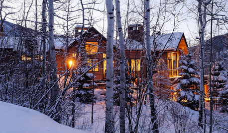
LIFEHouzz Call: Who'll Post the First Snow Photo of 2013?
If the weather's been flaky in your neck of the woods, please show us — and share how you stay warm at home
Full Story
PRODUCT PICKSGuest Picks: What’s Purple All Over?
With kitchen appliances, pillows, chairs and more in shades of lavender to plum, your home can be as purple as you please
Full Story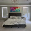


ideamom
amysrq
Related Discussions
VOTE!! Pic included! About To Purchase this bedroom..
Q
pale gray or tan pics in bedroom please?
Q
Please post pics of darker bedroom colors!
Q
Is White Just Boring? Bedroom Color Help Please! (lots of pics)
Q
organic_smallhome
littledog
les917
patricianat
organic_smallhome
johnatemp
hoyamom
fran1523
squirrelheaven
lindybarts
CaroleOH
organic_smallhome
duffy0401
squirrelheaven
kabergsOriginal Author
kabergsOriginal Author
jejvtr
kats
susanlynn2012
organic_smallhome
brutuses
amysrq
susanlynn2012
amysrq
threedgrad
kabergsOriginal Author
Kathleen McGuire
kabergsOriginal Author
mqmoi
squirrelheaven
kabergsOriginal Author
squirrelheaven
Kathleen McGuire
squirrelheaven
hoyamom
kabergsOriginal Author
hoyamom
kabergsOriginal Author