


Banish the color wheel.
ironbelly1
16 years ago
Sort by:Oldest
Comments (53)
Related Stories
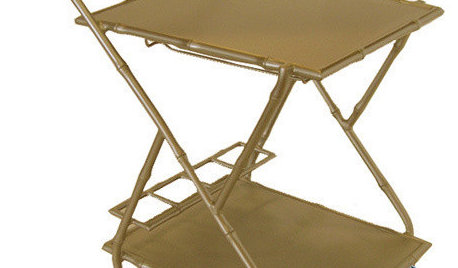
Guest Picks: Serving Up the Best Bar Carts
Pick a cart and fill with your favorite libations to wheel in fun for any party
Full Story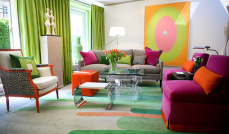
BOLD COLORBe Bold, Be Brave With Color
Add some fearless color to your home with help from designers who do it well
Full Story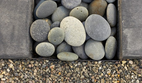
LANDSCAPE DESIGNThe Right Stone for Your Garden Design
Gravel, pebble, cobble and paddle: Stones vary in size and shape, and have different uses in the landscape
Full Story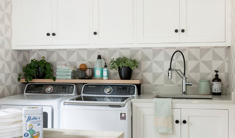
HOUSEKEEPINGYour Guide to a Spotless, Beautifully Organized Home
Use our 7-day plans to bring order and cleanliness to each room of your house
Full Story
MOST POPULARThe Unexpected Color That Goes With Everything
Move over, beige. Green is staking its claim as the freshest neutral around
Full Story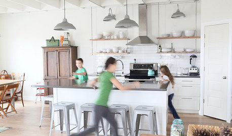
MOST POPULARA Fine Mess: How to Have a Clean-Enough Home Over Summer Break
Don't have an 'I'd rather be cleaning' bumper sticker? To keep your home bearably tidy when the kids are around more, try these strategies
Full Story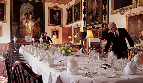
FUN HOUZZEverything I Need to Know About Decorating I Learned from Downton Abbey
Mind your manors with these 10 decorating tips from the PBS series, returning on January 5
Full Story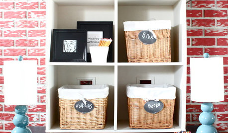
KIDS’ SPACESCreate a DIY Homework Station They’ll Really Use
Start the school year on the right foot by setting up an inviting study zone with things you may already own
Full Story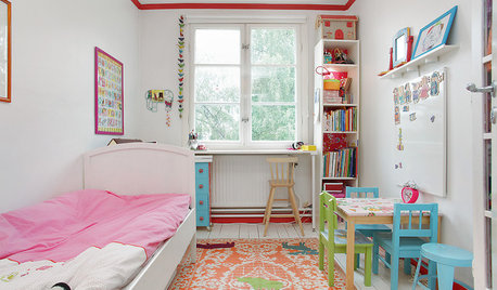
LIFEStop the Toy Takeover by Changing the Way You Think
Make over your approach and get gift givers onboard with your decluttering efforts by providing meaningful toy alternatives
Full Story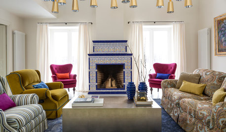
TASTEMAKERSWorld of Design: Where Color Trends Begin
Colors go in and out of vogue. Here’s how they make their way into our home decor
Full Story
maro
ironbelly1Original Author
Related Discussions
Color wheel and greys
Q
Complicated question about color wheel color schemes.
Q
All over paint color - Wheeling Neutral ?
Q
Parquet must be banished?
Q
Saypoint zone 6 CT
pls8xx
mjsee
inkognito
bahia
ironbelly1Original Author
rhodium
gardengal48 (PNW Z8/9)
laag
catkim
inkognito
landart
inkognito
ironbelly1Original Author
mad_gallica (z5 Eastern NY)
ironbelly1Original Author
mad_gallica (z5 Eastern NY)
woodyoak zone 5 southern Ont., Canada
inkognito
inkognito
woodyoak zone 5 southern Ont., Canada
Embothrium
ironbelly1Original Author
Embothrium
woodyoak zone 5 southern Ont., Canada
bahia
laag
woodyoak zone 5 southern Ont., Canada
ironbelly1Original Author
bahia
tibs
gardengal48 (PNW Z8/9)
ironbelly1Original Author
bahia
ironbelly1Original Author
inkognito
laag
duluthinbloomz4
Embothrium
ironbelly1Original Author
wellspring
nandina
bahia
wellspring
ironbelly1Original Author
kristin_flower
gigiwigi
irene_dsc