


Colour bind
inkognito
17 years ago
Sort by:Oldest
Comments (27)
Related Stories
NEUTRAL COLORSColor Guide: How to Work With Beige
If you yawn and dismiss it, you're missing out on beige's infinite subtleties and the possibilities it brings to room designs
Full Story
DECORATING GUIDESCreate a Classic Look With Beautiful Blue and White
These techniques and patterns from around the world never go out of style
Full Story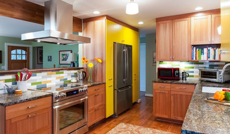
KITCHEN DESIGNThrowback Kitchen Gains Countertop Space, Color and Smart Storage
Pullout pantries, sustainable hardwood cabinets and all-new appliances turned this kitchen into a showpiece for a Portland couple
Full Story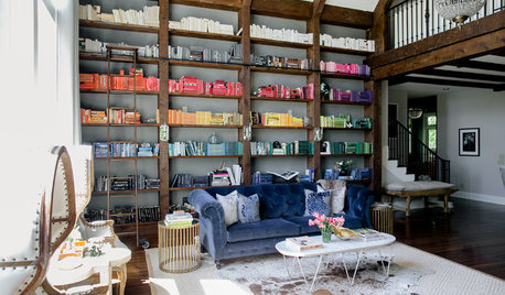
ROOM OF THE DAYRoom of the Day: Color-Coded Bookcase Spiffs Up a Nashville Library
Starting from nothing, designer Hannah Crowell crafted an eclectic decor scheme that turns traditional style on its head
Full Story
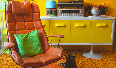
HOUZZ TOURSMy Houzz: Groovy 1970s Retro Pad in Los Angeles
Tune in to a dazzling kaleidoscope of colors, collectibles and vintage furnishings in this lovingly curated, mod California home
Full Story
DECORATING GUIDESGet the Scoop on Finding the Best Paint for Your Money
Scoring the best deal on paint for your home may have nothing to do with advertised specials
Full Story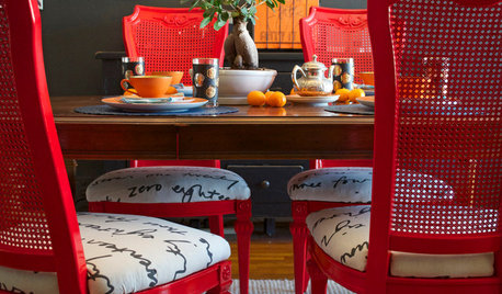
DIY PROJECTSDining Set Makeover: Paint and Tea-Tinted Fabric Make Old Chairs New
Reclaim dated dining chairs for far less than buying new, using spray paint, modern fabric and a handful of tea bags
Full Story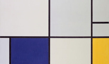
DECORATING GUIDESInteriors Need Energy? Look to Mondrian’s Paintings for Inspiration
The Dutch master of abstraction can help you return to basic colors, create zones, highlight function and more
Full Story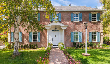
LANDSCAPE DESIGNHow to Make Your Brick House Feel at Home in the Landscape
Use these tips to pull your home’s colors into your garden for a more cohesive exterior look
Full Story

Cady
barefootinct
Related Discussions
red/white checker quilt pics
Q
The result of a binding transplant!
Q
has anyone changed the color of binds
Q
BM Color Samples are not the same as "Paint", lack binding agent
Q
rusty_blackhaw
annieinaustin
inkognitoOriginal Author
miss_rumphius_rules
cantstopgardening
mjsee
Cady
rusty_blackhaw
catkim
bahia
barefootinct
barefootinct
nandina
inkognitoOriginal Author
inkognitoOriginal Author
prairie_love
Cady
mjsee
Cady
rusty_blackhaw
paigect
watergal
paigect
inkognitoOriginal Author
barefootinct