


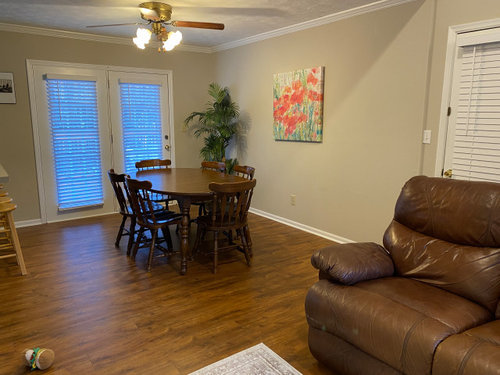
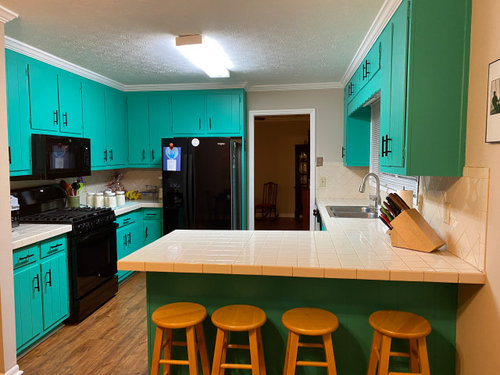
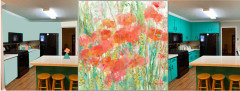
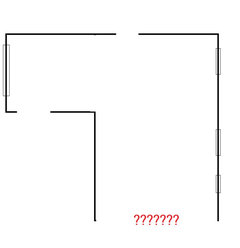
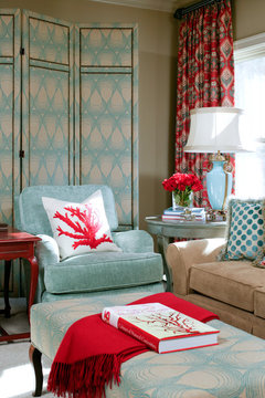
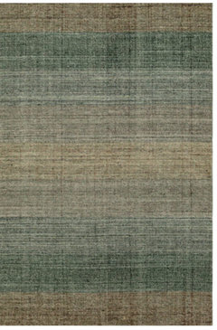
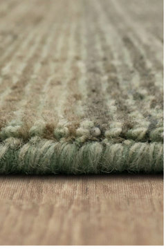
For those who like a challenge!
3 months ago


Featured Answer
Sort by:Oldest
Comments (24)
Related Discussions
For those who want a challenge- pic
Comments (7)Ok I dug it up. The leaves are attached to a 4-5 inch white stem which is attached to a small brown bulb with a basal plate and roots coming out the bottom. The bulb is no bigger than a thimble and shaped roughly like a hershey kiss without the curl on top. I replanted it in a sunnier spot. Does that sound like anything you can name? karen...See MoreSilly hood question for those with (or who like!) vintage ranges
Comments (28)Yup, I think we're tiling at least part of that wall (it wraps around in an L from the sink wall, so I can't figure out where to stop the backsplash otherwise---right now there's a chimney and it stops at the chimney). I had the same issue with many of the Victorian or 50s hoods looking, well, too Victorian or 50s...and we're not even going for true "period" per se. I'm hoping a simple modern hood will do the trick if I can find one that looks right---we're also not hiding the dishwasher, etc. so I figure throwing in some modern trappings isn't such a bad thing at that point. The Vent-a-Hood website, while mostly filled with lots of hoods that are out of our budget, did have some nice photos of canopy style hoods used as freestanding hoods with no cabinets, though (and I actually think those look great with cabinets to the sides, so maybe something that could work for yours?) The funny part is that we have the ceiling fan with the pull-switch right now (not that we use it as it shorts the kitchen out with the new GFCI outlets...) I went through a very brief little period of wondering if we could add a modern blower up in the attic and still use the old fan, since it looks really cool (probably c. 1950, all chrome-y) but got vetoed incredibly quickly on that one! We're trying to think of creative places to use the vent cover and an iron cover that's part of our built-on ironing cabinet that sadly is coming out with a wall removal, and has sparks cut out all over it---also very cool, and can't wait to see it when the paint is stripped!...See MoreFor those who use parchment paper or those who don't like it!
Comments (11)My Reynolds parchment paper is good to 420ð, too. I don't think I never need to go over that when using it. Mostly, I use parchment paper for baked goods, but when I use it for the occasional main dish, it's something that's cooked fairly gently, not blasted. My problem with the Martha wrap is having to throw away two products, instead of just one. I usually recycle my parchment paper a few times before I throw it away, and even then, I'm wishing I could recycle. Unfortunately, I've tried the Silpats, and don't like them nearly as much....See MoreTo all flowers fans who would like to take part in my photo challenge
Comments (0)I would love to invite you to my flowery contest for the chance of winning Kindle Fire HD7. More details: http://leafcanoe.com/spring-contest/ Please share it kindly with your wonderful community of flowers fans and your dear friends who love taking pictures of flowers even if the use simply their iPhones or iPads. I wish you all happy blossoms & good luck!...See More PRO3 months agolast modified: 3 months ago
 3 months agolast modified: 3 months ago
- 3 months ago


Related Stories
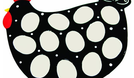
PRODUCT PICKSGuest Picks: Egg Platters to Keep Those Devils in Their Place
You just might cluck with delight over these perfectly portioned egg plates for Easter and beyond
Full StoryBATHROOM DESIGNBathroom of the Week: Pamper-Me Features and Marble-Like Tile
An Orlando, Florida, couple’s former cramped, dated master bathroom gets an elegant, contemporary update
Full Story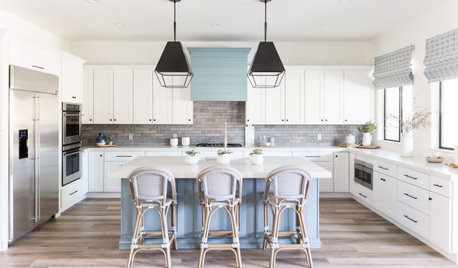
LATEST NEWS FOR PROFESSIONALS‘Challenge Your Clients’ and More Insights From Design Pros
Five design pros share business knowledge gained from recently completed renovation projects
Full Story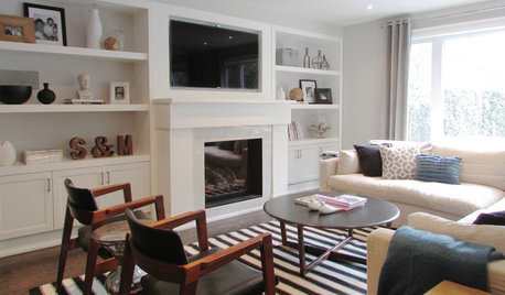
HOUZZ TOURSMy Houzz: Rising to the Renovation Challenge in Toronto
An eye for potential and substantial remodeling lead to a chic and comfortable home for a Canadian family
Full Story
DECORATING GUIDESFix Those 'Whoopsies': 9 Fast Solutions for Decorating Mistakes
Don't suffer in silence over a paint, furniture or rug snafu — these affordable workarounds can help
Full Story
MOST POPULARGet Organized: Take a 10-Day Simplification Challenge
Organizational expert Emily Ley helps us get a jump-start on our New Year’s clear-outs
Full Story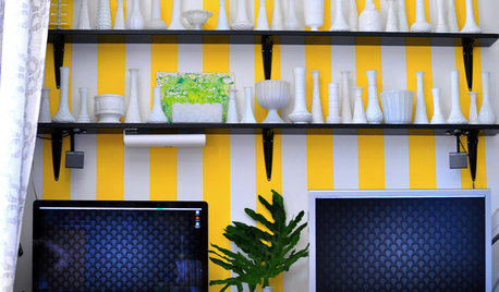
ACCESSORIESHow to Hide Those Messy Wires
Untangle Yourself From Ugly Electrical Cords With a Few Tricks and Accessories
Full Story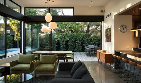
HOUZZ PRODUCT NEWS9 Architects Share What It’s Like Being a Woman in Architecture
For International Women’s Day, female architects around the world reflect on their careers and how the field has changed
Full Story
HOMES AROUND THE WORLDWorld of Design: 11 Book Lovers and Where They Like to Read
Bibliophiles across the globe reveal their top books and favorite reading spots, from a 2-story library to an artfully curated book nook
Full Story
STAIRWAYSArt Rises to Staircase Challenge
It can be tricky to make the most of a staircase's wall space, but these ideas for using art will have you stepping up in style
Full Story


deegw