


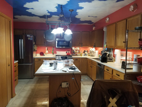
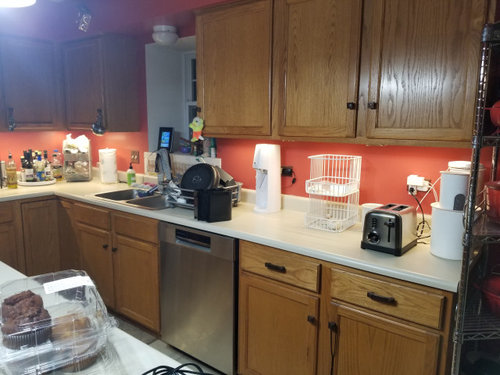
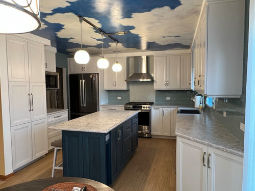
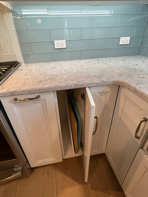
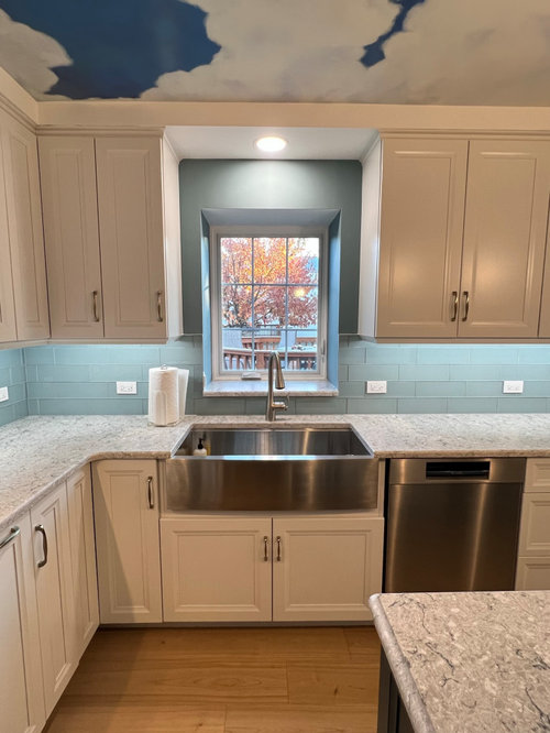
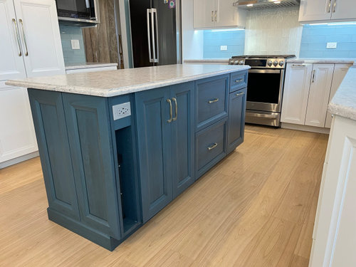
Before & After Kitchen refresh: Blue Skies! (note: many pix!)
Leslie P
5 months ago


Featured Answer
Sort by:Oldest
Comments (35)
Related Discussions
never knew I had a 'before' kitchen! (painting 80s melamine cabs)
Comments (32)natesgram, thanks, I've actually seen that link before, and it's what really pushed me towards painting. It really has a lot of helpful info too. As much as I would love to get new doors (shaker is my favorite!), I'm going with paint for now. The wallpaper...yes, I don't see what's wrong with it either. I took a really close up shot just to show the blue specks, but it really just looks like textured cream colored walls. I would like to know if the suggestions to remove it are because it's ugly/dated or more for resale purposes where painted walls are the preference for most buyers??? alabamanicole, now that I look at it some more, I agree the track lighting needs to go. It should be easy and inexpensive ($100-150?) to change it out. I love the look of bronze, but would it work with my ss appliances and ss cabinet pulls? Or should I get bronze pulls and faucet...CAN you have a bronze faucet and a stainless steel sink? Confusing! Also, thanks for your kitchen idea. The rest of my house is decorated with warm creams, reds, greens. I love organic stuff like wicker, stone, metal, and I love shaker style, country style, and arts-n-crafts style. I really like cream cabinets, but I already have enough cream with the counter, the tile, and the wall. The breakfast bar opens into the dining room, which is has cream furniture and red and green as the accent colors. The kitchen doesn't have to be matchy-matchy with the adjoining rooms, but it should flow colorwise. I'm going for a sleek, simple, yet casual and warm look with bluish/green cabinets. Below are kitchen looks that I love. Some won't work with my sleek cabinets, but it's just to everyone an idea of the look and feel that I hope to achieve... I love the color on this wall...if I ever take down my wallpaper! lol I love the warmth and casualness of cream cabinets. My dream kitchen...if I could start from scratch! :) Here, I love how the bottom cabinets are darker than the top cabs. Cute chandelier, and the island color is gorgeous! Ok, since I also LOVE the idea of two cabinet colors, what if I paint my top cabs cream and my bottom cabs blue/green? I really can't decide between my two colors below, and painting all the cabs either color will be too much cream in the room, or too much blue/green in the the room...no? I'm also open to sage green. If I go with using two colors, what if I paint the storage wall like the storage wall below (where the top and sides would be the blue/green color)?...See MoreFinished Kitchen: White-ish, charcoal counters and blue glass bs
Comments (43)Alexx - I really love your kitchen! It came out beautifully!! I have a question about your counters. I am doing a similar look with the white shaker cabs (framed w/full overlay) and quartz (Caesarstone Raven) countertops. I will also be doing a mitered edge with a 1.5" overhang. My question is ... how far do your counters project past your cabinet boxes, as well as past the doors/drawer fronts. There is some dispute between my cabinet maker and the countertop folks. Cabinet maker says I should have a 1" projection past the doors/drawer fronts, while the countertop folks are suggesting a "flush" appearance (not truly flush, but more like a 1/4" projection). Can you tell me what yours are? And if anyone reading this has suggestions or advice, I would appreciate it! Thank you!...See MoreUnder April skies....
Comments (80)I've been having trouble getting into "my next book." I checked four books out of the library the other day and rejected them one-by-one after reading just a few pages of each. Last night I scanned my own bookshelves and selected A Patchwork Planet thinking, "Maybe Anne Tyler can get me out of my funk." As I started reading, the book seemed vaguely familiar and yet I had no idea what was coming next. This morning, I checked my book journal to see if I'd read it before. I had to laugh at what I had written: I was disappointed in this book. While entertaining, it's pretty forgettable. Forgettable indeed!...See MoreKitchen refresh and other things that don't matter : )
Comments (73)Jterri; I see your point, but let me save you some posts! ... not happening. First, I would only use a black hood if it matched my black enamel range. The range is pretty shiny, with lots of nickel and brass trim and I can't see pairing it with something dull. Second, more importantly, this entire exercise began with a decision to lighten the room by lightening the counters, and possibly the island. So I wouldn't add a 6' wide dark box, since that would run counter to my goal. And I certainly would not paint the walls dark! I might darken the muntins but only a few shades. I do think that repeating some of the black in accessories is not a bad idea, once my counters are lighter. Can't see black on top of my old dark cherry counter....See More
Leslie P
5 months agoLeslie P
5 months agoLeslie P
5 months agolast modified: 5 months agoLeslie P
5 months agoLeslie P
5 months agoLeslie P
5 months agoLeslie P
5 months agoLeslie P
4 months agoLeslie P
4 months agoLeslie P
4 months agoLeslie P
4 months agoLeslie P
4 months agoLeslie P
last month


Related Stories
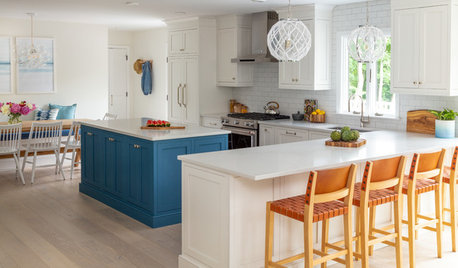
KITCHEN MAKEOVERSBefore and After: 4 Kitchens With Refreshing Blue Touches
See how blue tile and cabinetry bring energizing color to these kitchen remodels
Full Story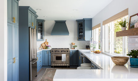
KITCHEN DESIGNBefore and After: Blue and Brass Refresh a Kitchen in Bel Air
Freshly painted cabinets and new surfaces and hardware update this kitchen in a Los Angeles couple’s first home
Full Story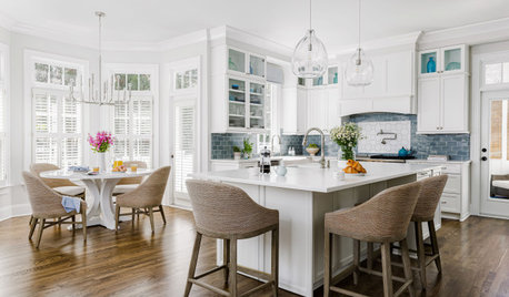
KITCHEN MAKEOVERSBefore and After: 4 Uplifting Blue, White and Wood Kitchens
Chase away cooking space doldrums with shades of ocean and sky paired with classic colors
Full Story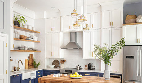
KITCHEN DESIGNBefore and After: 5 Beautiful Blue-and-White Kitchen Makeovers
See how this great color combination transformed these outdated spaces
Full Story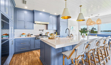
KITCHEN MAKEOVERSBefore and After: 3 Beautiful Blue-and-White Kitchen Makeovers
These remodels embrace open layouts, nature views, modern blues and warm white hues for better function, form and style
Full Story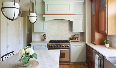
BEFORE AND AFTERSBefore and After: New Paint, Counter and Tile Refresh a Kitchen
A former restaurant owner chooses a new palette inspired by her beloved Lake Michigan
Full Story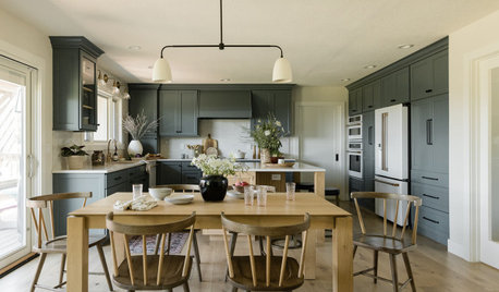
KITCHEN MAKEOVERSBefore and After: 3 Refreshing Green Kitchens
Rich green cabinets banish the banal in these redesigned cooking spaces
Full Story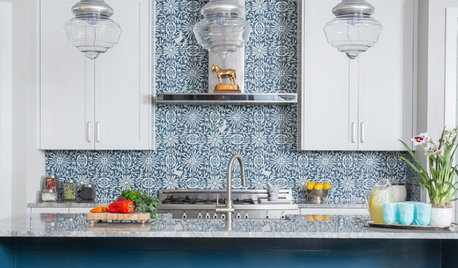
COLOR5 Refreshing Ways to Bring Blue Into the Kitchen
Try a splash of blue, whether in an unexpected or a tried-and-true hue
Full Story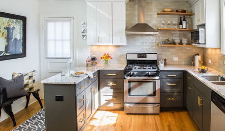
MOST POPULARBefore and After: 13 Dramatic Kitchen Transformations
See the wide range of ways in which homeowners are renovating their kitchens
Full Story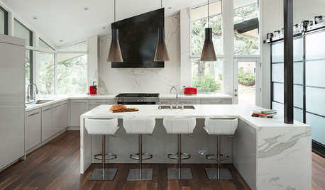
KITCHEN DESIGNBefore and After: 4 Black-and-White Kitchen Makeovers
See how the chic color palette adds contrast and drama to these renovated kitchens
Full Story


rebunky