


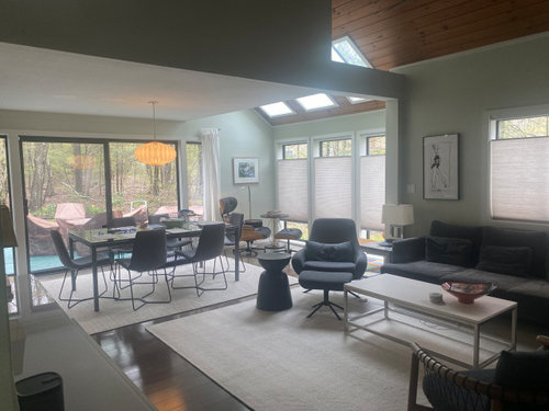
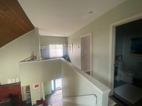
HELP: Open floor plan paint color?
Rhonda Hurwitz
last year
last modified: last year


Featured Answer
Sort by:Oldest
Comments (24)

kandrewspa
last year
Rhonda Hurwitz
last yearlast modified: last yearRelated Discussions
Need help w/ paint in open floor plan
Comments (5)What a treasure you found. How fun to decorate and make it your own. Lovley place. I have a double story open floor plan house and I use a color called Baked Scone by Behr. It is a very light color but it is perfect. It has a creamy yellow base to the hue. Image the soft crust opening to a flaky baked scone and there you have it. I find it goes with everything. I have changed the color in my kitchen which opens to the Baked scone about 7 times and each color from red,blue, royal, yellow, sage green, brown caramel.. (in fact I need to repaint it again but that is another post.) Baked Scone by Behr Your idea of Whole Wheat SW is perfect as it too goes with everything. See here below Whole Wheat next to Antique White. Buttercream by Ellen Kennon paints White Opal With White trim also by EK Ultra Premium New Penny by Valspar Calming Cream by Benjamin Moore Here is a link that might be useful: Check out GeorgiaGirl's Blonde SW painted room...See MoreHelp with paint colors for an open floor plan.
Comments (5)Take a look at this design seeds thread and scroll down to August 24, 2013. I created an example of how you can play with a color palette to get the rooms to all coordinate while each being their own identity. Perhaps this will help you see how it can all work. Then you'd need to look for an overall inspiration for the color palette and the select the specific colors you want to predominate in each room....See MorePaint color suggestions open floor plan PLEASE HELP!
Comments (4)I'm no color expert, but have you tried BM Wickham gray HC171? We used that in our house and in some lights it reads blue, other times of day a light gray. It might be a good middle ground between your gray and hubby's blue....See MoreNeed help with new paint for open floor plan
Comments (4)On my screen, looks like you posted in the Paint forum. I suggest you post in Home Decorating, for lots of opinions. The colors on the non-removable items seem warm to me: especially the floors and cabinets, which are really pretty! I like warm colors, myself, and with what you have there, I'd just paint the walls lighter, like a nuanced warm shade of white. But I guess that's not what you want to do.... So, my advice is to visit some paint stores, buy some posterboards, and many small sample jars of paints you may like... and start experimenting. I think your experiments will go better if you paint out one wall as white a color as you can, and then you can judge the posterboard colors more easily. You do seem drawn to cooler-toned rugs. There are experts who can help you with this. I'd go to the home dec. forum for more advice....See More
Lyn Nielson
last yearkandrewspa
last yearRhonda Hurwitz
last yearlast modified: last yearRhonda Hurwitz
last yearlast modified: last yeartresmamma
last yearRhonda Hurwitz
last yearlast modified: last yearakcohen65
last yearRhonda Hurwitz
last yearlast modified: last yearRhonda Hurwitz
last yearlast modified: last yearakcohen65
last yearRhonda Hurwitz
last yearlast modified: last year
Jen K (7b, 8a)
last yearRhonda Hurwitz
last yearlast modified: last yearRhonda Hurwitz
last yearlast modified: last year
Jennifer Hogan
last yearRhonda Hurwitz
last year
Donna G
11 months ago


Related Stories
DECORATING GUIDESHow to Use Color With an Open Floor Plan
Large, open spaces can be tricky when it comes to painting walls and trim and adding accessories. These strategies can help
Full Story
DECORATING GUIDESHow to Create Quiet in Your Open Floor Plan
When the noise level rises, these architectural details and design tricks will help soften the racket
Full Story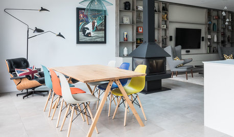
HOMES AROUND THE WORLDColor Helps Zone an Open-Plan Space
Smart design subtly defines living areas in an opened-up family home in England
Full Story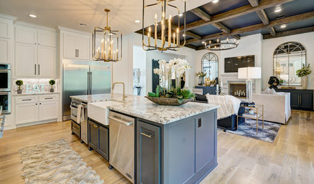
HOUZZ TV LIVETour a Designer’s Glam Home With an Open Floor Plan
In this video, designer Kirby Foster Hurd discusses the colors and materials she selected for her Oklahoma City home
Full Story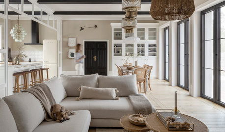
REMODELING GUIDES10 Things to Consider When Creating an Open Floor Plan
A pro offers advice for designing a space that will be comfortable and functional
Full Story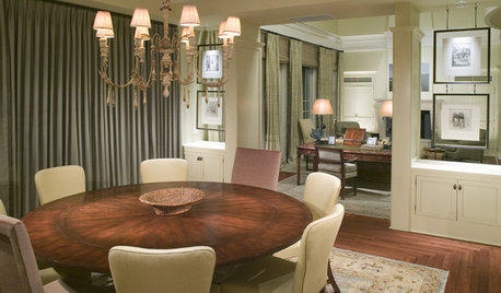
REMODELING GUIDESThe Open Floor Plan: Creating a Cohesive Space
Connect Your Spaces With a Play of Color, Materials and Subtle Accents
Full Story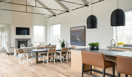
ARCHITECTURE5 Questions to Ask Before Committing to an Open Floor Plan
Wide-open spaces are wonderful, but there are important functional issues to consider before taking down the walls
Full Story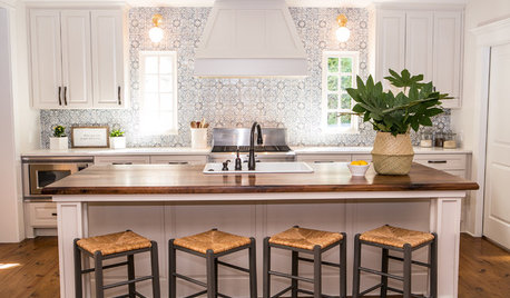
BEFORE AND AFTERSKitchen of the Week: Saving What Works in a Wide-Open Floor Plan
A superstar room shows what a difference a few key changes can make
Full Story
DECORATING GUIDESHow to Combine Area Rugs in an Open Floor Plan
Carpets can artfully define spaces and distinguish functions in a wide-open room — if you know how to avoid the dreaded clash
Full Story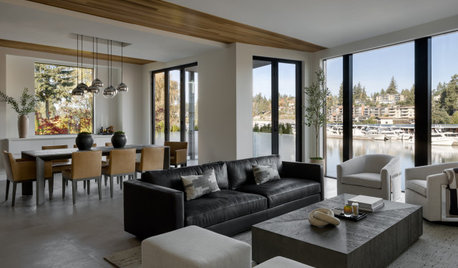
DECORATING GUIDES15 Ways to Create Separation in an Open Floor Plan
Use these pro tips to minimize noise, delineate space and establish personal boundaries in an open layout
Full Story


Rhonda HurwitzOriginal Author