


Color Helps Zone an Open-Plan Space
Smart design subtly defines living areas in an opened-up family home in England

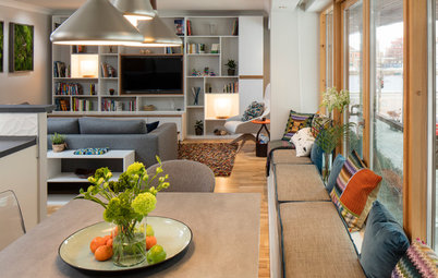
When you have an open space, it can be difficult to divide the area into adult zones and child-friendly spots, but that’s exactly what Simone Gordon of Owl Design did. An addition helped open up the ground floor of this four-bedroom house in England, whose owners wanted to create a modern space where their daughter could play and where they could entertain their friends. Gordon started with the kitchen layout and cleverly planned four distinct areas around it, using color and design to define each area’s functionality.
The owners like midcentury style, so Gordon chose some pieces that tied in with this aesthetic.
The wood flooring here contrasts with the polished look elsewhere, helping to zone the family space.
The wood flooring here contrasts with the polished look elsewhere, helping to zone the family space.
The adult seating space is the perfect spot for guests to relax in before and after a dinner party. To the left is a stylish formal dining area.
For this space, Gordon chose a neutral scheme to give it a more sophisticated feel. A luxurious rug sits beneath the monochrome furniture.
At the far end is a wood-burning stove, which makes the whole area feel cozy. The homeowners and designer originally chose a triangular model, but this square version protruded less. Gordon’s team positioned the stove where the flue would go straight up through the flat roof and angled away from the bedroom window above.
Sofa and coffee table: Houseology; Grant Featherston-style contour lounge chairs: Vita Interiors; rug: Designers Guild; pendant light: Made in Design
The tiled floor is a stylish and cost-effective alternative to polished concrete.
The lighting throughout the ground floor is a combination of spotlights and pendants, with floor and table lamps to add atmosphere.
The lighting throughout the ground floor is a combination of spotlights and pendants, with floor and table lamps to add atmosphere.
This shelving area was built by Schmidt, the team that designed the kitchen. Gordon worked out the perfect spot for the television and designed the shelving around it. Below is a run of cabinets that hide cumbersome items such as the DVD player. A picture rail above the TV is ready for the owners to display their artwork.
For the living room, Gordon chose an elegant pendant light that doesn’t distract attention from the television. “It’s dainty and clear, and you can even adjust the height,” she says.
For the living room, Gordon chose an elegant pendant light that doesn’t distract attention from the television. “It’s dainty and clear, and you can even adjust the height,” she says.
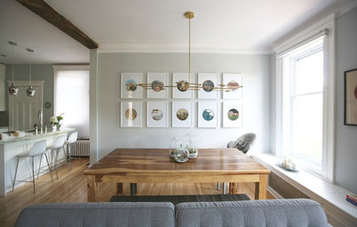
Next to the seating area is a formal dining space. A round table works well in this corner, and its dark color creates a moody atmosphere. The dark rug helps zone this area, while the neutral walls ensure that the space stays light during the day.
A sideboard along the back wall stores glasses and formal tableware, making them easily accessible, while a mirror adds texture and interest.
Mirror and dining chairs: French Connection; dining table: Houseology; sideboard: Harvest Moon; table lamp: Habitat: pendant light: Holloways of Ludlow; Medallion rug: Fading World collection, Louis De Poortere via Naken Interiors
Since windows and doors interrupt the walls in this space, it was essential to choose furniture that fit the area without overcrowding it.
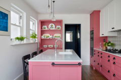
The kitchen looks simple and chic while providing plenty of storage and functionality. The island consists of drawers and cabinets, and houses a sink, cooktop and pop-up exhaust fan. Gordon chose darker cabinets at the back to add tone and interest. The copper pendant lights provide yet another element and stand out against the neutral scheme.
To the right of the wall cabinets is the breakfast area, where the owners keep their toaster and coffee machine.
Kitchen cabinets: Schmidt; pendant lights: Holloways of Ludlow
To the right of the wall cabinets is the breakfast area, where the owners keep their toaster and coffee machine.
Kitchen cabinets: Schmidt; pendant lights: Holloways of Ludlow
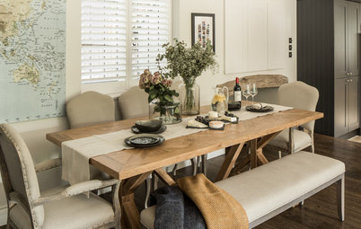
This other dining area is a more informal spot for family meals. The bright colors give it a fun feel, and Gordon chose wipeable plastic chairs to keep the space child-friendly.
An ethereal pendant light contrasts with the solid colors on the chairs but ties in with the hues of the artwork behind.
Charles Eames-style dining chairs: Cult Furniture; dining table: Bluesuntree; pendant light: Made in Design
An ethereal pendant light contrasts with the solid colors on the chairs but ties in with the hues of the artwork behind.
Charles Eames-style dining chairs: Cult Furniture; dining table: Bluesuntree; pendant light: Made in Design
An armchair teams with a floor lamp to provide a handy spot for chilling out.
Armchair: Vita Interiors; floor lamp: Bluesuntree
More
Design Workshop: How to Separate Space in an Open Floor Plan
Open Plan Not Your Thing? Try ‘Broken Plan’
Armchair: Vita Interiors; floor lamp: Bluesuntree
More
Design Workshop: How to Separate Space in an Open Floor Plan
Open Plan Not Your Thing? Try ‘Broken Plan’


Room at a Glance
Who lives here: A young couple an their 3-year-old daughter
Location: Loughton, Essex, England
Size: 797 square feet (74 square meters), including an addition of 344 square feet (32 square meters)
Designer: Simone Gordon of Owl Design
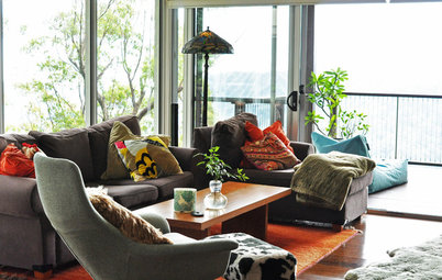
The first area visitors see when they enter this new-build home is a bright family space. This is where the homeowners watch television together, and it’s a comfortable spot in which their 3-year-old daughter can play.
“The owners already had this bright rug,” Gordon says. “So I used the colors as a starting point.” The blue wall pulls out the dark tones in the rug’s pattern, while the furniture highlights the lighter shades. A glass door divides this area from the rest of the space, offering privacy while keeping the two zones connected.
Wall paint: Gauze, Little Greene Paint Co.