


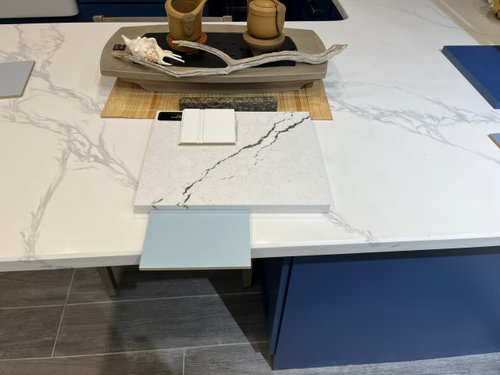
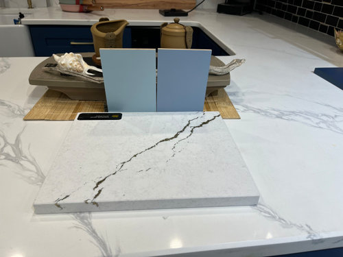
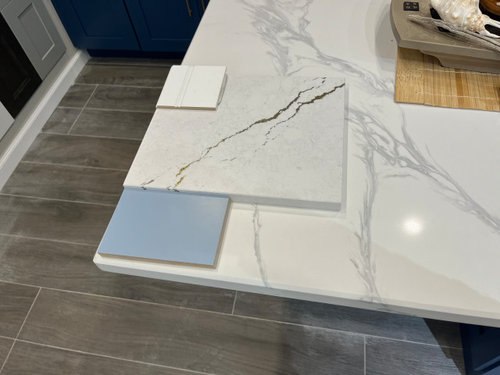
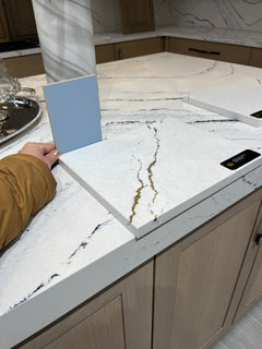
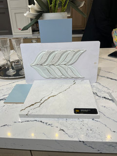
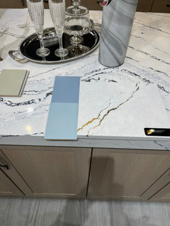
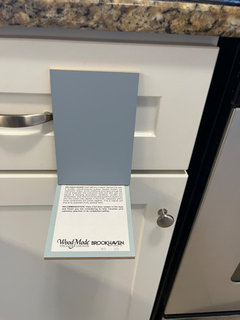
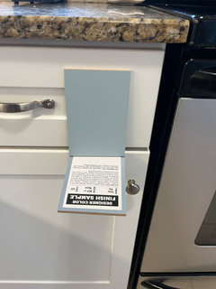
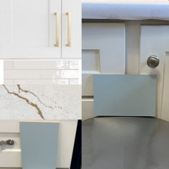
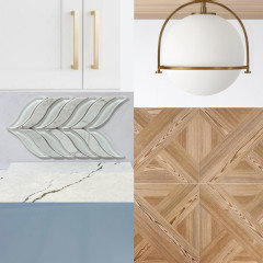
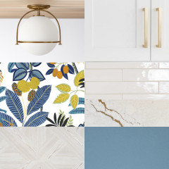
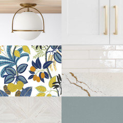
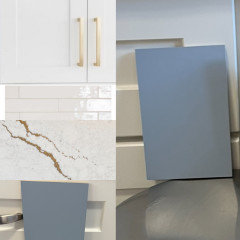
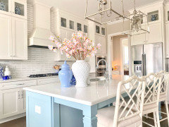
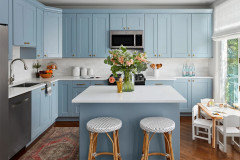
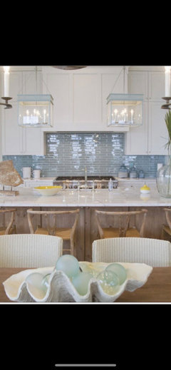
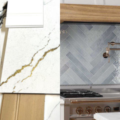
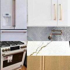
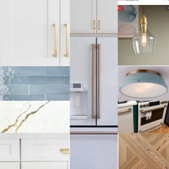
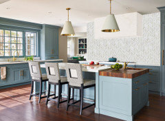
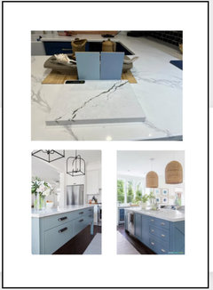
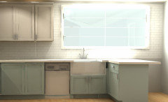
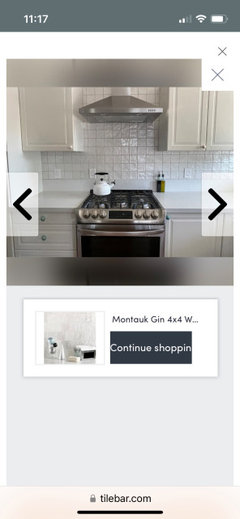
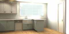
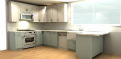
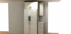
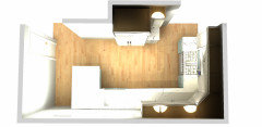
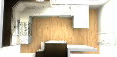
Which color do you prefer for lower kitchen cabinets?
HU-860381722
last year
Featured Answer
Sort by:Oldest
Comments (78)

HU-860381722
last yearHU-860381722
last yearRelated Discussions
Which do you prefer for period bathroom?
Comments (7)Well--it sounds like universal approval of the two sconce option (4 for and 0 against, anyway :)!) I agree it looks more balanced with the two sconces, I just wasn't sure how I felt about a sconce over the toilet! kgwlisa--I know, I've been so slow on this project! The real horror is that I ripped out the vanity months ago, so I've been without a bathroom sink all that time. I finally have the first workman coming next week, so hopefully this seemingly small project will be wrapped up before we get too far into 2008! I remember that Athena sconce--I live in Seattle, so I spend too much time (and money) in the local Rejuvenation store! Are you using porcelain hardware as well? I know they have the Bennett porcelain towel bars, hooks, etc. on clearance, if they are still available. (I've stocked up!) Thanks for the opinions!...See MoreWhich floor plan do you prefer for a more functional kitchen ?
Comments (57)Now that I zoom in the window, I see what you mean. Hard to tell since the plan shows a box, pic looks flat, and there's no interior shot. How to deal with it? Maybe leave that window as it is; The former front door could be a round or octagonal window, which would suit the house, and not put the stair hall on display lol! What I ment by recessed front door is, that part is stepped back from the front build line. Your "photoshop" looked like it was all even across the front on my screen, maybe it's must my screen (or eyes). Either way, I think it's a great idea :) I like some protection for a front door, and I suspect that the front door as originally built is right at the permitted build line, and adding an overhang wouldn't be allowed. So where you suggest it allows for an overhang of some kind, even if it's just a pergola....See MoreHelp! Which Plan for Storage around the Range Do You Prefer?
Comments (85)Ice, thanks for posting your lovely kitchen. I struggle with visualizing ideas, so it is really helpful! Funky, if we go with additional lighting I think you are right that the sconces are going to work better with the look and small space. It also makes a lot of sense to add a little additional light - it can always be turned down - and to have a couple lights that are task-specific or for mood. The artwork idea is so fun. I'm going to have to think about this! I also have that evil powder room wall, if I could find the right decoration. There's something terribly pleasing about having begun the kitchen planning with the thought, "Oh my, where am I going to put all my stuff? How is this ever going to work?" and to be drawing toward the conclusion and be thinking things like, "My storage plan around the range should be nothing, or art. Bbtrix, Thanks for hunting out this pictures for me. The style you pictured and the placement might look really good in this situation. The pulls are a kind of a strange color, "antique pewter," so maybe hard to match. The faucet is chrome and lighting fixtures in the dining area are currently dark bronze. So ... we're already getting patchworky, for better or worse. Here are the pulls - first is the stock photo, and the second is a photo I took when investigating flooring. (We're probably about to order the brown tile on the top.) The pull looks more silvery in direct light:...See MoreWhich of these two kitchen layouts do you prefer?
Comments (42)"The only issue that we are unsure on, is what to do with the microwave and toaster oven in this layout. We use both a lot." Would your budget stretch to a MW drawer? If so, put it in the island at the end closest to the range. That leaves the drawers across from the DW and fridge free for dishes, silverware and possibly glassware. Or you could design a cubby for a small counter top MW in the pantry cabs, either behind doors or on an open shelf. The GE Spacemaker II MW is designed to fit in a standard upper cabinet so it would fit, no problem in your shallow pantry cabs. We use our toaster oven a lot, too. It was our only oven for 2 years after our oven died and couldn't be repaired (too old). We thought we'd get rid of it after the remodel but we decided to keep it. So glad we did! We designed a cubby for it. It works really well for us but we dud add an automatic fan behind it (like the ones used in stereo cabs to cool off components) to blow hot air out of the cubby and protect our cabinets. If I were to do it again, I probably would make the cubby height 18" not the 15" we did to help with air circulation. Here's mine: You could do something similar on your pantry wall. Here's another example: You could also place it on a pull-out shelf in your pantry. Here's an example of MW and toaster oven in a tall pantry cabinet. How large is your toaster oven? Our cubby is 19" deep with counter, which gives us room behind it and in front. We don't really need room behind it, per mfg specs, just room on each side of it and above. HTH!...See MoreHU-860381722
last year PRO
PRODesign Interior South
last year- PRO
Design Interior South
last year HU-860381722
last yearSally T
last yearUser
last yearHU-860381722
last year
JP L
last yearHU-860381722
last yearHU-860381722
last year
elcieg
last year PRO
PROHome Interiors with Ease
last year- PRO
Home Interiors with Ease
last year HU-860381722
last yearanna_682
last year
Project Mode
last yearHU-860381722
last yearKatherine Canon
last yearlast modified: last yearHU-860381722
last yearProject Mode
last year
rebunky
last year- PRO
lisedv
last year gigi4321
last yearHU-860381722
last year PRO
PROBeth H. :
last yearHU-860381722
last yearkl23
last year PRO
PROJAN MOYER
last yearMeredith Vargas
last monthkl23
last month


Related Stories
INSIDE HOUZZTop Kitchen and Cabinet Styles in Kitchen Remodels
Transitional is the No. 1 kitchen style and Shaker leads for cabinets, the 2019 U.S. Houzz Kitchen Trends Study finds
Full Story
KITCHEN DESIGNEcofriendly Kitchen: Healthier Kitchen Cabinets
Earth-friendly kitchen cabinet materials and finishes offer a host of health benefits for you and the planet. Here's a rundown
Full Story
KITCHEN DESIGN8 Top Hardware Styles for Shaker Kitchen Cabinets
Simple Shaker style opens itself to a wide range of knobs and pulls. See which is right for your own kitchen
Full Story
KITCHEN DESIGN10 Gorgeous Green Paints for Kitchen Islands and Cabinets
Pros share which green shades they used to take these islands and cabinets to the next level
Full Story
KITCHEN CABINETSPainted vs. Stained Kitchen Cabinets
Wondering whether to go for natural wood or a painted finish for your cabinets? These pros and cons can help
Full Story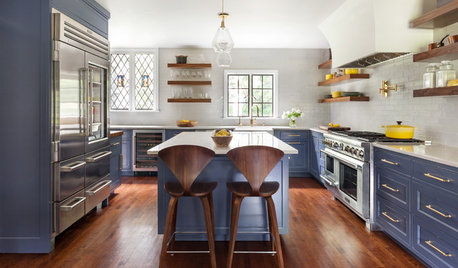
COLORFUL KITCHENSA Baker’s Dozen Colors for Kitchen Cabinets
Not into white? Try one of these deliciously colorful kitchen cabinet possibilities
Full Story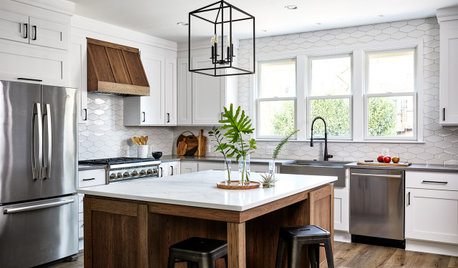
HOUZZ TV LIVEHouzz Editor Shares Kitchen Cabinet and Color Trends
In this video, Erin Carlyle discusses popular cabinet styles and colors from the 2021 U.S. Houzz Kitchen Trends Study
Full Story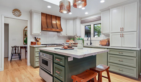
KITCHEN DESIGNKitchen of the Week: Two-Tone Cabinets Play Up a Warm Copper Hood
A remodeling team updates a couple’s 1990s kitchen with new cabinets, appliances and finishes, all in the same footprint
Full StoryKITCHEN OF THE WEEKKitchen of the Week: Blue-Black Cabinets Bring the Drama
Absorbing a nearby family room allows for a roomier kitchen layout that makes family cooking nights more comfortable
Full Story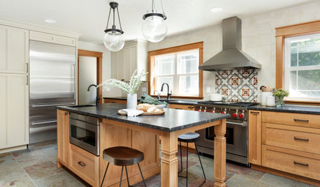
KITCHEN DESIGNBefore and After: 4 Kitchens With Two-Tone Cabinet Schemes
Why choose one cabinet color when you can have two? Let these kitchen remodels with two-tone cabinets inspire you
Full Story

Beth H. :