


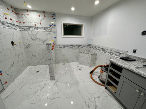
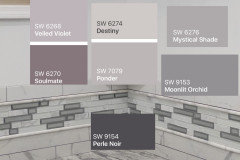
Cannot Decide on a color to coordinate our bathroom
sdiver2489
last year


Featured Answer
Sort by:Oldest
Comments (19)
Related Discussions
Bathroom Paint - Still Can't Decide On Color
Comments (1)I'd paint it with a nod to the hallway but with it's own personality. My hallway to the small bathroom for guests is SW scalded milk which appears a soft white but the bathroom is going to be Valspar Betsy's linen, very white trim and Rainwashed by BM in the vanity area....See MorePaint color to coordinate with peach/tan/pink bathroom tile?
Comments (15)Hate to say it, but I vote for the gut rehab if you can afford it. You would love it if you could pick everything out for yourself and update it. It's easy to splurge a bit on bathrooms because we don't need much in the way of volume of materials. So you could put in a really gorgeous slate floor, for instance. But if this is an "antique" house maybe this looks right for the house and is part of its charm? That's up to you. My inclination is if it's old subway tile it's priceless, so I'd work with it... but this... mmmm... not so much, sorry. If you decide to leave it for now, how about picking up some paint color chips at the store and holding them up to the picture to see how they look to you? Another choice is to beadboard over the wall tile, then redo your floor. You'd probably want to re-tile behind the tub in something neutral. You can also have a tub professionally resurfaced, and a bathroom remodel place can advise about the cost. It's undoubtedly cheaper than a new tub as I've seen them do it on HGTV's "Designed to Sell." You might want to take a photo to the hardware store and ask what they see as your possibilities and approximate costs for each thing. One word of warning... when you dig into old bathrooms there is often rot in the walls and floor from years of water, and mold. Subflooring may need to be replaced as well as wallboard. I'd just expect that. That's an added headache, but it's also a good reason to go for the gut rehab, to make sure it's structurally sound and mold-free. Do you have another bathroom in the house if you need to tear this one down? Whatever you do, please post before and aftef pics for us!...See MoreCan't decide on bathroom color/curtain.
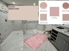
Comments (16)I like bright colors and I love the bright turtle I like the purple colors. I would go with a color match for some of the Golden color from the sun. The whale I would go with light gray and crisp white and pull some gray accents into your bedroom they will be easier to find. I think it would be lovely. I like all your choices....See MoreDeciding on paint color for small guest bathroom w/ multi colored tile
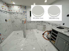
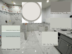
Comments (10)It's difficult to help pick colors based on computer screen and picture variations, but I think the bold colors take away from your pretty tile. I personally like a gray-blue or gray color when looking at your tile. I played around with Sherwin Williams color and found these two as an example: All of these colors will vary depending on lighting and larger samples help make things easier to see. Once you settle on a few colors, get some sample cups and paint poster board edge to edge leaving no white border. Place it around the room and see how you like it!...See More
sdiver2489
last yearsdiver2489
last yearsdiver2489
last yearsdiver2489
last year
Jennifer Hogan
last yearlast modified: last year


Related Stories
REMODELING GUIDESBathroom Workbook: How Much Does a Bathroom Remodel Cost?
Learn what features to expect for $3,000 to $100,000-plus, to help you plan your bathroom remodel
Full Story
BATHROOM DESIGNWhich Flooring Should I Choose for My Bathroom?
Read this expert advice on 12 popular options to help you decide which bathroom flooring is right for you
Full Story
BATHROOM MAKEOVERSReader Bathroom: Understated Nature in Australia for $9,000
A couple decide to act as their own general contractors for their bathroom renovation
Full Story
BATHROOM MAKEOVERSBathroom of the Week: Inspired by Palm Springs Vacation Joy
A designer plays with shapes and color to create a happy midcentury modern design in this primary bath
Full Story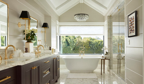
BATHTUBSBefore and After: 6 Dream Bathrooms That Free the Tub
Freestanding tubs replace bulky built-ins in these beautiful bathroom remodels
Full Story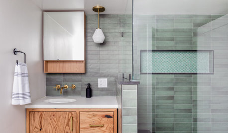
BATHROOM MAKEOVERSBathroom of the Week: Earthy Modern Style in 68 Square Feet
A designer found on Houzz helps a Chicago homeowner add a basement bathroom with a low-curb shower and spa-like feel
Full Story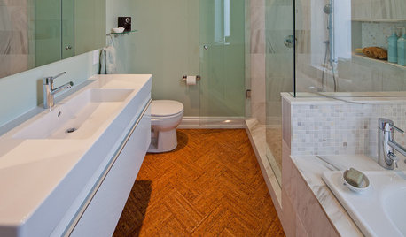
FLOORSWill Cork Float for Your Bathroom Floor?
Get the facts on advantages, disadvantages, costs and installation to see if a cork bathroom floor is right for you
Full Story
BATHROOM DESIGNRoom Tour: Modern Country Bathroom
Contemporary fixtures and tiles provide a versatile base for fun vintage details
Full Story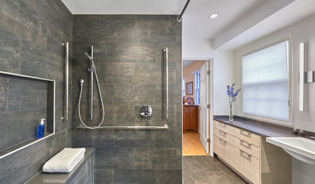
BATHROOM DESIGNA Barrier-Free Master Bathroom With a Luxurious Feel
This Maryland remodel offers ideas for designing an accessible bathroom that’s elegant too
Full Story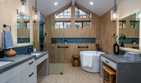
BATHROOM MAKEOVERSBathroom of the Week: Warm Spa Feel With Aging-in-Place Features
A designer helps an empty-nest couple create a space with a curbless shower, an inviting style and room to maneuver
Full StorySponsored
Columbus Area's Luxury Design Build Firm | 17x Best of Houzz Winner!

Beth H. :