


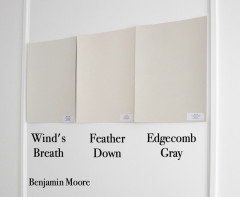
Paint: a color less yellow than Wind's Breath (and a bit lighter)
chispa
2 years ago
last modified: 2 years ago
Featured Answer
Sort by:Oldest
Comments (23)

chispa
2 years agoRelated Discussions
Are light colors 'classier' than darker colors?
Comments (106)sandyponder - that's a beautiful color. It works so well with the wood, the stone, the leather, and the oriental rug. I think this is an example of a "classy" dark color. "Classiness" doesn't have to enter into it... any shade can be classy, though of course people have personal preferences and may still not like a dark palette, or a light palette. But I suppose "classiness" (meaning lack of tackiness and a professional look) can enter in... as I wrote above, I think it can come down to a homeowner picking the WRONG shade... and I suppose "classiness" (or lack thereof) comes into it in that if they do pick the wrong shade it can look amateurish and tacky. Low-class. It's simply harder to make an egregious mistake with lighter colors... hence less of a chance to veer into the "tacky" and "unclassy" realm. (It's also much easier to paint with light colors - small errors in application do not show that much.) But I would never look at a well-done dark color and think it wasn't classy simply because it was dark, or even simply because it wasn't my particular cup of tea. Also... I think it comes down to current styles. Light is 'in' right now. White kitchens, light neutrals in the living areas, etc.. And bucking the trend can be perceived as less-than-classy even if it isn't....See MoreSuggestions for Yellow Paint Color?
Comments (15)Joyce, Thank you re: your kind words about our kitchen. I am hoping to do the final touch up painting this weekend and get a kitchen reveal up on gardenweb sometime soon. We call our puppy the "Swedish Chef' because she's dopey like the muppet and likes to be in the kitchen (probably because that's where we are)! I used satin rather than semi-gloss. The P&L paints are a little glossier but mostly I thought it was what had been used before. Also, our cabinets are old and I thought the gloss would show more imperfections. I painted the kitchen with brushes which I thought would like fine (versus spraying them). Since they are old I thought the brushed look would fit fine with the period of the kitchen (which it does). If I had newer cabinets I would use a semi-gloss. I did use an extender which helps the paint relax and reduces brush lines and gave me more time to work with the brush strokes to make them look nice. I was glad I did. I do think it made a difference. This would only be needed though if you were not having them sprayed. As an aside, painting the kitchen (inside and out) is a job I would never do again - it was so much more time, work and energy than what I anticipated. Thank goodness my dear mother loves a good project and helped a ton. My other advice, which I'm sure lots of people say but don't do, is to find colors you love but then actually paint a good size cabinet/piece of wood and see how that particular color is reflected with the light and other colors (e.g. floor) in your particular kitchen space. The color that works best and gives you a closer match to your vision may not be the color swatch that is your favorite initially or even recommended here. It's a pain but I've had so many problems with gray/blue gray paint looking purple in our house and have learned the hard way. Our light (west facing house on a slope) and red oak floors have me resorting to very tan looking gray paint to get a more gray non-purple look....See MoreColor similar but lighter than BM Pashmina AF-100?
Comments (59)I am sorry to hear that you are not in love with the color you choose. I happen to have Pashmina in my very large entry that runs the length of my home and I have been happy with it for a nearly a decade, it really seems to have lush softness to it, almost like real pashmina. I have never felt it was "muddy" as some people say. My adjacent living room and dining room are BM Frappe which has a creamy warmth to it, but with a new floor in the entry coming in a few weeks, I have decided to change it up and was also looking for a bit lighter than Pashmina. I have a delivery from Samplize arriving tomorrow with some color options, many based on this dialog so I am happy to share my thoughts with you in comparison to Pashmina if you are still thinking along those lines. I know it's a bit 'over-done' but I have Revere Pewter in two guest rooms and my toilet closet which are all varying sides of the house and levels of light and honestly, the color really does work well anywhere and like Pashmina, it tends to give off a soft glow. I know it would be fabulous in my LR/DR, it seems to be a magical neutral, but I feel I want to change it up and inflict some self torture on myself ; ) Another yummy BM that really works for me is Mascarpone. I have it in my laundry room and am going to have my wood cabinets re-done in this as well, as my dark herringbone floor will also extend into the laundry. We did build a little getaway and I did the entire home BM White Dove which is a crisp white but just seems to lack in the "feel good" factor of Mascarpone. Sorry, this probably is not helpful information, especially if you have moved to exteriors... not sure if you are thinking light or dark but I recently was looking at darker colors for exteriors and I have to say, BM Dragon's Breath is way stunning as is FW Mole's Breath....See Morewinds breath undertones
Comments (21)I have Wind's Breath on my Kitchen cabiinets. As I heard one color expert say on you tube, it's a complicated color. There are times of the day when it looks a bit more grey, (but warmish gray) and times where it looks creamy - especially at night when we just have one not very bright overhead light on. And often it's just in-between. Personally, I like it alot. I think what makes it "complicated" is that it seems sort of cool, but also feels warm. Hard to explain! I have granite countertops that have gold, brown, deep taupe and beige throughout, and travertine wall tiles that are beigey-taupe with a very slight pink/rose undertone - barely noticeable unless you are really looking for it. I was worried it wouldn't all come together but it did quite nicely. Floors are honey which works, but slightly darker would probably be better. Right now I have BM Desert Tan on the non-cabinet wall and while I LOVE the color, it's not the greatest when paired with Wind's Breath. It doesn't look bad or "wrong" but I know I need to find something a little more toned down....See Morechispa
2 years agochispa
2 years agolast modified: 2 years ago
Mark Aboutfood
last year PRO
PROMark Bischak, Architect
last yearSofia
last yearRTHawk
last year PRO
PROBeth H. :
last year


Related Stories

DECORATING GUIDESPaint Color Ideas: 8 Uplifting Ways With Yellow and Green
Dial up the cheer with yellow and green paint combinations sure to cast off winter doldrums
Full Story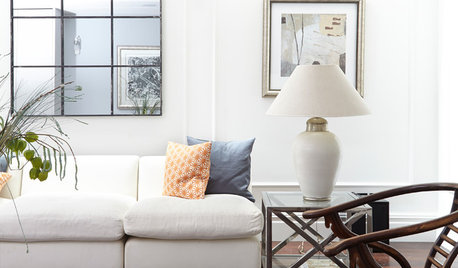
FEEL-GOOD HOME9 Ways to Boost Your Home’s Appeal for Less Than $75
Whether you’re selling your home or just looking to freshen it up, check out these inexpensive ways to transform it
Full Story
BUDGET DECORATING9 Tricks to Boost Your Home’s Appeal for Less Than $400
Whether you’re redecorating or just doing a quick update, check out these ways to enhance your home on a budget
Full Story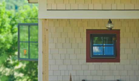
EXTERIOR COLORWhen to Paint Your Home Yellow
Be a cheer leader with this color that captures the sun and radiates a warm welcome
Full Story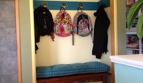
MUDROOMSFrom Coat Closet to Mudroom for Less Than $300
Clever DIY moves give a family of 5 the drop-off space they needed
Full Story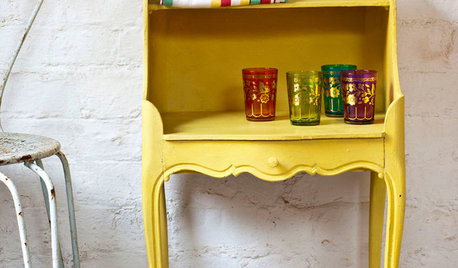
PAINTINGWhat to Know About Milk Paint and Chalk Paint — and How to Use Them
Learn the pros, cons, cost and more for these two easy-to-use paints that are great for giving furniture a vintage look
Full Story
PAINTINGShare Your Biggest Paint Color Mistake
Did a shade that looked perfect in the store turn out to be less than perfect on your walls? Let’s swap stories!
Full Story
COLORPick-a-Paint Help: How to Create a Whole-House Color Palette
Don't be daunted. With these strategies, building a cohesive palette for your entire home is less difficult than it seems
Full Story
DECORATING GUIDES10 Ideas for a Lighter, Brighter Living Room
Give your space a boost all year round by making the most of every bit of daylight
Full Story
COLORBest Ways to Use the Soft Yellow Color of 2014
You may fall for PPG Pittsburgh Paints’ Turning Oakleaf if you like your hues warm, mellow and cheery
Full Story

chispaOriginal Author