


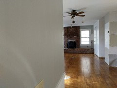
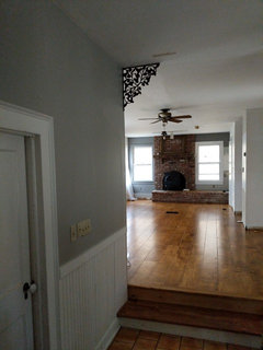
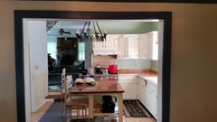
Color similar but lighter than BM Pashmina AF-100?
nuhouse10
5 years ago
last modified: 5 years ago
Featured Answer
Sort by:Oldest
Comments (59)

nuhouse10
5 years agosloyder
5 years agolast modified: 5 years agoRelated Discussions
Does paint color appear darker or lighter in windowless bathroom
Comments (15)In another thread I was introduced to "LRV" concept - Light Reflecting Value - 1-100% scale black to white. Higher numbers are lighter. On the BM site, Healing Aloe is 68.95. Quiet Moments is 60.79. I think that difference is going to be noticeable and wonder how you will feel moving from room to room with a different color. Or, if both colors be seen in the same eyeful, that can be troublesome too with some colors. Quiet Moments Healing Aloe As a reference point, I have Woodlawn Blue in my bedroom and it is 60.38 LRV and it definitely comes across as light. I normally do deeper richer colors, but felt in the mood for a pale color there and it is. I think you will be best served to get a sample of each and try them both in both rooms. They read a little differently in grey-ness and green-ness too. That will affect your decision too. Also, at some BM paint stores they can show (or sell/ rent) you a large sheet of the colors. That may help you too. A nearby BM store has 16" square pieces of many colors and 7"ish squares of every color....See MoreHelp selecting BM blue/green color for kitchen
Comments (10)On my monitor, your countertop looks like a charcoal gray, and the backsplash looks like a navy blue. Having said that, we used Benjamin Moore's formula for Tranquility, but with Mythic paint, for trim in the kitchen. I'm not sure whether it's a blue with a lot of green in it or a green with blue in it, but in our kitchen, it reads as a green. It's a light, soothing color; however, I don't know whether it would be right for your room. We do like it a lot....See MoreSo many whites!! PPG vs BM vs SW and color matching...
Comments (118)@Lori A. Sawaya Happy Thanksgiving !! I am looking to get some idea before appointment as first time buyer for Kitchen. I am looking for 2 tone kitchen cabinet, Thanks a ton for above thread, upper could be PPG Dedicate white and lower equivalent to BM Hale Navy, would you please help to find equivalent of BM's Hale Navy on PPG, I checked Cavalry & Annapolis Blue both are near to that but I am not sure, if those are accurate. Ceiling : PPG Dedicate White, Trim - PPG Dedicate White , Counter - White & Grey Granite, Cabinet : Upper Fixture : PPG Dedicate White, Lower : BM Hale Navy equivalent., Island : BM HN, South Facing large open concept Kitchen with Family Room, Breakfast Nook : PPG Whiskers equivalent to Agreeable Grey. Attached catalog pages for reference....See MoreAnother color similar to the warm side of Edgecomb Gray but lighter?
Comments (24)which is a match to SW creamy. Δ E is the first line of data. It tells you how closely a color matches your target color. Anything over 1.0 isn't that great of a match. For example, at 1.2 I wouldn't bother pulling a chip of Creamy because I know it's not going to be close enough. Δ E less than 1.0 and it's worth taking a look. Δ E less than 0.5 and it's likely to be very close in hue family, value and chroma. LCh works extremely well for whites and neutrals - it's an objective description of color under a controlled and balanced light source. If a color appears different from it's LCh notation, that's a matter of subjective opinion, context and lighting. It's not a matter of fact. For every one person who perceives a color as looking different from its LCh notation in a specific context, under unspecified light sources, you'll find at least one more who perceives the color exactly as the LCh values indicate. There's evidence of that all over this forum. For example, Stonington Gray. Some think it's a blue-gray while others think that's absolutely nuts. Because in their house, in their context and lighting Stonington looks "true neutral gray" no hue bias at all, which is in alignment with it's Green-Yellow hue family notation. And because we have an organized framework of color notations, we can put evidence of color appearance together and study the results. For example, we know that low chroma colors from the Green-Yellow hue family, like Stonington Gray, can absolutely appear with no hue bias and look totally neutral - or - it can shift and look bluish in certain contexts and lighting conditions. Because we're aware, we can sample colors smarter. We know what to look for. That's one of the main reasons it's useful to learn how to use color data values like you see on EasyRGB. I like how the main color stays in the background so you can see how the others are more green, gray, etc. Be careful with that. What you're seeing is 100% about how your device is able to display color than actual and factual color appearance in real life. You can see this for yourself. For example, what you're seeing will look markedly different on your phone vs. your laptop....See Morenuhouse10
5 years agonuhouse10
5 years agosloyder
5 years agoUser
5 years ago
mstender
5 years agonuhouse10
5 years ago
Steve Daigneault
5 years agosloyder
5 years agoSteve Daigneault
5 years agonuhouse10
5 years agosloyder
5 years agonuhouse10
5 years agonuhouse10
5 years agolast modified: 5 years agonuhouse10
5 years agonuhouse10
5 years ago PRO
PROLori A. Sawaya
5 years agonuhouse10
5 years agonuhouse10
5 years agolast modified: 5 years ago
Molly D. Zone4B
5 years agonuhouse10
5 years agoMolly D. Zone4B
5 years agoMolly D. Zone4B
5 years agonuhouse10
5 years ago- PRO
Lori A. Sawaya
5 years ago Molly D. Zone4B
5 years agoMolly D. Zone4B
5 years agoMolly D. Zone4B
5 years agoMolly D. Zone4B
5 years agosloyder
5 years agolast modified: 5 years agoMolly D. Zone4B
5 years agosambah006
5 years agosambah006
5 years agolast modified: 5 years agosambah006
5 years agoMolly D. Zone4B
5 years agonuhouse10
5 years agolast modified: 5 years agonuhouse10
5 years agolast modified: 5 years agon0thing
3 years agonuhouse10
3 years agosuzenleigh
3 years ago
Mandy Hall
2 years ago


Related Stories
MOST POPULARThis Under-$100 DIY Project Can Transform a Room
With a little skill and not much money, you can bring color and character to any space by painting part of a wall
Full Story
MOST POPULAR50 Shades of Gray
Gray is hotter than ever, thanks to a hit novel full of risks and dark secrets. Tell us: Which paint shade possesses you?
Full Story
COLORPick-a-Paint Help: How to Create a Whole-House Color Palette
Don't be daunted. With these strategies, building a cohesive palette for your entire home is less difficult than it seems
Full Story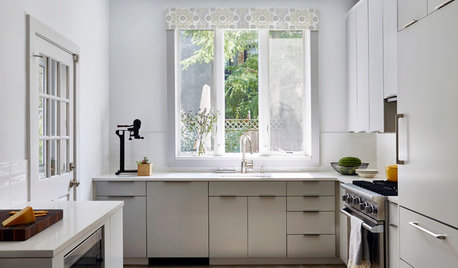
SMALL KITCHENSNew This Week: 3 Ways to Make Your Kitchen Feel Bigger
Using lighter colors, bringing in more sunshine and a few other tricks can help you visually enlarge your kitchen
Full Story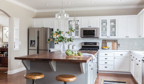
KITCHEN CABINETS6 Kitchen Makeovers That Benefited From Refaced Cabinets
These kitchens show how updating rather than replacing cabinets can keep costs down while adding style
Full Story
PAINTINGShare Your Biggest Paint Color Mistake
Did a shade that looked perfect in the store turn out to be less than perfect on your walls? Let’s swap stories!
Full Story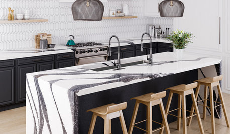
EVENTS5 Color and Style Trends for Kitchens and Baths in 2019
See top looks on display at the Kitchen & Bath Industry Show and the International Builders’ Show
Full Story
FRONT DOOR COLORSFront and Center Color: When to Paint Your Door Green
Fresh, fun and a pleasant surprise on a front door, green in subtle to strong shades brings energy to home exteriors
Full Story
DECORATING GUIDESThe Case for In-Between Colors
These mutable hues defy easy description, but their appeal all around the home isn't hard to get
Full Story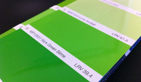
DECORATING GUIDESFrom Queasy Colors to Killer Tables: Your Worst Decorating Mistakes
Houzzers spill the beans about buying blunders, painting problems and DIY disasters
Full Story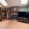
Lori A. Sawaya