


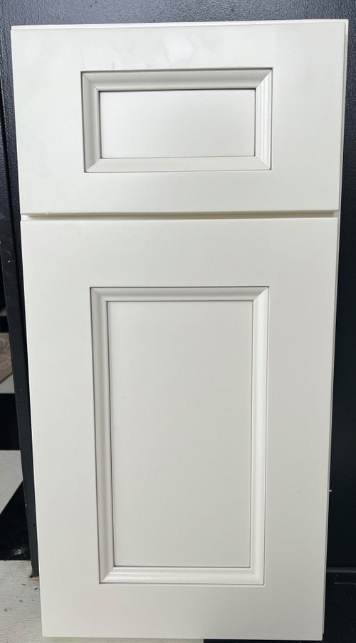
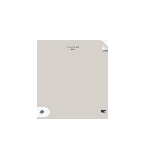
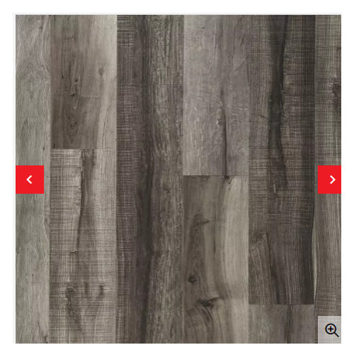
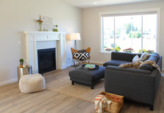
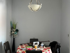
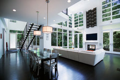
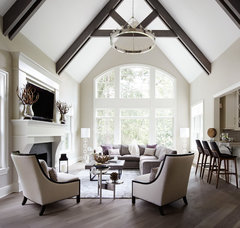
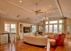
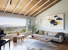
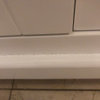
Coordinating paint colors
Christine
2 years ago
Featured Answer
Sort by:Oldest
Comments (19)

Christine
2 years ago
kandrewspa
2 years agoRelated Discussions
Coordinating Paint Colors Shaker Beige/ Lenox Tan
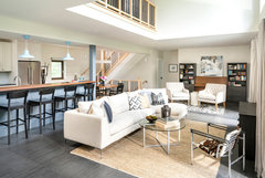
Comments (4)Thank you for all the input. I will be painting over the Laura Ashley gold in the back hallway, ( but was mentioning that I actually like that color- but just won't be the right tone go gold against the lenox tan). What I am leaning towards now is the shaker beige in the 2 story foyer ( which runs into an upstairs living loft area) and use same color in the downstairs formal living room as well. It will look nice with the burgundy dinning room. Instead of lenox tan in the kitchen - I am now leaning towards going a golden/light brownish color. I like sherwin Williams whole wheat ( and it would go well with the burgundy dinning area as well. Then, I could keep a golden color in back hallway- SW believable buff or BM monroe bisque). I would like to have a green color in the family room ( it's currently gold). The small square opening into the kitchen is going to be opened up to the ceiling and I will be adding a tall wainscot to the family room as well ( painted creamy white). All cabinetry will be replaced in the kitchen with a creamy white and will go to the ceiling. From my kitchen you can see the dinning room, family room and back hallway. The front foyer is not seen from the kitchen. Most of my home has greens, golds with some burgundy mixed in. However, for the front of the home ( 2 story foyer, loft area) wanted to go with more of a taupe ( as it shares walls with the upstairs loft/living area) and the upstairs bedrooms are off that loft area. All trim will be in BM mascarpone. Living room Part of foyer runs into loft area Front hallway off living room and foyer Continuation Hallway off foyer Family Room ( opening will go up to ceiling). Also, thinking of putting tall wainscoting in this room painted in creamy white). Massive fireplace almost covers one entire wall. Kitchen ( cabinetry being replace with creamy white cabinets and will go up to ceiling. Appliances being replaced with stainless and lighting will be recessed). Flooring - debating lighter hardwood or tile. Other side ofvlitchen ( shares walls with another loft area) Back hallway ( off of kitchen). Flooring will be replaced with lighter hardwood or neutral tile...See MoreHelp choosing coordinating paint colors
Comments (3)From these photos, the house looks dark. You might want to do offwhite walls with slight beige undertones. Taupe are tricky. Some have brown undertones and some have red undertones. So the light in the home effects how colors look as well. If you are doing the brick and trim white I would consider doing a tint of white only. There are about a thousand whites. Maybe more. Check out the Sherwin Williams off white brochure for ideas. Make up some sample boards and see what appeals in that light....See MoreCoordinating paint color help
Comments (2)Grays don’t work well with tans like Pashmina unless you have bridge colors, and a lot of skill combining warm and cool. You also need products beyond the typical Home Goods route. You need a good Pro’s help. Or you need to play it safe and not try to combine warm and cool on your own. Stick with warm colors....See MoreCoordinating paint colors
Comments (2)I'm a big fan of using the same color on the walls and the trim, just in a different sheen. So you can use flat or matte on the walls and semi-gloss or satin on the trim. Even though it's the same color, it will look a bit different because of the way the light hits it. It solves the problem of trying to "match" the whites, which can be very problematic....See More
raee_gw zone 5b-6a Ohio
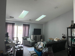
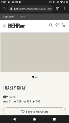
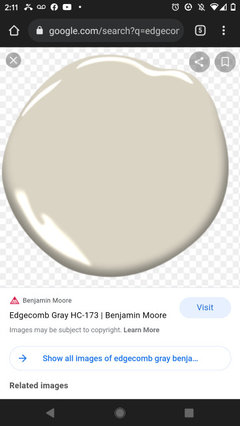
2 years agoChristine
2 years agoChristine
2 years agoChristine
2 years agoChristine
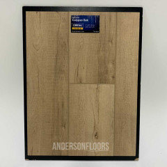
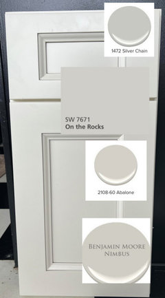
2 years agoherbflavor
2 years agoChristine
2 years ago
Related Stories
CURB APPEAL5 Bright Palettes for Front Doors
Splash bold green, blue, orange or red on your front door, then balance it with a more restrained hue on the rest of the house
Full Story
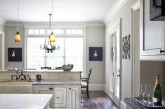
KITCHEN DESIGNPalatable Palettes: 8 Great Kitchen Color Schemes
Warm and appetizing or cool and relaxing? These 8 paint palettes can help you choose the best colors for your kitchen
Full Story
COLORBest Uses for the Boho Blue Color of 2015
PPG Pittsburgh Paints’ Color of the Year is a bold bohemian blue best used in small doses
Full Story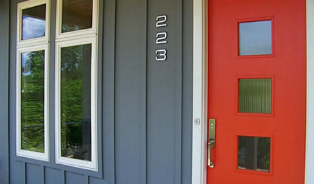
FRONT DOOR COLORSFront and Center Color: When to Paint Your Door Bright Red
Welcoming and intense, a red front door kicks up a home's entryway and is impossible to miss
Full Story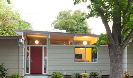
FRONT DOOR COLORSFront and Center Color: When to Paint Your Door Deep Red
Rich reds draw the eye and send an inviting message. See if one of these palettes speaks to you for your own front door
Full Story
COLORFront and Center Color: When to Paint Your Door Purple
From grapelicious to lavender, a front door cloaked in the color of royalty might just reign supreme in the neighborhood
Full Story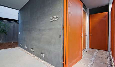
FRONT DOOR COLORSFront and Center Color: When to Paint Your Door Orange
Bring high energy and spirit to your home's entryway with a vibrant shade of orange on the front door
Full Story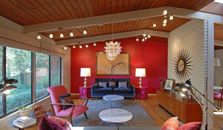
COLORWhat Goes With Red Walls?
These coordinating colors and materials will make your red walls look right at home
Full Story
COLORColor of the Year: Off-White Is On Trend for 2016
See why four paint brands have chosen a shade of white as their hot hue for the new year
Full Story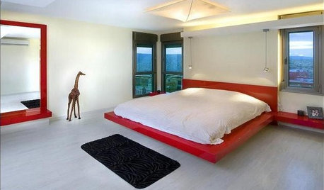
BEDROOMSPaint Your Bed for a Colorful Night’s Sleep
Take your bedroom somewhere over the rainbow with a bed done up in a shade beyond the pale
Full Story

Beth H. :