


Front and Center Color: When to Paint Your Door Purple
From grapelicious to lavender, a front door cloaked in the color of royalty might just reign supreme in the neighborhood
Jennifer Ott
November 5, 2012
San Francisco-based architectural color specialist and design writer. Jennifer's work has been featured in many print and online publications. Her recently-published book, "1000 Ideas for Color Schemes," is a beautifully illustrated and easy-to-navigate guide that takes the guesswork out of selecting the perfect color palette for your home or special event. For more information on Jennifer Ott Design, visit http://jenottdesign.com/.
San Francisco-based architectural color specialist and design writer. Jennifer's... More
Purple is a tricky color to work into a home's interior. Dramatic and moody, it can veer toward garish if combined with too many other vibrant colors or fussy materials. Large expanses of pastel purples can come across as overly sweet and girly, while too much deep purple tends to make a space feel gloomy, dark and cavelike. But purple can be terrific on the oft-overlooked exterior. The entry to your home should be attention getting — why not do that via a gorgeous purple color on your front door? It won't appear too busy in such a small dose, and with abundant natural light it won't feel too heavy or gloomy.
Check out these eight examples of gorgeous purple doors, along with suggested palettes that include siding and trim or accent colors.
Check out these eight examples of gorgeous purple doors, along with suggested palettes that include siding and trim or accent colors.
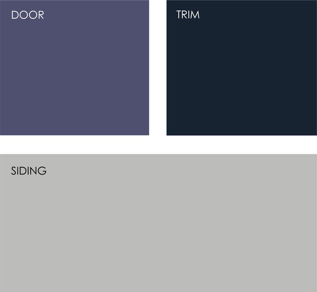
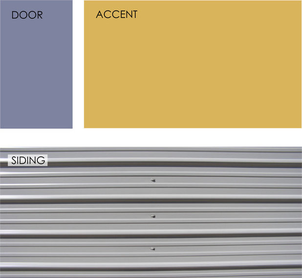
1. Bluish-Purple Door With a Light Gray Exterior
If the exterior of your home has a light neutral hue, the best way to call attention to your door is to go with a contrasting deep, dark color.
This bluish purple reads as a neutral, making this palette feel calm, cool and restrained — perfect if you like purple but want to go with a relatively neutral exterior palette.
Note: If your door gets hit with a lot of afternoon sun, a dark color will absorb heat and may fade more quickly than a lighter hue.
Example palette: Get a similar look with (clockwise from top left, all from Pittsburgh Paints): King's Robe 246-6, Dill 310-5 and Fisherman's Net 512-4.
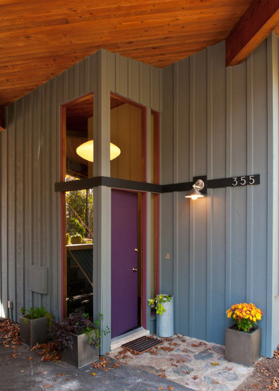
2. Red-Purple Door With a Medium Gray Exterior
If your home has a medium gray exterior, similar to the one here, you can dress up your door in any color you desire. This saturated purple with a bit of red in it is an excellent choice, especially in concert with the wood-clad overhang ceiling, which reads as a warm orange-red. This unusual palette warms up this contemporary home and makes the entry welcoming and inviting.
If your home has a medium gray exterior, similar to the one here, you can dress up your door in any color you desire. This saturated purple with a bit of red in it is an excellent choice, especially in concert with the wood-clad overhang ceiling, which reads as a warm orange-red. This unusual palette warms up this contemporary home and makes the entry welcoming and inviting.
Example palette: Get a similar look with (clockwise from top left, all from Pratt & Lambert): Tulip Purple 30-14, Orange Bead 6-16 and Kid Glove 26-28.
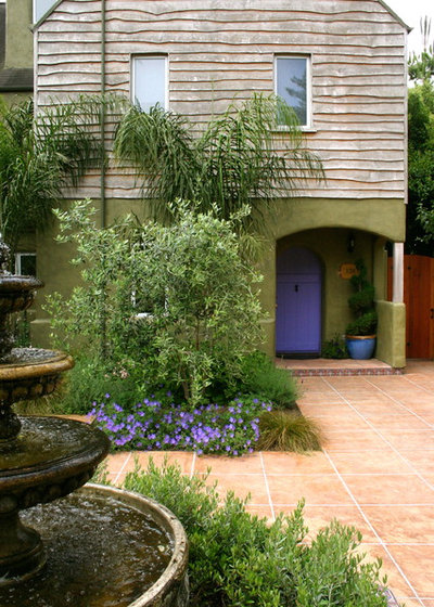
3. Purple Door With an Olive Green and Taupe Exterior
This door sports a beautiful cool bluish purple that helps it stand out against the olive-green and light taupe siding. I like how the landscaping picks up the house's exterior colors and the warm-hued pavers offer a clean, welcoming path to the front door.
This door sports a beautiful cool bluish purple that helps it stand out against the olive-green and light taupe siding. I like how the landscaping picks up the house's exterior colors and the warm-hued pavers offer a clean, welcoming path to the front door.
Example palette: Get a similar look with (clockwise from top left, all from Sherwin-Willams): Luxe Blue SW6537, Black Swan SW6279 and Destiny SW6274.
4. Dark Purple Door With a Green-Gray Exterior
This is a very cool and striking palette. The purple has quite a bit of inky blue in it, making it appear almost navy or black, and the siding color is one of those complex hues that sometimes reads as gray, sometimes blue, sometimes green. The white trim gives each element a clean, crisp edge.
This is a very cool and striking palette. The purple has quite a bit of inky blue in it, making it appear almost navy or black, and the siding color is one of those complex hues that sometimes reads as gray, sometimes blue, sometimes green. The white trim gives each element a clean, crisp edge.
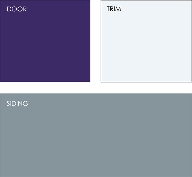
Example palette: Get a similar look with (clockwise from top left, all from Kelly-Moore): Evening Magic KM3104-5, Drizzle KM3785-1 and Raw Steel KM3836-2.
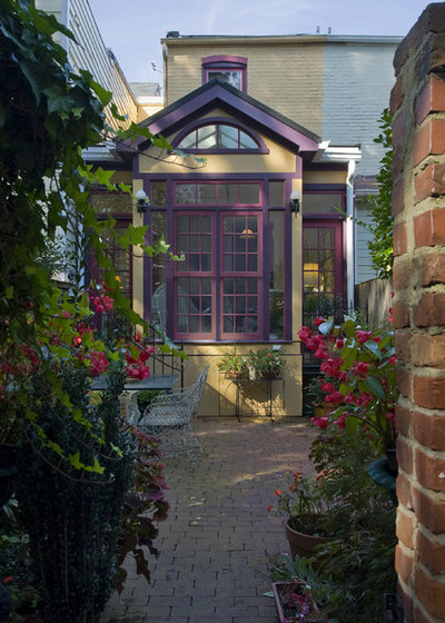
5. Purple and Plum With a Beige Exterior
I love this delightful exterior palette. It shows how color can be used to accentuate architectural elements on a home in a fun way. (It helps to live in a neighborhood that is amenable to whimsical exterior palettes.)
You could easily do a variation on this palette using your favorite vibrant hue. If you keep the main exterior color neutral, simply select two hues that are near each other on the color wheel (for instance, lime green and lemon yellow, or turquoise and navy blue). This will give you a colorful palette with just enough restraint.
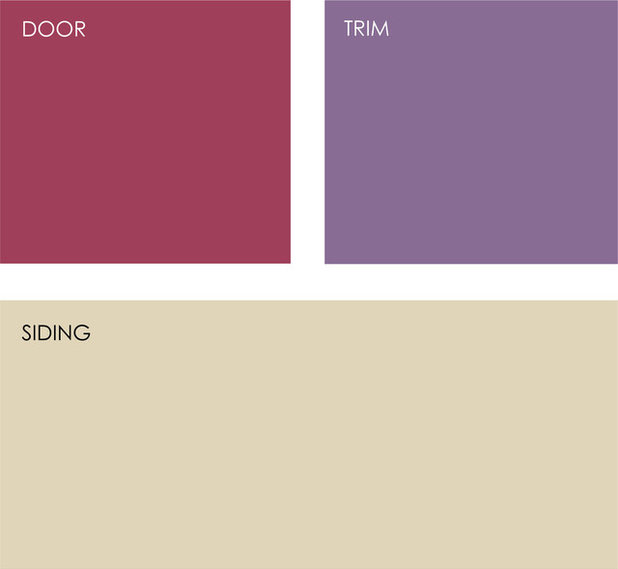
Example palette: Get a similar look with (clockwise from top left, all from Benjamin Moore): Old Claret 2083-30, Mauve Bauhaus 1407 and Barbados Sand 1094.
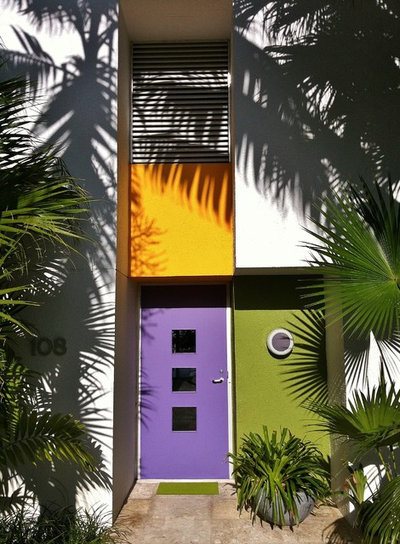
6. Bright Purple Door With Other Bold Hues and White
Here's another fun palette that again is not for everyone. Because the main house color is a light off-white, the small square chunks of vibrant color look clean, bold and modern — reminiscent of an abstract expressionist painting.
I love these colors and how they are used, but what's great about employing bold color as a decorative element is how relatively easy and affordable it is to repaint with a different set of bold hues or neutrals for a completely different look.
Example palette: Get a similar look with (clockwise from top left, all from Mythic Paint): Blue Bomber 015-5, Spanish Saffron 095-5, Arapaho Valley 079-6 and Morning Song OW-5-3.
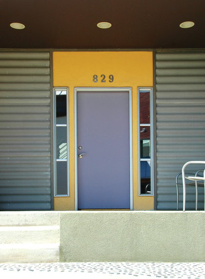
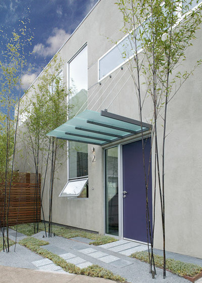
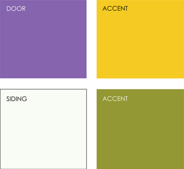
7. Lavender Door With Corrugated Metal Siding
If you prefer a purple shade that's more on the lavender side, pair it with a bold yellow hue to make the lavender really stand out. Purple and yellow are complementary colors — opposite each other on the color wheel — so they offer the most contrast to each other when used in combination. In small amounts against a neutral background, in this instance light gray corrugated metal siding, the two colors look great.
If you prefer a purple shade that's more on the lavender side, pair it with a bold yellow hue to make the lavender really stand out. Purple and yellow are complementary colors — opposite each other on the color wheel — so they offer the most contrast to each other when used in combination. In small amounts against a neutral background, in this instance light gray corrugated metal siding, the two colors look great.
Example palette: Get a similar look with (clockwise from top left, all from Sherwin-Willams): Indulgent SW6969 and Sunrise SW6668, with corrugated metal siding.
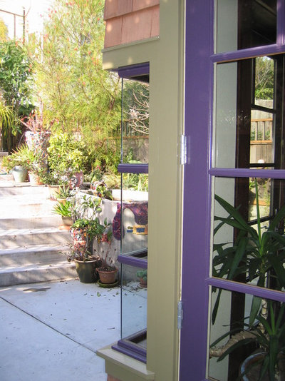
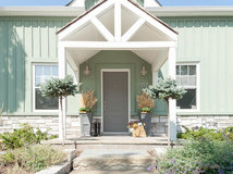
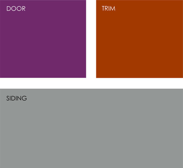
8. Purple Door With a Light Taupe Exterior
My strategy for picking out an interesting exterior paint palette is to select two neutrals and one bold hue. Generally you want to paint the largest portion of your home — the siding — one of the neutrals. Then use the bold hue for doors, trim or accents.
The second neutral should coordinate with the main neutral, but you want it to be different enough that it reads as a completely different color; otherwise it can look like you were trying to match colors and made a mistake. Use this second neutral as a trim or an accent color.
Here the wood siding serves as the main neutral and reads as a light tan-taupe color. The soft olive green also reads as a neutral, and they both serve as a nice supportive ground for the bits of deep purple on the door and window frame.
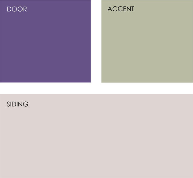
Example palette: Get a similar look with (clockwise from top left, all from Valspar): Twinkle Night 4004-8C, Willow Wind 6004-3B and Vanilla Steam 2006-10C.
Tell us: Would you paint your door purple?
Tell us: Would you paint your door purple?


Related Products
We at Frasure Home Improvements feel like everyone deserves our best. We constantly push for excellence. We truly... Read More
Related Stories

Decorating Guides
Design Pros Share 10 Favorite Creamy White Paints
By Becky Harris
These off-white color choices include versatile tones, warming hues and pleasingly soft shades
Full Story

Kitchen Countertops
What Kitchen Countertop Colors Should You Choose?
By tidgboutique
Consider these popular colors and styles to get the look you want — no matter what material you use
Full Story

Colors of the Year
Pantone Picks a Peach for Its 2024 Color of the Year
By Jennifer Ott
See how to use this juicy hue to create calm yet flourishing spaces inside and outside the home
Full Story

Decorating Guides
5 Ways Designers Are Working With Rich Warm Tones Right Now
By Becky Harris
Interior designers describe their strategies for using rich warm colors to create an inviting home
Full Story

Colors of the Year
10 Paint Colors Ready to Take Over in 2024
By Jennifer Ott
Blue is huge, but dark hues and warm tones also find favor among major paint companies’ 2024 Color of the Year picks
Full Story
Decorating Guides
How to Mix Colors and Make It Work
By tidgboutique
Don’t want to confine yourself to neutrals but lack the confidence to embrace colors? Check out this pro advice
Full Story

Events
7 Color Trends for 2024 at Maison & Objet
By Claire Tardy
New harmonies and unexpected pairings at the fall 2023 trade fair set the tone for next year’s interiors
Full Story

Decorating Guides
9 Ways to Layer Warm Neutral Colors for Comfortably Refined Rooms
By Becky Harris
Design pros share advice for building an inviting palette, introducing high contrast and mixing textures
Full Story

Decorating Guides
How to Create a Cohesive Color Flow Throughout Your Home
By Erin Carlyle
Designers share eight techniques for avoiding a choppy feeling in your spaces
Full Story

Decorating Guides
How to Get Your Ceiling Paint Color Right
By tidgboutique
Here’s how to tweak the shade of your ceiling paint to get the effect you want
Full Story
I love my purple door and it even leans to
conservative, which was not my goal. I had originally planned on a bright sunshiny door but as things fell into place it was apparent that was not the color for this house. The siding is BM Bear Creek,a medium grayish color, windows BM
Tulsa Twilight (dark charcoal) porch ceilings BM 2128-60 Beacon Gray (bluish
gray) and the door is BM mystical grape (2071-30 with a slight dry brushing over
it with gentle violet 2071-20. This, in order to obtain a bit of an antique look to the door. The blues, grays and purples seem to blend in very well.
I love my purple front door, painted with SW Fabulous Grape.
Mine is Sherwin Williams’ Amethyst.