


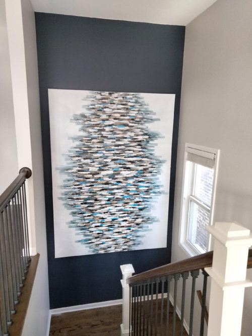
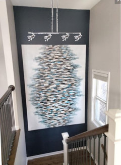
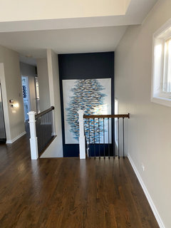
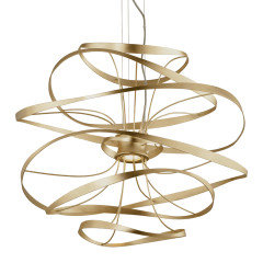
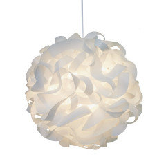
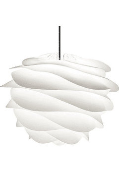
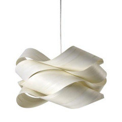
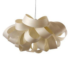
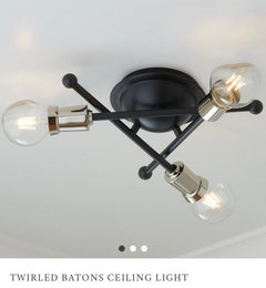
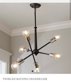
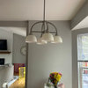
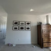
Feature wall art lighting
Charlie Brault
2 years ago
Featured Answer
Sort by:Oldest
Comments (23)
 PRO
PROBeverlyFLADeziner
2 years agolast modified: 2 years ago
Carrie B
2 years agoRelated Discussions
Need art advice- Hollywood Regency meets Art Deco
Comments (8)Hi Blessedbe. I used to live in an incredible Streamlined Deco apartment building built in 1940, with terrazzo floors, glass block walls & steel casement windows with metal Venetian blinds 12 feet wide--the widest made--and although it's been 25 years since I lived there, I still love that sleek look. OK, so you don't mention whether your whole place is, like mine was, actually of the period, or if it's newer construction, and you also don't say whether you're going for an authentic period look--as though your bath might have been decorated during the era & somehow survived intact till now, or whether you're making a room that's about the era & the style. They're two totally different things. Either way, forget Maxfield Parrish & Alphonse Mucha. Both were wonderful artists, but they're both way earlier, and their lush colors & lavishly ornamental style have nothing to do with the slick, high-contrast style typical of late Art Deco that you're after. In fact, when Bette Davis' elegant movie characters were swooning about in sleek penthouses & nightclubs, both Mucha's & Parrish's artwork would have been considered hopelessly old-fashioned, and all that adding them into the mix would do is muddy the concept. Paris & San Francisco, on the other hand, were both sophisticated & up-to-date, with plenty of shops & theatres & apartments & hotels executed in just the glamourous style you're after. In fact, Paris' exhibition in 1937 & San Francsco's in 1939 represent the pinnacle of the style's development just before the dark days of WWII put a sudden end to the party. But watch out if you're thinking about using photos: there are a lot of classic photos of both cities that, like the Mucha & Parrish posters, would only confuse your decor. The Eiffel Tower is too old by half a century to say anything about the Art Deco era, and while the Golden Gate bridge is an icon of 1930s design, neither image would have been used to decorate a bathroom of the period. Nor would a picture of Bette Davis, talented though she was. No, those things--movie star portraits, photos of landmarks of the period, vintage magazine ads for, say, Evening in Paris perfume or Packard automobiles, covers from Fortune magazine or Vogue, colorful fruit crate labels, vintage travel posters featuring the Pan-American Clipper or the 2oth Century Limited--while perfect for a room that's ABOUT the period/style, are all wrong for a bathroom that's meant to look as though it's FROM the same period. OK, maybe a struggling actress or a shopgirl living on the cheap in an efficiency apartment might hang a picture of Bette Davis in her tiny bathroom, but only becasue she could tear it out of a magazine for free and hang it in a ten-cnt frame from Woolworth's. But a wall full of ads & commerical art wasn't likely to appeal to most people, even if they wanted to hang artwork in their baths, which generally, they didn't. For the upper classes--the target audience, after all, for the styles that we call (thanks to Kelly Werstler & Bevis Hiller) Hollywood Regency & Art Deco--the whole point of 1930s baths was Glamour Without Fussiness. That's why they went for rich or striking new materials on the walls--marble, Vitrolite, colored or engraved mirror--and often, strong color in the fixtures: by making beauty inherent in the materials themselves, they could eliminate superfluous ornamental touches. You wouldn't have found pretty crocheted doilies or dainty flower arrangements or frilly curtains in any high-style bathroom of the period. As Belle Watling said in 1939, "It wouldn't be fittin'." So, if you want a true period look but you still want a bit of decoration, you might try adding a stenciled (or taped) border (a zigzag, or a Greek key, or a very-authentic angel-fish-&-bubbles motif in black & one other color--there are lots of possibilities) just above the tiles or just below the ceiling. Stenciled & painted designs are an authentic look, because a border is actually part of the room rather than something in the room. And, on the other hand, if you're doing a room that's not intended in any way to be authentic but one that's, rahter, ABOUT the period, you have a lot more possiblities beyond the obvious cliches. If it's photos you want, look at the striking black-&-white images that Hedrich-Blesing took for the 1933 World's Fair here in Chicago. Their lustrous shot of the Chrysler building at night has gotta be the most drop-dead glamorous photo of the whole century. I think you can buy a reproduction from the Library of Congress. Or check out Ewdard Weston's work, if you don't know it. Once you've seen his voluptuous, suggestive photgraphs of produce, you'll never look at a green pepper the same way again. For Art Deco drawings, look up Hugh Ferris' work. His renderings of Hoover Dam are awesome. For posters, look at the work of A.M. Cassandre, or Joseph Binder, whose graphic work between the wars is some of the most powerful ever. And since this approach is not really authentic for the period, anyway, there's one more image that would fit in just fine with the style & also with the black-&-white scheme you've already got going on: Richard Estes' iconic painting "Drugs" from the Art Institute of Chicago. It's a 196Os piece, but the subject is a classsic late-1930s facade in curved black Vitrolite & bent glass, and I bet the AIC has it in reproduction. I hope this suggests the two different approaches you can take as you finish your room. Be sure to post some pics when you get your room the way you want. Regards, Magnaverde....See MoreLighting art work.
Comments (2)When my wife and I and our friends Tom and Freda visited Italy in 2011, I told Tom that if he bought this stingray at Murano in Venice that I'd design and build an appropriate display. It's gloss black thermoformed Corian Nocturne with built-in lighting. We fished a wire through an upstairs closet to install an overhead ceiling light which isn't pictured. I love Tom and Freda, so I did this for material costs only. Anyone else would pay about 2K plus shipping....See MoreBare Wall - Add Lighting, or Art, or ...?
Comments (12)Thank you all so much. I love lmmcnitt's idea of tone-on-tone wallpaper, I hadn't thought of that (despite loving wallpaper! I did a funky mid-century modern style accent wall in our master). That could really work - adding either a blue tone-on-tone, or even a neutral, could really do the trick, the texture would be a great layer. Special thanks to Groveraxle for the renderings - that is incredibly helpful! I love the first rendering of that mechanical-arc lamp, that's what I was envisioning and seeing it makes me really think that's the way to go (in addition to a tone-on-tone wallpaper that would really complete the space). I'm going to look around for things similar - even taller maybe, as the ceilings are high and can really handle height. I do like everyone's ideas of a plant too - a little green would warm things up. Alas, I am crazy picky about plants, not sure I'd be able to find one I like. It's weird, but it's hard to find 'modern plants'. Cheers everyone, again - much appreciated....See MoreI don’t know if art work or a mirror is better on the buffet wall ?
Comments (13)I agree that the rug is much too small as well as dark. The tones are taking away from the distinct table base and the coordinating chair legs. As an admitted minimalist, I'd have no rug there or one that's the same color as the floor but textural. The floors are beautiful. Given the many hard reflective surfaces, I think a mirror would be too much and would prefer a textural art piece. The height can't be greater than what's there now due to the vent. Although I really like the candlestick lamps below, it may look cluttered due to the glass cabinet close to the sideboard....See More
Charlie Brault
2 years ago
M Riz
2 years agolast modified: 2 years agoCharlie Brault
2 years ago
Jilly
2 years ago- PRO
Patricia Colwell Consulting
2 years ago M Riz
2 years agolast modified: 2 years agoCharlie Brault
2 years ago- PRO
BeverlyFLADeziner
2 years ago  PRO
PRORL Relocation LLC
2 years agolast modified: 2 years agoCharlie Brault
2 years agoM Riz
2 years agoloobab
2 years agoCharlie Brault
2 years agoloobab
2 years agoloobab
2 years agolast modified: 2 years agoloobab
2 years ago- PRO
RL Relocation LLC
2 years ago Renee
2 years agoRenee
2 years ago PRO
PROAnnette Jaffe Interiors
2 years ago
Related Stories

ARCHITECTUREModern Roof Features for Light, Rhythm and Interest
Discover the benefits of skylights and other high-up elements beyond the obvious
Full Story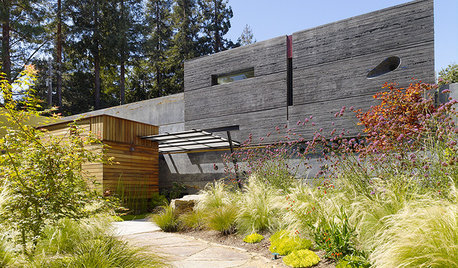
ARCHITECTUREArchitecture and the Art of the Wall
See how common building materials can become uncommonly beautiful displays of color, pattern, texture and light
Full StoryART6 Bold Murals Turn Outdoor Walls Into Art
When sprucing up your outdoor space, consider adding something one of a kind to the walls too
Full Story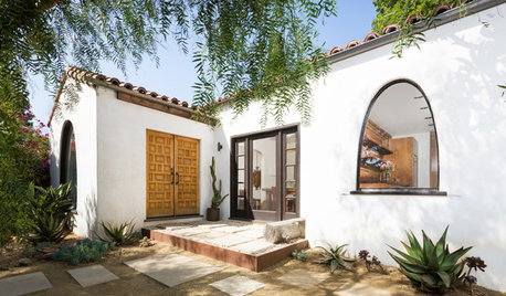
BEFORE AND AFTERSHouzz TV: See Recycled Walls and Cool Cassette Art in a Woodsy DIY Home
Walnut countertops join hardwood floors and pieces made from leftover framing in a bright Spanish colonial
Full Story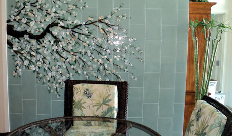
WORKING WITH PROSInside Houzz: An Art Mosaic Wall Banishes Dining Room Gloom
A glass mosaic created by Houzz pros gives a San Diego couple's condo a major design boost
Full Story
CONTEMPORARY HOMESHouzz Tour: Light, Art and a Floating Bed in a Chic London Flat
A Notting Hill apartment is opened up, drenched in white and furnished with clever pieces and the first-time homeowner’s DIY art
Full Story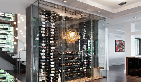
WINE CELLARSRoom of the Day: Chilled Wine Box Makes a Fun Feature Wall
A narrow compartment of slate, glass, steel and cork adds surprise and utility to an open-plan room
Full Story
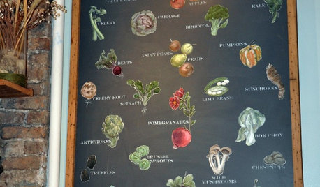
ACCESSORIESStreet Smarts: Produce Wall Art
Borrow an idea from a gourmet shop and celebrate the harvest on your kitchen wall
Full Story
HOMES AROUND THE WORLDMy Houzz: A Melbourne Apartment Filled With Light, Love and Art
A compact apartment in Australia serves as a creative couple’s relaxation and design hub
Full Story

Charlie BraultOriginal Author