


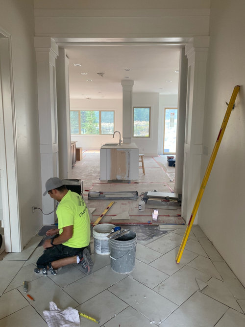
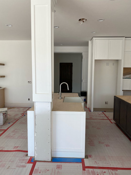
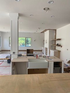
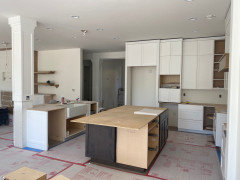
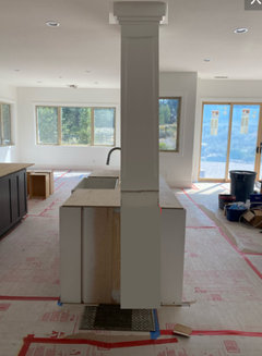
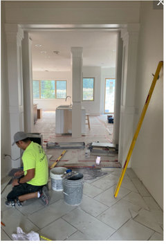
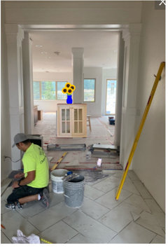
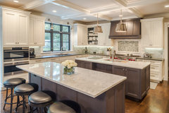
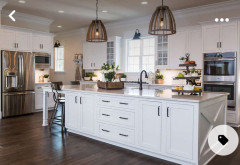
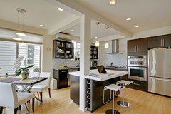
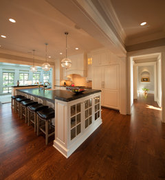
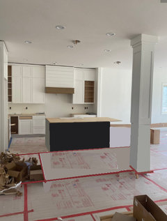
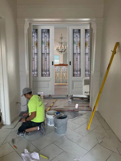
Kitchen Sink Visible from front door
smccahill
2 years ago


Featured Answer
Sort by:Oldest
Comments (73)

Mrs Pete
2 years agolast modified: 2 years ago PRO
PROGN Builders L.L.C
2 years agoRelated Discussions
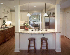
Kitchen visible from entry
Comments (9)A kitchen visible from the entryway can be a huge plus if executed properly. Many would argue that the kitchen has become the heart of the home. Immediately anchoring visitors to your "heart" can make them feel "at home"! You truly need to do a little reading on feng shui principles to determine how you would like to apply them. Hiring a practitioner/consultant will give you their expertise, though like designers, each has their own approach/style/character. Take a look at Johnny Grey's website. He likes to design open plans incorporating kitchens into a cohesive living area. You might get some ideas there. You want to account for flow and space/activity apportionment as you design your space. The approach to the kitchen should be layered or "landscaped" so folks are not seeing/walking into your "cooking triangle." You can do this with sitting/eating areas transitioning into mid sized bars (42" or so) or cabinets (42-54") to channel eyes and feet as they journey into your kitchen proper. Sounds like a really fun project. Good luck, but please do some reading and research. You will find it both educational and rewarding as you take some control of your living space....See MoreOT?? Help w/bookshelves visible from kitchen
Comments (4)Definitely 15" and 30"! You could always build 45" cabs youself - they'd need face frames along the sides and solid wood rails across the front of each shelf for added strength, though. The bookshelves flanking my fireplace are 48" each, but they are original to the house and new wood is not as strong as old wood, that's why you cannot buy bookshelves over 36" today....See MoreHow to conceal kitchen from front door?
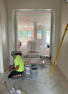
Comments (12)Could you close off that passageway and walk around through the living room, or would that be too much impact on traffic flow? I realize this won't work in many cases -- just brainstorming some options for you. I think the beads/cloth panels will be the easiest/lowest cost by far but its a look not everyone will want. You might also look at freestanding trifold panels which could be moved as you need them (fully blocking, partially blocking so you can squeeze by, or taken away if you need full access)....See MoreSee kitchen from front door
Comments (9)A kitchen that blends well with the open living and dining areas can be very attractive and dramatic. At night lighting can contribute to the effect. You need, like every beautiful interior space, to carefully design for that. Just as you would for a living room. Three spaces together- that's the coordination goal given your layout. You're the primary arbiter. If you find the finished product comfortable and inviting you've succeeded. You have the option of removing part of the wall opposite the entrance as well as all of the wall on the dining room side. You'll need to post a scaled layout of your space with measurements including doors and windows....See Moredecorpatti
2 years agocat_ky
2 years agopalimpsest
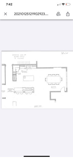
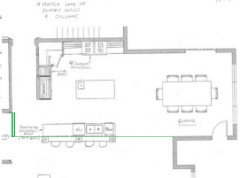
2 years agosmccahill
2 years ago
KW PNW Z8
2 years agolast modified: 2 years agocupofkindnessgw
2 years agopalimpsest
2 years agolast modified: 2 years ago
Nidnay
2 years agopalimpsest
2 years agochicagoans
2 years agocupofkindnessgw
2 years ago PRO
PRODiana Bier Interiors, LLC
2 years agolast modified: 2 years agopalimpsest
2 years agosmccahill
2 years agosmccahill
2 years ago
rebunky
2 years agomodpod
2 years ago
mnmamax3
2 years agopalimpsest
2 years ago
Jennifer Hogan
2 years agopalimpsest
2 years ago
Maureen
2 years agoJennifer Hogan
2 years agowilson853
2 years agopalimpsest
2 years agopalimpsest
2 years ago- PRO
Diana Bier Interiors, LLC
2 years ago palimpsest
2 years agoNidnay
2 years agopalimpsest
2 years agochicagoans
2 years agolast modified: 2 years ago
Fori
2 years agolast modified: 2 years agosmccahill
2 years agopalimpsest
2 years ago
3onthetree
2 years agopalimpsest
2 years agopalimpsest
2 years agosmccahill
2 years ago3onthetree
2 years agopalimpsest
2 years ago3onthetree
2 years agolast modified: 2 years agopalimpsest
2 years agoTara
2 years agoKyle
2 years agolast modified: 2 years agoFori
2 years agorebunky
2 years agolast modified: 2 years agotheresa21
2 years agoHU-217444546
2 years ago


Related Stories
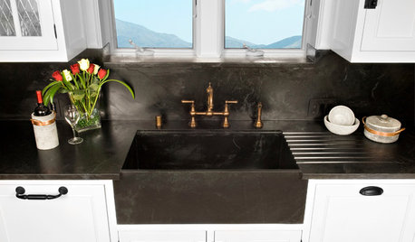
KITCHEN DESIGN8 Apron-Front Sink Styles for Kitchens of All Kinds
Simple or showy, matching or contrasting, apron-front sinks are popping up in kitchens far from the farm
Full Story
COLORHow to Paint Your Front Door, From Start to Finish
Learn what you need to know about this weekend project, such as the best paint to use and the right time to do it
Full Story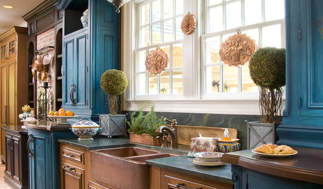
KITCHEN DESIGNKitchen Sinks: Antibacterial Copper Gives Kitchens a Gleam
If you want a classic sink material that rejects bacteria, babies your dishes and develops a patina, copper is for you
Full Story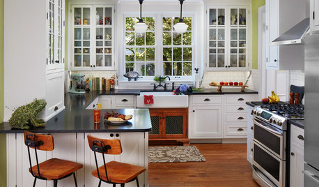
KITCHEN MAKEOVERSBefore and After: Glass-Front Cabinets Set This Kitchen’s Style
Beautiful cabinetry, mullioned windows and richly refinished floors refresh the kitchen in an 1879 Pennsylvania home
Full Story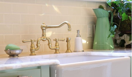
KITCHEN DESIGNYour Kitchen: Farmhouse Sinks
These extra-deep and minimal sinks can go from country to jet set
Full Story
KITCHEN DESIGNStandouts From the 2014 Kitchen & Bath Industry Show
Check out the latest and greatest in sinks, ovens, countertop materials and more
Full Story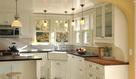
KITCHEN DESIGNIs a Kitchen Corner Sink Right for You?
We cover all the angles of the kitchen corner, from savvy storage to traffic issues, so you can make a smart decision about your sink
Full Story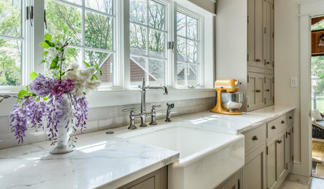
KITCHEN DESIGNHow to Choose the Best Sink Type for Your Kitchen
Drop-in, undermount, integral or apron-front — a design pro lays out your sink options
Full Story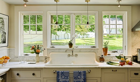
PHOTO FLIP60 Kitchen Sinks With Mesmerizing Views
Check out this parade of views from the kitchen sink and tell us: Which offers the best backdrop for doing the dishes?
Full Story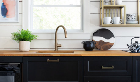
KITCHEN DESIGN20 Stylish Kitchen Sink Setups
Beautiful views, bold backsplashes and sparkling finishes make these well-designed sink setups stand out from the crowd
Full Story

Jen K (7b, 8a)