


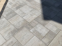
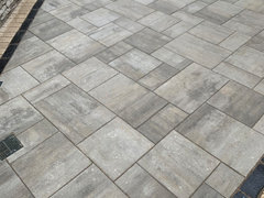
What color would work with Unilock Beacon Hill Fossil color
Sami
3 years ago
Featured Answer
Sort by:Oldest
Comments (6)

skeeley
3 years agoSami
3 years agoRelated Discussions
Checking out latest fabric colors, for what it's worth
Comments (14)Thanks for your responses. It's a fun topic, isn't it! I should point out that there are scores of fabric manufacturers that were not represented here, so who knows how true my post is! But Beacon Hill, Stroheim, and many more that I saw are industry leaders. Oceanna--upholstery fabrics used to follow by a few years, but now its right on the heels of the clothing industry. BTW, I'm loving your cottage posts. mqmoi--Sorry I don't know how to find Sequoia by Richloom, but I'll but there is somebody here who can. tinker--I think the rust/spice colors are pretty neutral and easy to accent, as already stated; depends on how light or dark (saturated) you go. meg711--what happens where I am, is the distributor shows the newest fabric samples "to the trade", and these samples are constantly coming in; some stay longer than others. For someone like me, who goes maybe 3-4 times a year, the changes kind of jump out more than if I went weekly or daily like some clients. The new stuff filters down to retail showrooms almost immediately, where they are added to the samples that already exist, and their staying power can (and should) be a lot longer there--often for years. Sample books are almost immediately provided to the retailer as well. So you basically see the new stuff fast, but generally not on the same huge scale. In other words, there are no real surprises lurking in the background to blindside us; just general directions that get tweaked constantly. I was also thinking and wondering about browns when I left the place, because I didn't really notice browns. Maybe I just spaced it. Someone else may know the answer to that. At any rate, they didn't jump out at me, but I wasn't really looking. Syllabus--I agree about the greens. Some of them were very pretty though, by themselves. I think for traditional, country, cottage, shabby chic, etc. that sage green will always have a place; as well as any other color that you would find at, say, Williamsburg or other places of our heritage....See Morewall color to coordinate with stained glass window - please help
Comments (31)So you can get an idea of what brown w/ dark trim may offer you here are 2 browns that I used yrs. ago and really liked w/ my dark trim. Clearly you can see that I lean towards most anything w/ a green tone. I won't list the names as I just wanted to give you a general idea.: On a dreary day & flash: The next lighter shade on the strip: Brown could work very well w/ the greyer tones that you are trying to work w/. If I might make a few color suggestions to give you some ideas of greyed colors that could be close to some of those Farrow and Ball colors that could look so nice w/ your wood - not sure about the windows: Really Greyed colors BM Imperial Gray #1571 BM Cheyenne Green #1502 or 1512 - can't read my writing SW Svelte Sage SW Softened Green #6177 BM Mesquite #0501 Clearer colors that are similar to some F&B colors: BM Healing Aloe #1562 SW Mountain Air Valspar Field of Pines #5004-4A BM Blue Grass #CC-640 Valspar April Thicket #5003-3C BM Wythe Blue #HC-143 BM Florentine Plaster #520 SW Naturel #2080 Also don't think that using a rich cream/ neutral color is a cop out. Sometimes that is a beautiful way to pull all of the others colors together and have a subtle yet rich palette that flows so well. Remember - if that window can be seen from other rms. the wall colors in those other rms. can raelly help draw the color of the window out and totally unify everything around it. Have you thought about painting the parlor another color instead of Rich Cream? Maybe paint the entry rm. Rich Cream instead. My thought process is that when you would walk into your home you would see the beautiful window w/ no hard visual color pulling away from it and then all of the subtle greyed tones all around. Although I do see your point - Rich Cream would really look lovely w/ that white in that rm. Personally I do not regret for an instant deciding to go neutral in my hallway....See MoreCastleton Mist vs. Beacon Hill Damask?
Comments (6)Thanks! I looked at Greenmount Silk too and was just worried that because it's so pale, it might be too subtle for the room (as the room itself is fairly dark and has very strong wood tones). I've sampled Beacon Hill Damask on a couple of spots in the room to see how it plays in different light/times of day. The room faces North, East and West and there is greenery / woods outside every window, so a green cast is somewhat inevitable (perhaps why the PO settled on Pear for the window trim in the first place). I'm just not sure on the fluorescent bit - thanks Lynn for confirming that. So - to the drawing board - my goal is warmth (the stark white is cold looking) but I don't want anything too bright or deep as the room is very large and I think it might be overpowering with the strong wood and brick that's already there. I'd love something that sort of picks up the tones of old, unpainted plaster, to bring in more of the character of the old part of the house. Our furniture is warm woods, a dark brown leather sofa, some dark brown toy storage with cream fabric bins, braided jute rugs (with a flokati in the play area and a sage green shag in front of the fireplace - we sit on the floor a lot). It's fairly neutral and we have not done much by way of accessorizing/throws/mantel decor as I feel sort of stuck on figuring out a wall color first. Our style is casual and fairly care-free. We have 2 huge hairy dogs, elementary aged kids, and spend a lot of time outdoors. Thanks again, and if you have any more experience or suggestions for color, I am all ears! Mary...See MoreWhat would you do?
Comments (31)Brittu, you have tons of great ideas. Thanks! You have given me a lot to review & consider. I like the idea of replacing the trash compactor (which I NEVER use) with something functional. It was very observant of you to notice it...sharp eye! Love your window seat idea! That's the kind of thing I really find charming...maybe down the road. Ideagirl, yes I see what you mean about greens being the most neutral among colors. The green on my wall, btw, is not as vivid as in the pics. It looks sort of cactus green in the pics, & IRL it's softer & less yellow. Whenever I saw quartz samples today that were soft greens, I'd go "ooooh & ahhh" & my dh would say, "What color is that?" & I'd say "Sort of a mossy green...or sort of a soft gray green" & he'd shake his head(not with enthusiasm!) However, If I brought the samples home & they looked good, then he'd say so, & wouldn't stand on the neutral principle, so it's not out of the question. He does really like the idea of something darker & more high contrast for the countertop. I'm with you, I am definitely a green fan! One of the best decor decisions I ever made was to paint this kitchen green in March. I loved this color & knew it was right with the first brush stroke. Every morning I've come downstairs & walked into my kitchen since it was painted, I've so enjoyed seeing it! Green is good!...See Moredancingmarilyn
2 years agodancingmarilyn
2 years agolast modified: 2 years agoLaureen England
11 months ago
Related Stories
OUTDOOR ACCESSORIESBring On the S’mores With These 10 Smoke-Free Fire Pit Ideas
These fire features help take the party outside while keeping the air clear
Full Story


HU-825172730