


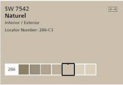
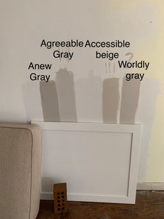
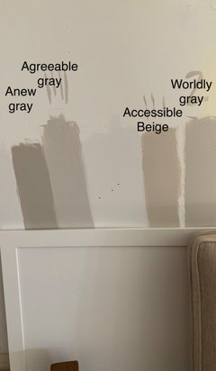
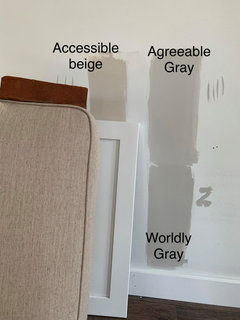
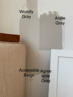
Accessible Beige and Agreeable Gray together?
Tracy Weber
4 years ago
last modified: 4 years ago
Featured Answer
Sort by:Oldest
Comments (29)

Jennifer Hogan
4 years agoJennifer Hogan
4 years agoRelated Discussions
Paint Help - SW Agreeable Gray vs SW Anew Gray
Comments (52)I have anew gray currently in my bedroom on the walls and alabaster on the trim. I think it would be beautiful to have the trim and perhaps the door also sw anew gray and the walls alabaster. Another look depending on the height of your ceilings, you could paint the ceiling anew gray with alabaster walls....See MoreIs Sherwin Williams Agreeable Gray too blue?
Comments (9)Just did Grey in my kitchen and wast have a very simular problem. Grey can change colors on you depending on the lighting and other finishes in the room. The modern Grey is most likely going to look more beige than grey with all the cream and beige you already have in your counters and cabinets. The Agreeable Grey will look more grey (if that is what you are wanting) and I think that the cream and beige in your counters and cabinets will tone down the blue quite a bit. That is the color I like the best from the sample photo you posted. I would get enough paint and try doing an entire wall (so the paint somes up to the cabinet and counter), then look at it in different lighting situations. Daylight and night lighting can really change the look of grey paint. The first grey that I loved looked great in the daylight but was a muddy brown/purplish mess in our night lighting....See MoreAccessible Beige vs. Shiitake vs. Edgecomb Grey
Comments (33)You made the right choice! It looks great and definitely is not too dark in your room. Also, I like that it's the same as your adjoining entryway (and coordinates beautifully with your kitchen)....See MoreWould you use agreeable gray and pale oak together in palette?
Comments (11)Would you use agreeable gray and pale oak together in palette? No. Because Pale Oak and Agreeable Gray are essentially the same color Except Pale Oak is lighter. It's obvious when you look at two large-size samples next to each other. Both colors have potential to show up purple-ish in certain lights. That doesn't mean they are purple or have purple "undertones". That doesn't mean they're "taupe". It just means that low chroma, near neutral colors factually in this Yellow hue family range can actually show up warm, neutral with no discernible hue. Or - they can flash moments of purple/purple-brownish. We know because we have a framework of color data values that define, describe and order paint colors so we can easily track - and predict - how they show up....See MoreJennifer Hogan
4 years ago PRO
PROJudyG Designs
4 years agolast modified: 4 years ago PRO
PROPatricia Colwell Consulting
4 years agoTracy Weber
4 years agoJennifer Hogan
4 years agoTracy Weber
4 years ago- PRO
JudyG Designs
4 years agolast modified: 4 years ago Tracy Weber
4 years agoJamie Schroeder
4 years agoJennifer Hogan
4 years agoJennifer Hogan
4 years agoTracy Weber
4 years agoTracy Weber
4 years agolast modified: 4 years agoJennifer Hogan
4 years ago
bbtrix
4 years agoTracy Weber
4 years agoTracy Weber
4 years agobbtrix
4 years agoTracy Weber
4 years agobbtrix
4 years agoTracy Weber
4 years agoJennifer Hogan
4 years agomagflo1
3 years agoMarylee H
3 years agomdefree
3 years agolast modified: 3 years ago
Courtney J
3 years ago


Related Stories

MOST POPULARRethinking Beige in a World Gone Gray
Gray, the ‘it’ neutral of recent years, has left beige in the shade. But is it time to revisit this easy-on-the-eyes wall color?
Full Story
DINING ROOMSColor Feast: When to Use Gray in the Dining Room
The right shade of gray pairs nicely with whites and woods to serve up elegance and sophistication
Full Story
GRAYChoosing Paint: How To Pick the Right Gray
Which Version of Today's 'It' Neutral Is For You?
Full Story
COLORHow to Layer Tones of Gray for Depth and Harmony
Use texture, pattern, contrast and more to create a subtle, sophisticated look with this popular color
Full Story
GRAYDesigners Share Their Favorite Light Gray Paints
These versatile neutrals can help create a range of moods in any room
Full Story
DECORATING GUIDESColor of the Week: Decorating With Warm Gray
Tired of tan? Getting gloomy from cool gray? Make warm gray your new go-to neutral
Full Story
MOST POPULAR50 Shades of Gray
Gray is hotter than ever, thanks to a hit novel full of risks and dark secrets. Tell us: Which paint shade possesses you?
Full Story
EXTERIOR COLORExterior Color of the Week: 7 Ways With Warm Gray
See why this hue can be the perfect neutral for any house
Full Story
MOST POPULARHouzz Tour: Easygoing and Elegant in White, Cream and Gray
The renovation of an 1860s Massachusetts home creates a sophisticated, serene and comfortable living space
Full Story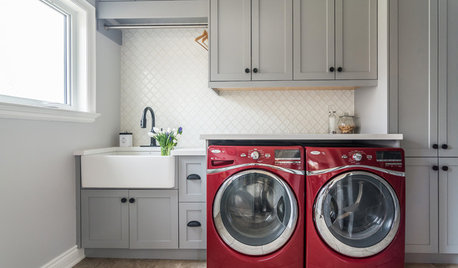
TRENDING NOWBlue, Green and Gray Cabinets Star in the Top New Laundry Rooms
White cabinets are still the most common choice in laundry rooms, but these trending photos tell a more colorful story
Full Story


Lori A. Sawaya